


Dynamic Zone Visibility in charts
Tableau dashboards are generally not static, but dynamic, thus using dynamic visibility in our dashboards allows the user to explore different aspects of the data.
Dynamic visibility lets you show or hide elements in a dashboard based on user interaction. Charts, text, containers, buttons can appear only when they are needed. Instead of overwhelming users with everything at once, you reveal information at the right moment.
Using this will allow you to create a cleaner layout, with the aspect of story telling and making your dashboard less cluttered.
In this blog, I will show you how to do exactly that.
Firstly, we will be using the Superstore Sales data in tableau.
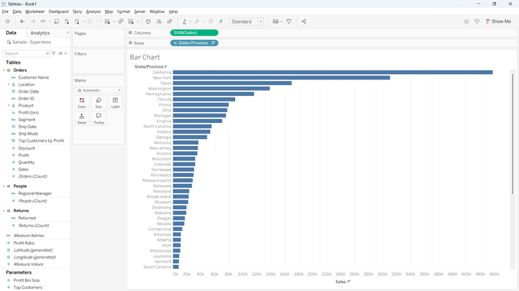
My question is to show the amount of sales in each specific state and which states have the highest sales. To begin, this can be done with a simple bar chart.
The bar chart:
We drag sales ‘Sum(Sales)’ onto columns and then the ‘State’ field onto rows.
Make sure to change the marks type to ‘Bar’
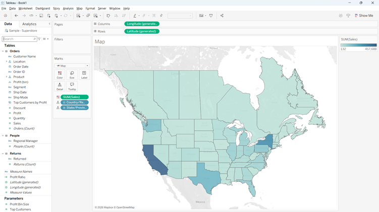
The map:
Tableau is very useful when it comes to maps. We can see the fields of state and country in on the left hand side. Tableau has automatically considered these geographical data, so we just need to double click both of these pills for tableau to populate the map in our view.
To make the map coloured in the way that we want it (gradient by the ‘Sum(Sales))’, we need to simply drag ‘Sales’ onto the colour section in the marks card.
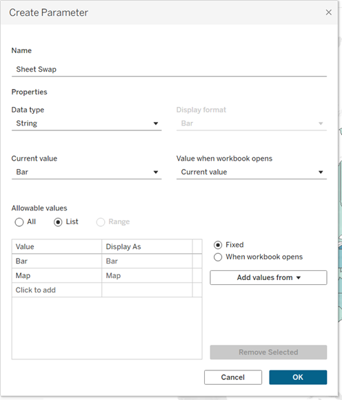
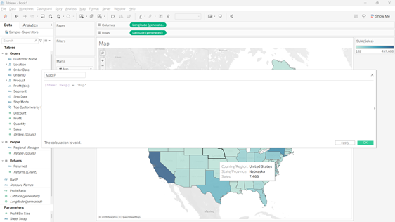
Now the fun part, the parameters. A parameter is a user controlled value that drives behaviour in a dashboard.
For dynamic visibility, it acts as the trigger. It holds the options that decide which elements appear and which are hidden, usually by linking to a calculated field that controls visibility.
When you create the parameter, you need to ensure the data type is string and then list the values you want, for this example we will use ‘Map’ and ‘Bar’ for the parameters swaps to keep it simple.
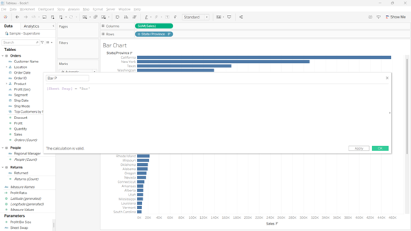
Once the parameter is created, you need to create two calculated fields. Drag the parameter into the calculated field and when it is on the map sheet, make sure the parameter = map, and when it is on the bar sheet, make sure the parameter = bar. It should show the parameter to equal ‘True’.
Now we need to build out dashboard! Drag in a horizontal container and then drag the bar sheet and the map sheet inside the container. Make sure you right click on the parameter and click ‘Show Parameter’.
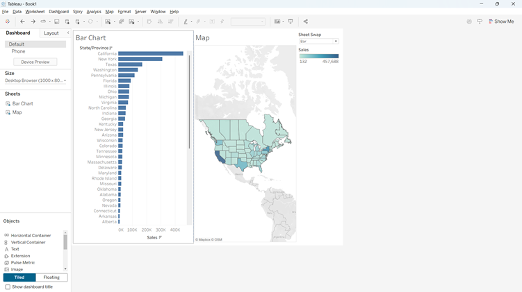
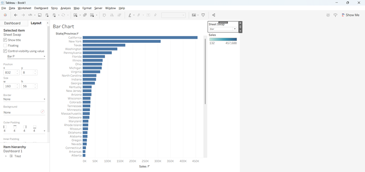
Now we need to control the visibility using our parameter we set up earlier. We need to click onto layout, and click ‘Control Visibility using Value’.
When you then click on the parameter, it will change the visual in the view, to flick between the bar when selected, or the map when selected! This is your Dynamic Zone Visibility!!