


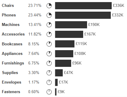
When you're trying to show both absolute values and percentages of total, using separate bar and pie charts often creates more confusion than clarity.
Viewers have to jump between visuals, match colours, and mentally piece things together. Pie charts in particular aren't great for judging sizes, especially when the differences are small.
What to do instead?
Instead of using separate charts, you can combine pies and bars into a single, cleaner view by using Measure Names and Measure Values. This allows you to show both totals and percentages side-by-side for easier comparison and better clarity — all without overwhelming the dashboard.
Step-by-step: Combine pie and bar charts in Tableau
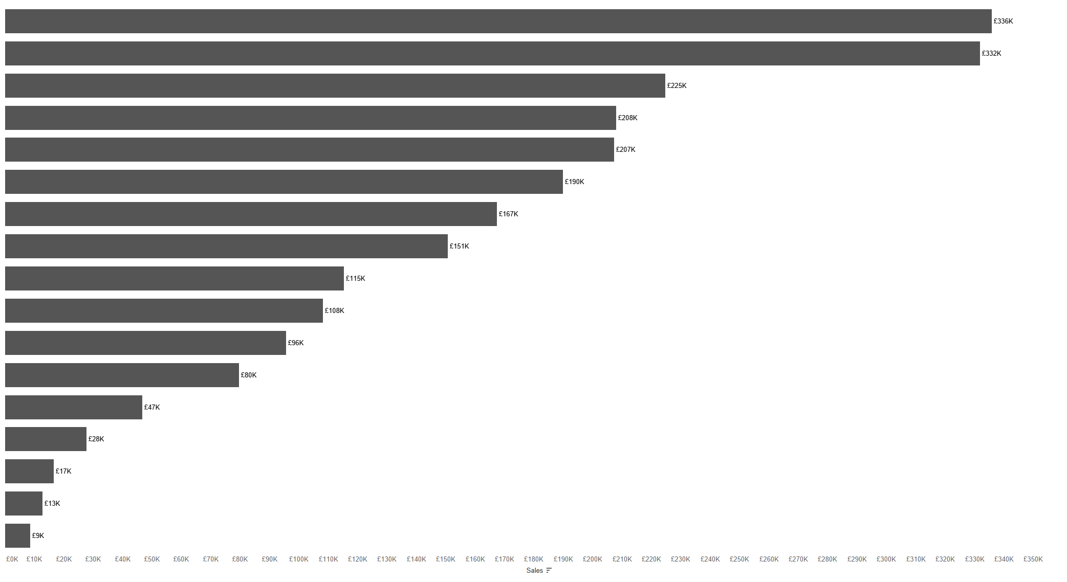
Step 1: Create a simple bar chart
- Place
Sub-Categoryon Rows. - Drag
SUM(Sales)to Columns. - Add
SUM(Sales)to Label. - Remove axis headers and tidy up the formatting (optional).
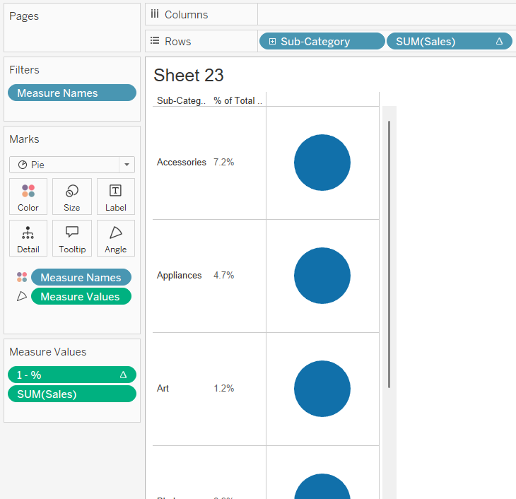
Step 2: Create a pie chart sheet
- Create a new sheet.
- Add
Sub-Categoryto Rows. - Add discrete
Salesto Rows and create Percent of Total Table Calc.
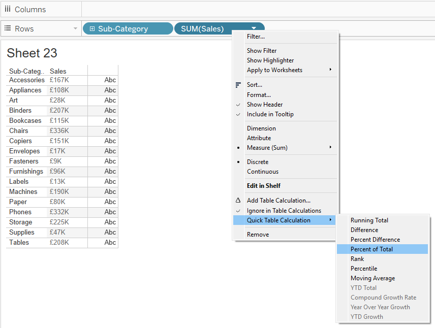
- Change the mark type to Pie.
- Drag Measure Values to Angle.
- Add Measure Names to Colour.
- In Measure Values, remove all measures except
Sales.
Step 3: Create the percentage calculation
Create a new calculated field called 1 - % of Total:
1 - SUM([Sales]) / TOTAL(SUM([Sales]))
Step 4: Add the new field to Measure Values
- Drag the
1 - % of Totalfield into Measure Values. - Now you should have two fields:
Salesand1 - % of Total.
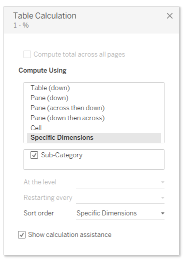
Step 5: Update table calculations
- For both
Salesand1 - % of Totalin Measure Values, set them to % of Total. - Use Sub-Category as the addressing field.
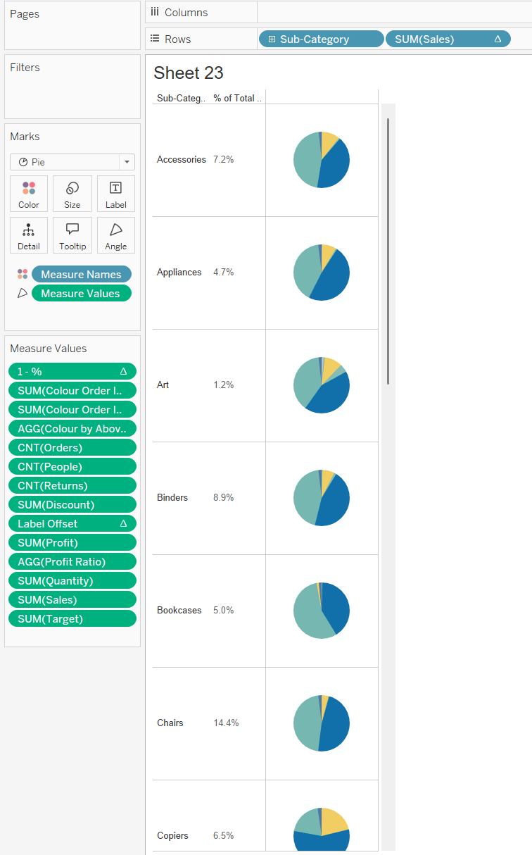
Step 6: Clean up and format
- Remove all other measure values from the view.
- Sort the sub-categories descending by total sales.
- Fit the view to Entire View.
- Add a border to the pie marks to separate the slices visually.
Step 7: Combine the two charts
Use a dashboard to place the bar and pie chart sheets side-by-side. Align them vertically so that each sub-category has both its total (bar) and proportion (pie) displayed on the same row.
