Want to make granularity gains? You've come to the right place. Last week I took a Tableau test and failed to create a Barbell Chart, it's a simple chart to make so I'm writing this short blog so you don't make the same mistakes as me.
If you're looking to create a Barbell Chart using measure values check out this great blog by Thanoshaan.
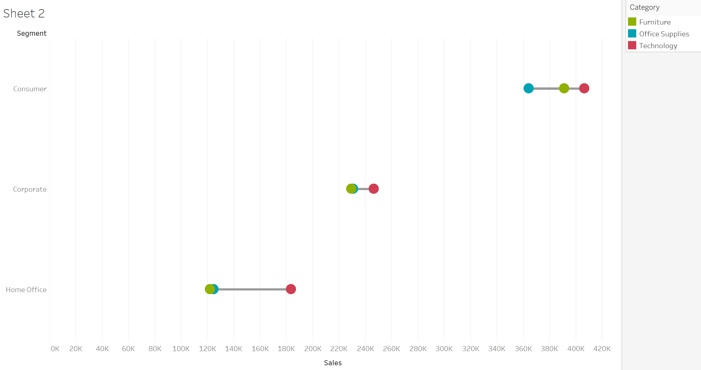
Jump into your superstore data to get started!
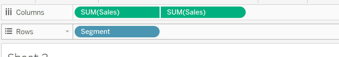
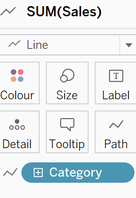
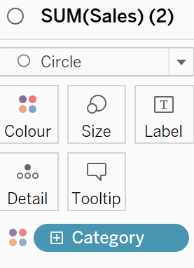
The first step is to put duplicate measures on columns and create a dual axis (don't forget to synchronise), I have chosen Sales. Accompany this with a dimension on rows, I have chosen Segment.
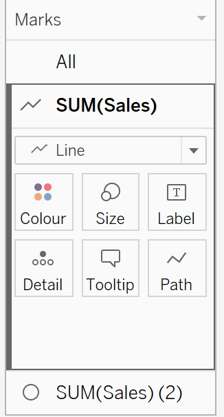
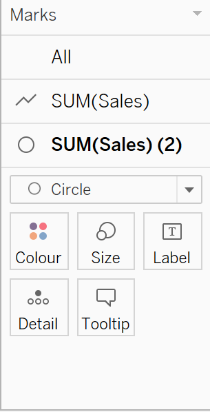
Change your first mark to Lines and the one below to Circle as shown above. Next, add a new dimension to path on your line chart and colour on your circle chart, I have chosen category:
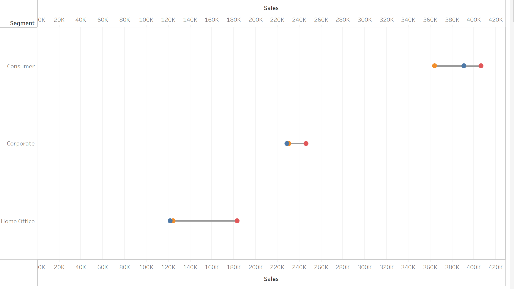
Finally, play around with the formatting to create your desired barbell chart!