


Ever built a dashboard you were proud of, only to have your audience say, "This is great, but can I see just the Cars?" or "What if I only want to look at buses?"
If you're nodding along, you've come to the right place. Today, we're going to unlock one of Tableau's most powerful features: Parameters.
We'll go from a static, one-size-fits-all chart to a fully interactive dashboard that puts your user in the driver's seat. We'll be using a dataset of Global Battery Electric Vehicle (BEV) sales, but you can apply these steps to any data.
Let's dive in!
Step 1: Create the The Parameter
Think of a parameter as a "control knob" for your dashboard. On its own, it doesn't do anything. But it’s the user-facing tool (like a dropdown or slider) that will let your audience tell the dashboard what they want to see.
First, let's build that Parameter.
- In the Data pane (on the left), click the small drop-down arrow next to the search bar and select Create Parameter.
- A new window will open. Let's fill it out. We want our users to be able to see all vehicle types, or just one.
- Name:
Select Mode - Data type:
String - Allowable values:
List - List of values: We'll add our vehicle types. It's also crucial to add an "All" option!
AllBusesCarsTrucksVans
- Name:
Here’s what that setup looks like:
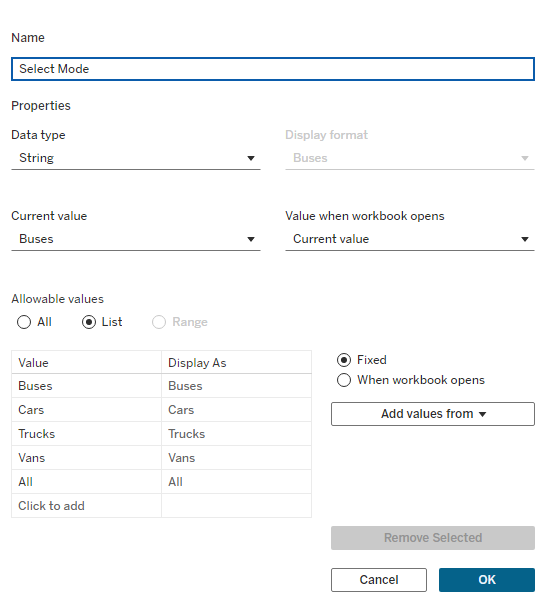
Click OK. You'll see your new parameter at the bottom of the Data pane. It's not connected to anything yet, but we've built the control.
Step 2: Connect the "Wiring" (The Calculated Field)
On its own, our parameter is just a fancy dropdown. It doesn’t do anything... yet. We need to connect it to our data with some "wiring." This "wiring" is a Calculated Field that tells Tableau how to react when the user changes the parameter.
- Click the Data pane drop-down arrow again and select Create Calculated Field.
- Name it
Filter Mode. - Type in the following simple formula:
[Select Mode] = 'All'
OR
[Select Mode] = [Mode]
This calculation is a simple True/False check. It will be True if:
- The user has selected "All" (so we show everything).
- ...OR if the mode selected by the user (like "Cars") matches the
[Mode]in our data.
Here is the setup for the calculation:
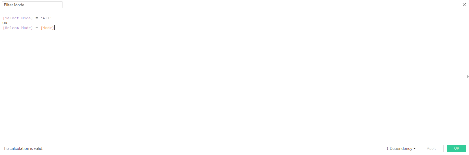
Click OK. Now we have the logic!
Step 3: Activate the Filter on Your Chart
This is the "Aha!" moment. Let's build a basic line chart (like SUM(Sales) on Rows and Year on Columns) and add Mode to the Colour card.
You'll see all four vehicle lines. Now, let's connect our parameter:
- Drag your new calculated field,
Filter Mode, from the Data pane directly onto the Filters shelf. - A small box will pop up asking what to filter for. Check True and click OK.
Why True? We're telling Tableau: "Only show the data rows where our calculation is true."
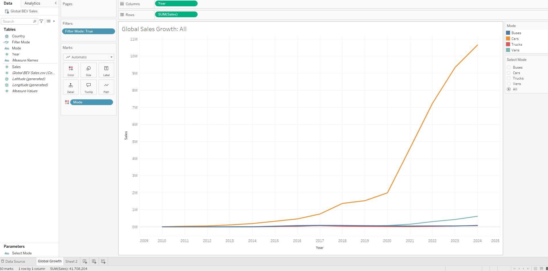
Your chart might look the same, or it might be blank. That's because we haven't shown the control for the parameter yet. In the Data pane, find your parameter Select Mode, right-click it, and select Show Parameter.
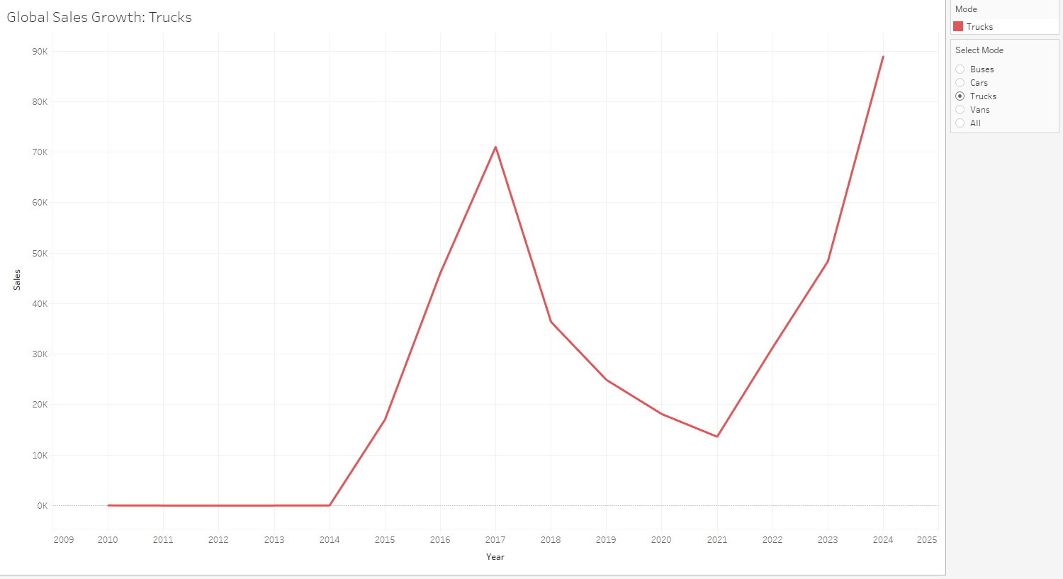
Go ahead, try it! Select "Cars" from the dropdown. Your chart will instantly update to show only the "Cars" line. Select "All," and all four lines will come back. How cool is that?
Step 4: Add the Polish (A Dynamic Title)
Want to really impress your audience? Let's make the chart's title update automatically based on the parameter selection.
- Double-click the title of your worksheet.
- Edit the title to be something like:
Global BEV Sales Growth: - After the space, click the Insert drop-down and select your parameter
Select Mode. - The title box should now show
<Parameters.Select Mode>.
Like this:
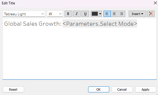
Click OK. Now, when you select "Trucks" from your parameter, your chart title will literally change to "Global BEV Sales Growth: Trucks." It's a small touch that makes your dashboard feel incredibly responsive and professional.
Step 5: Bring It All Together (The Dashboard)
The best part is that this single parameter can control as many charts as you want.
Go ahead and build your second chart. Once it's built, just drag the same Filter Mode calculated field to its Filters shelf and select True.
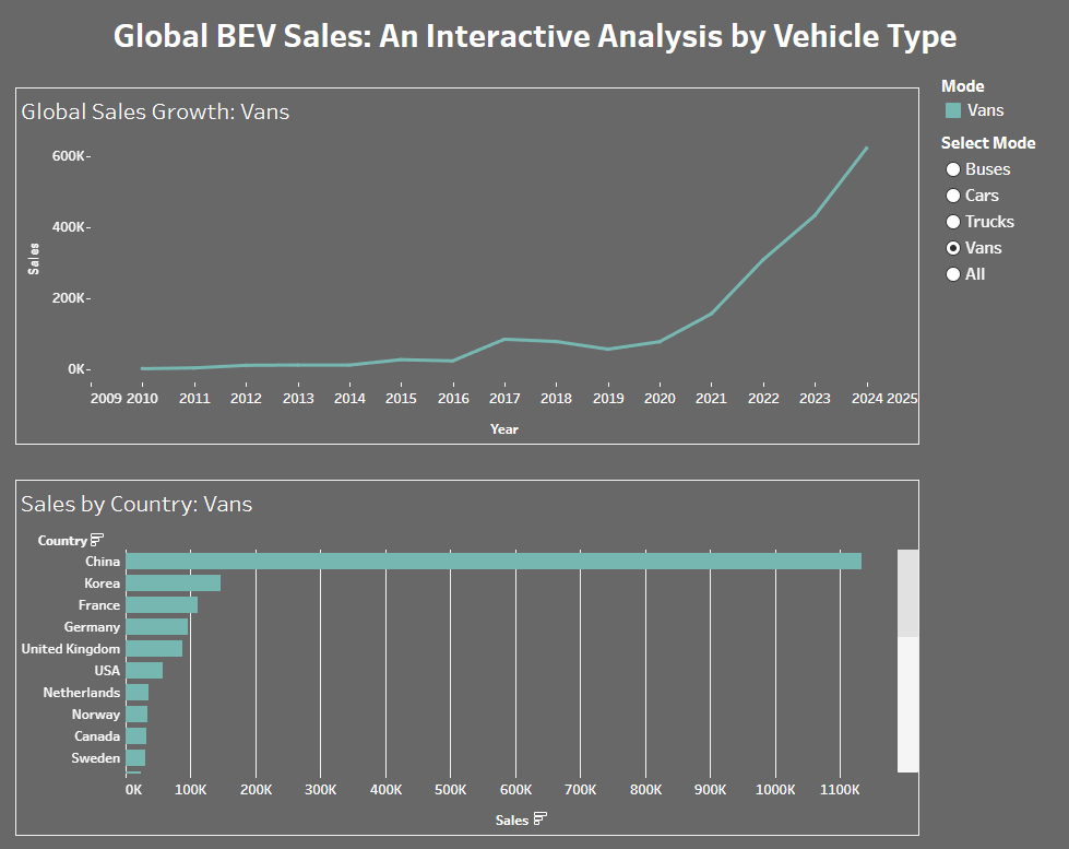
Now, create a new dashboard and drag both of your sheets onto it. You'll only have one Select Mode control, but it will filter both charts at the same time!
Add some formatting (like the dark background we used), and you have a stunning, interactive, and insightful dashboard that puts the power of exploration right in your user's hands.
Here is our final product:
And there you have it! In five simple steps, you’ve moved from a static report to a dynamic, user-driven tool. You’ve successfully given control to your audience, allowing them to answer their own questions.