


For the first day of Dashboard Week, we where tasked with exploring London’s cycling infrastructure. Our goal? To take live data from Transport for London’s (TfL) Bike Point API and transform it into an interactive dashboard that helps users plan a cycling trip across the city (see link to the API below).
 Artemis TFL
The specific challenge was to build a tool that allows a user to input a Start and End location and answers four key questions:
- Which Bike Points are near my start location?
- How many bikes are available there?
- Which Bike Points are near my destination?
- How many empty docks are available so I can park?
Here is how I approached the challenge using Alteryx and Tableau.
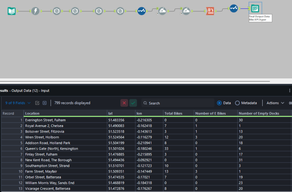
Step 1: The Data (Alteryx)
The data comes from the TfL Unified API, which updates real-time information about docking stations, including their coordinates, total capacity, and current availability.
I used Alteryx to connect to the API, parse the JSON response, and structure the data for analysis. The key steps involved downloading the data, JSON Parsing, splitting location column to street and area and cleaning up the field names to make them readable. You can see my final flow for this below.
Step 2: The Logic (Tableau)
The trickiest part of this dashboard is that Tableau doesn't natively know where the user "is" or "wants to go." To solve this, I used Parameters and Spatial Calculations.
1. Capturing User Input - I created four parameters to act as the user's input boxes:
User Start Lat/User Start LongUser End Lat/User End Long
2. Spatial Math - To filter the map dynamically, I needed to calculate the distance between the user’s input and every single docking station in the dataset. I used Tableau's spatial functions MAKEPOINT and DISTANCE.
For example, to find docks near the start point, I used a calculation like this: DISTANCE(MAKEPOINT([lat], [lon]), MAKEPOINT([Start Lat], [Start Long]), 'm')
I then created a boolean filter to only show docks within a specific search radius (e.g., 300m). This allowed the dashboard to dynamically update the map and bar charts based entirely on where the user wants to travel.

Feature Highlight: Google Maps Integration
A dashboard is good, but actionable insights are better. I wanted users to not only find a dock but also know how to get there.
I implemented a URL Action that links directly to Google Maps. By constructing a dynamic URL string using the user's start coordinates and the dock's coordinates, I created a custom "Button" in the tooltip.
The calculation looked something like this:
"https://www.google.com/maps/dir/?api=1&origin=" +
STR([User Start Lat]) + "," + STR([User Start Long]) +
"&destination=" +
STR([Lat]) + "," + STR([Lon]) +
"&travelmode=bicycling"
Now, when a user finds a dock with available spaces, they can simply click "🚴 Get Cycling Directions" to open a live route in their browser.
Final Thoughts
This challenge was a great exercise in spatial analytics and user-centric design. The combination of Alteryx for data prep and Tableau's spatial functions made it possible to turn a static list of bikepoint coordinates into a dynamic journey planner.
On to Day 2!