


This blog is about starting to work with an Uber dataset as an internal project. I explain how I started my analysis, and how I figured it out that the data was actually fake.
The fields (columns titles) looked realistic at first glance: Booking IDs, vehicle types, distances, ratings, payment methods and ... but after having a deeper exploration, I realized that something must be wrong.
1️⃣ Starting the Analysis and observing unnrealistic charts
At the beginning, I created several visualizations in Tableau to explore the data:
Heatmap: Showing the number of rides by weekday and hour
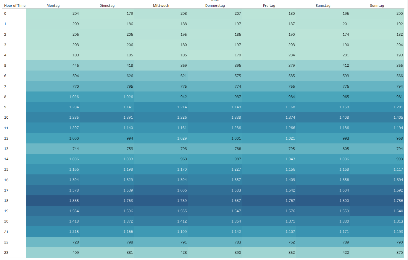
It can be seen that every weekday had almost the same number of rides and very consistant increase and decrease by peak hours.
Line Chart: Showing total revenue by month
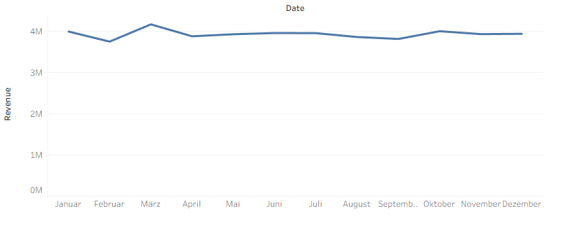
The monthly revenue stayed around the same amount all year, without any seasonality
Bar Charts: Comparing revenue by vehicle type and payment method
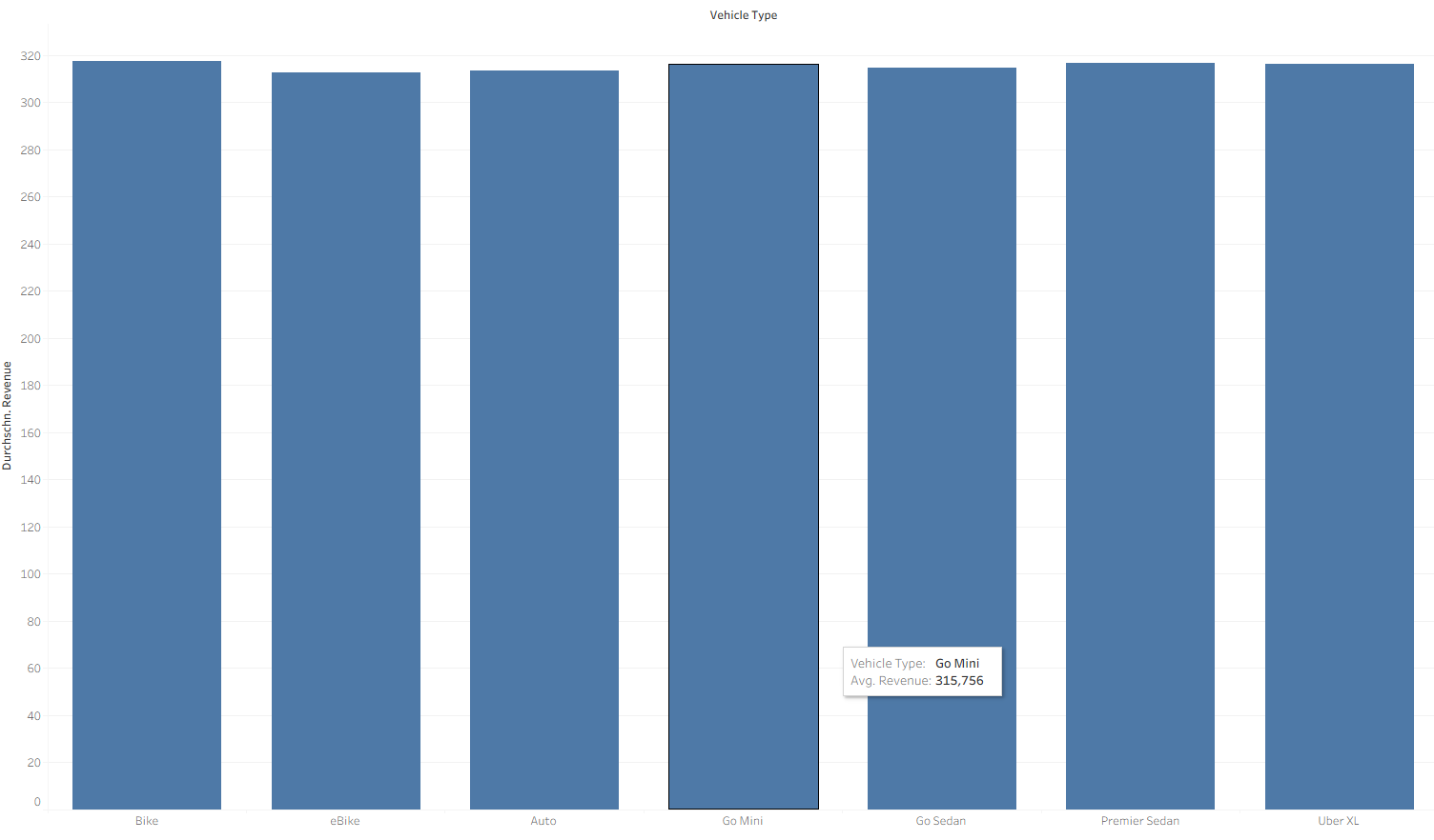
Here we also see an almost constant revenue for all vehicle types. If this would be true, it shows a very simple price modeling by uber.
Ratings Chart: Showing average customer and driver ratings over time
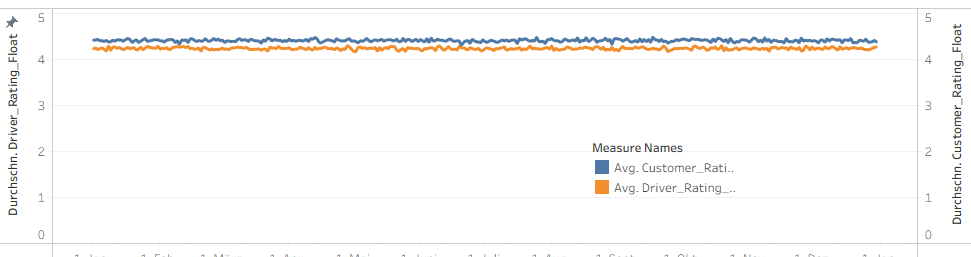
Driver and customer average ratings were always between 4.2 and 4.5 without changes in all days of a year. Moreover, it was like, that both curves for customer and driver moved together with an offset during a year.
Heatmap: Number of Booking by Vehicle Type and Distance
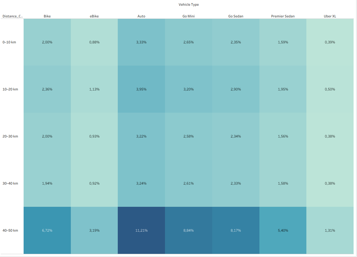
According to this chart, bikes have had cmparatively many long trips (even 40–50 km), which is very unlikely.
These patterns are not normal for real Uber data, as we expect to see variations between days, months, and vehicle types. Real data always would show some fluctuation or seasonality. The Uber dataset I had, looked like it was generated to mimic real data but without the natural changes that would happen in reality.
2️⃣What I Learned
This discovery gave me the awareness, that a good data analysis should be starting with data validation.
Investigating if the data is realistic is a braoder topic than just finding out that the data is fake. Sometimes, the data is't fake, but it is skewed or biased. I will discuss about it, in another blog.