I’ve just completed my first week at the Data School and have already learned so much. From learning how to speak to stakeholders and research companies, to learning Tableau Prep and Tableau, I know this is just the beginning.
I wanted to reflect on what it actually took to get into the Data School. I remember that during the interview process, I was scouring the internet for previous successful applicants and their insights, and what I found helped me immensely. So, for my second blog, I wanted to return the favor to the community.
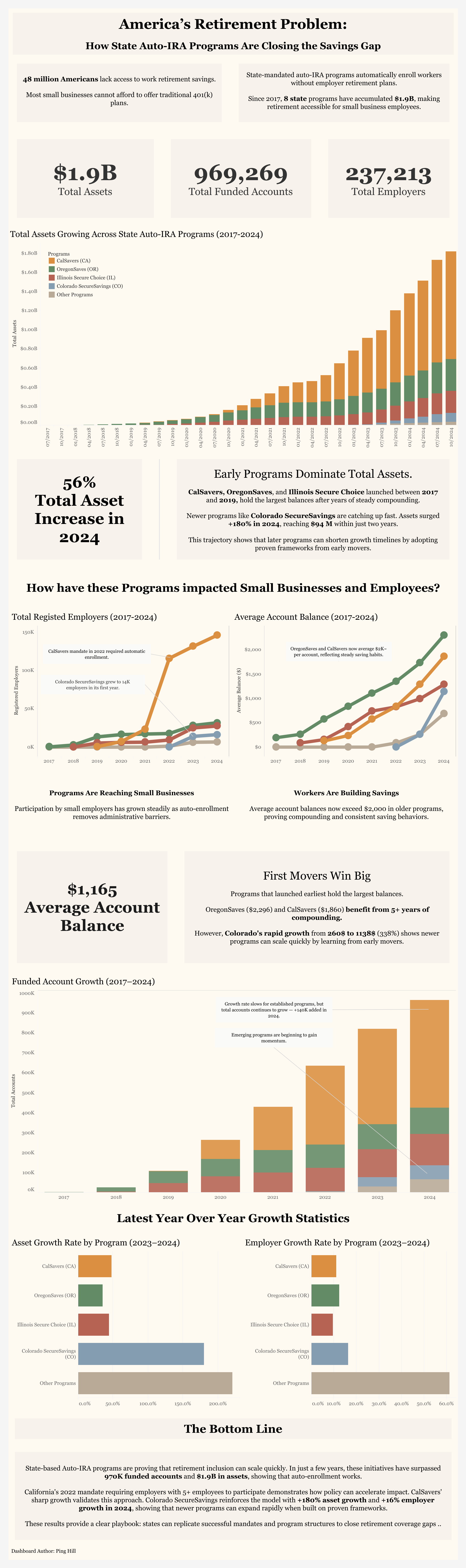
When I first applied, I saw that the application required a link to a Tableau Public dashboard. In my previous internship, I managed a simple dashboard with a single bar chart displaying Auto IRA data, so I submitted it without further review.
To my surprise, the very next day, I received a personalized email from Amelia from the recruitment team with specific feedback regarding my application.
She dove into what my dashboard did well and what it didn't, and linked many helpful resources, blogs, and previous successful applications.
Her feedback involved:
Storytelling through Data:
The dashboard should guide the viewer through a narrative or analytical flow, not just display data, but make connections between different parts of data and formulate a story behind the numbers.
Use of text and annotations:
Utilize text blocks or annotations to highlight your key findings and insights more prominently. She emphasized that my dashboard should aim to answer questions from the data, and this can help direct the viewer's attention to what's most important.
Providing context:
Including brief explanatory text where necessary can help clarify why this is important for viewers and make the data more meaningful and engaging.
Keep in mind these pointers were specific to my initial dashboard, and you will receive your own set of feedback. Upon receiving this, I knew I had some work to do, and I immediately dove into understanding my data more deeply and identifying insights to draw from.
I wanted to frame my dashboard not just as a budget tracker for auto IRA programs, but as a story of their growth and success. My main takeaway is that newer states, such as Colorado, don’t have to start from scratch when implementing these programs; rather, they can follow the framework of larger, successful states, leading to faster growth.
Upon submitting my updated dashboard, I received another round of feedback, this time even more specific to my submission; however, I will provide the feedback that I think everyone can draw from.
Tooltips:
Enhance your tooltips to make them more visually appealing and informative, as this can greatly increase user engagement and understanding.
Number formatting:
Be consistent with your number formatting throughout the dashboard, and represent large numbers such as 1,200,301 as 1.2M. This not only enhances user readability but also saves valuable space.
Multiple visual methods:
Be cautious about using multiple charts and graphs to convey the same information (known as double encoding), as this can create clutter and make the dashboard more complex than necessary. Choose the most effective single method to present your data clearly.
Minimize Color Palette:
Be wary of the number of colors used, as too many colors can overwhelm the viewer and make the dashboard look cluttered. Aiming for a simple color scheme enhances the data's readability and aesthetic.
After taking into account all the feedback, I finally submitted my dashboard and moved on to the next process.
If you're in the middle or starting your application, hopefully this helps. This whole process is about how you take and handle feedback, so don't worry if your first submission isn't perfect. I have attached my dashboard below, along with helpful links I was provided during my application. Good luck!
Storytelling:
https://thedataschool.com/habeeb-gayle/the-7-types-of-data-story/
https://thedataschool.com/nitesh-shrestha/whats-a-user-story/
https://thedataschool.com/vivian-ng/dash-board-ing-through-the-snow/
Text/ Annotations:
https://thedataschool.com/jose-delarosa/data-viz-titles-and-subtitle-concept-2/
https://thedataschool.com/vivian-ng/the-sharpest-tool-tip-in-the-shed/
Context:
https://thedataschool.com/bianca-ng/dashboard-week-day-2-communicating-with-your-audience/
Color:
https://www.tableau.com/blog/3-storytelling-color-tips-improve-your-data-visualization
https://thedataschool.com/tobias-fitschen/dashboard-design-best-practices-color/
https://thedataschool.com/boglarka-lipka/choosing-colors-for-your-dashboard/
Number Formatting:
https://thedataschool.com/matthias-albert/kjyflalkalk/
https://thedataschool.com/sabrina-vazquez/format-your-numbers-formatting-best-practices-on-tableau/
My Dashboard: https://public.tableau.com/app/profile/soong.ping.hill/viz/Auto-IRAStateProgramDashboardUpdated2/AutoIRASummary