


This was our fourth day of Dashboard week, and today we were tasked with utilizing an API key to gather data from the IUCN endangered species list and build an infographic. This was a specifically selected dataset to match our jungle-themed party on Friday. The API documentation can be found here. I chose to focus on tigers because they have been endangered for many years and are one of my favorite animals.
To reach the API, I utilized Alteryx and followed the documentation, including using the formula “Bearer” + [key] and configuring the Download Data tool accordingly.
Halfway through my Alteryx workflow, I realized it would not be too difficult to also bring in lion data, as I just had to copy my workflow. My new plan was to build a comparison infographic between lions and tigers. My workflow included JSON parsing, dynamic renaming, cross-tabs, and filtering to gather the data and fields I actually needed; however, I ended with each animal having a summary table and a more detailed “threats” table
This was my entire workflow for tigers:

And this was my workflow for lions:

This was my Excalidraw sketch:
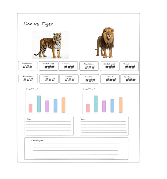
I chose to utilize many KPIs, as this was an infographic-type dashboard, and one could hover over the KPIs to see a more in-depth description of what they meant. The bar charts were split by animal and showed the biggest threat to each animal's extinction. For tigers, it was poaching, while for lions, it was war/farming.