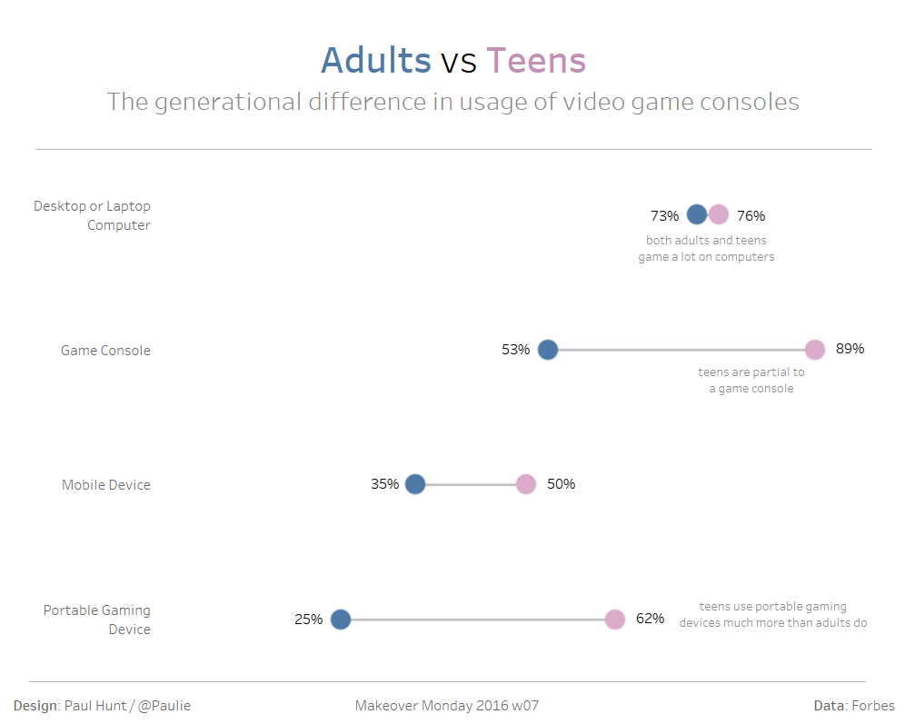
Dot plots are a nice and simple way to visualise two (or more) values across different categories. If you want to emphasise the range between these two values (or between the max and min in the case of more than two values) then this could be developed into a barbell (aka dumbbell) chart with a few extra steps.
In this tutorial I will be using a data set from Makeover Monday 2016 week 7, which looks at video game console time differences between adults & teens. It can be found here.
Step 1
Identify a measure (numerical field that can be mathematically operated on) and dimension (qualitative field that do not sum) that you want to look at. Drag the measure into the row shelf and dimension to the column shelf, this creates a horizontal bar chart which, in this example, has ‘Usage Rate’ organised by ‘Gaming Device’.

Step 2
Drag a second dimension onto the colour mark, in this case I’ve used ‘Category’ (which actually means user), which turns the bar chart into a stacked bar chart.
Step 3
Change the mark type from Bar to Circle to convert the chart into a dot plot.

Step 4
Duplicate the green SUM(Usage Rate) pill by holding down CTRL whilst dragging it to the right of itself. This will essentially repeat the existing chart in a second pane.
Step 5
Click on the third marks card (titled SUM(Usage Rate) (2)) that has just been created and change the mark type to line. This connects the values of each category/user across different gaming devices.

But we don’t want this. What we actually want is the connection to be between the values of different categories/users across each gaming device.
Step 6
Click the colour icon left of the blue ‘Category’ pill and change it to path (alternatively drag the pill to the path mark).
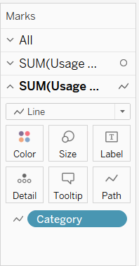
This gives us what we wanted, namely the actual bar of the barbell.

Step 7
Now we want to combine the two panes together, we do this through a dual axis. Right click the second SUM(Usage Rate) green pill and select dual axis.
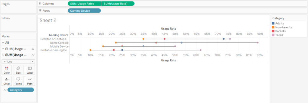
Step 8
Now a few bits of formatting are required to tidy this up:
(a) Right click the top axis and select ‘Synchronise Axis’
(b) Right click the top axis and select ‘Move marks to the back’
(c) Right click the top axis and deselect ‘Show Header’
Step 9
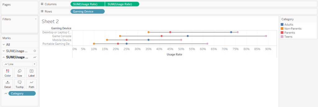
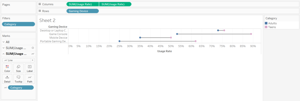
Feel free to add some optional filtering to really emphasise the range between two particular categories/users.
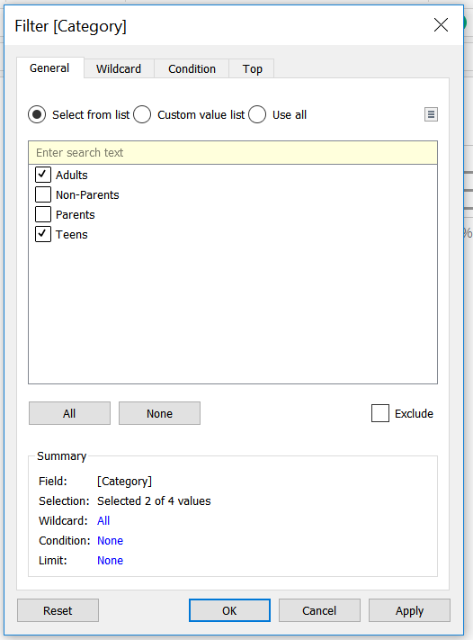
In this case I’ve decided I’m only interested in adults and teens (not fussed about parents and non-parents). So I drag the ‘Category’ dimension to the filter shelf and deselect parents and non-parents.
Step 10
Play around with the formatting, add it to your dashboard & enjoy your barbell chart!
