In a recent Makeover Monday, I ended up with a specific chart in mind. It was a type of radar chart, being closer to a type of line chart that was wrapped around a central point, rather than focusing on the area it contains. I was inspired by another dashboard on climate change, and thought about how this could be used to compare change year by year. It was a bit of a struggle to put it together, so this blog will be going into how you can create a radar chart.
In this blog, Tableau's Superstore data will be used to show how you can use radar charts. Radar charts are typically used to show multiple measures sharing the same unit, in a single chart, extending out from a singular point. You'll typically see it when it comes to surveys or ratings, such as baseball batting stats. But here, we'll be looking at is as a way to compare a measure across months and years.
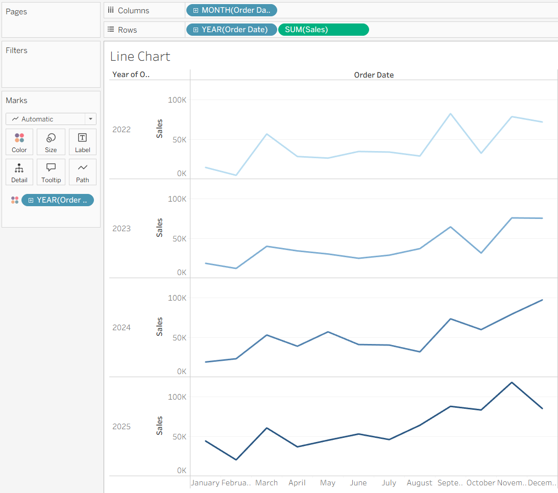
To start, we can create a simple line chart comparing sales across each month for each year. We can do that by dragging the Order Date onto columns, putting it to a month level, sum of Sales onto rows, and Order Date at the year level onto color on the marks card. We can also split it up even more by putting Order Date at the year level onto the rows as well. This gives us each individual line for the year.
However, we could use a radar chart to display how the sales have changed year by year. To do so, we'll need a few calculation to figure out where the points should be, angled based on the month. On a base level, a scatterplot will be made where each point is centered around 0,0 with a point for each month. To figure out the angle, we can use this calculation to base it on the month.
Month Angle: ((DATEPART("month", [Order Date]) - 1) / 12) * 360
This will determine which angle around the chart the month should be at, with January being up vertically. We can then use this angle, turning it into radians for use in Tableau's SIN and COS functions to figure out where the sales should be placed around 0,0. For our X or columns side, we'll use SIN, and for the Y or rows side, we'll use COS.
X Sales: SIN(RADIANS([Month Angle])) * [Sales]
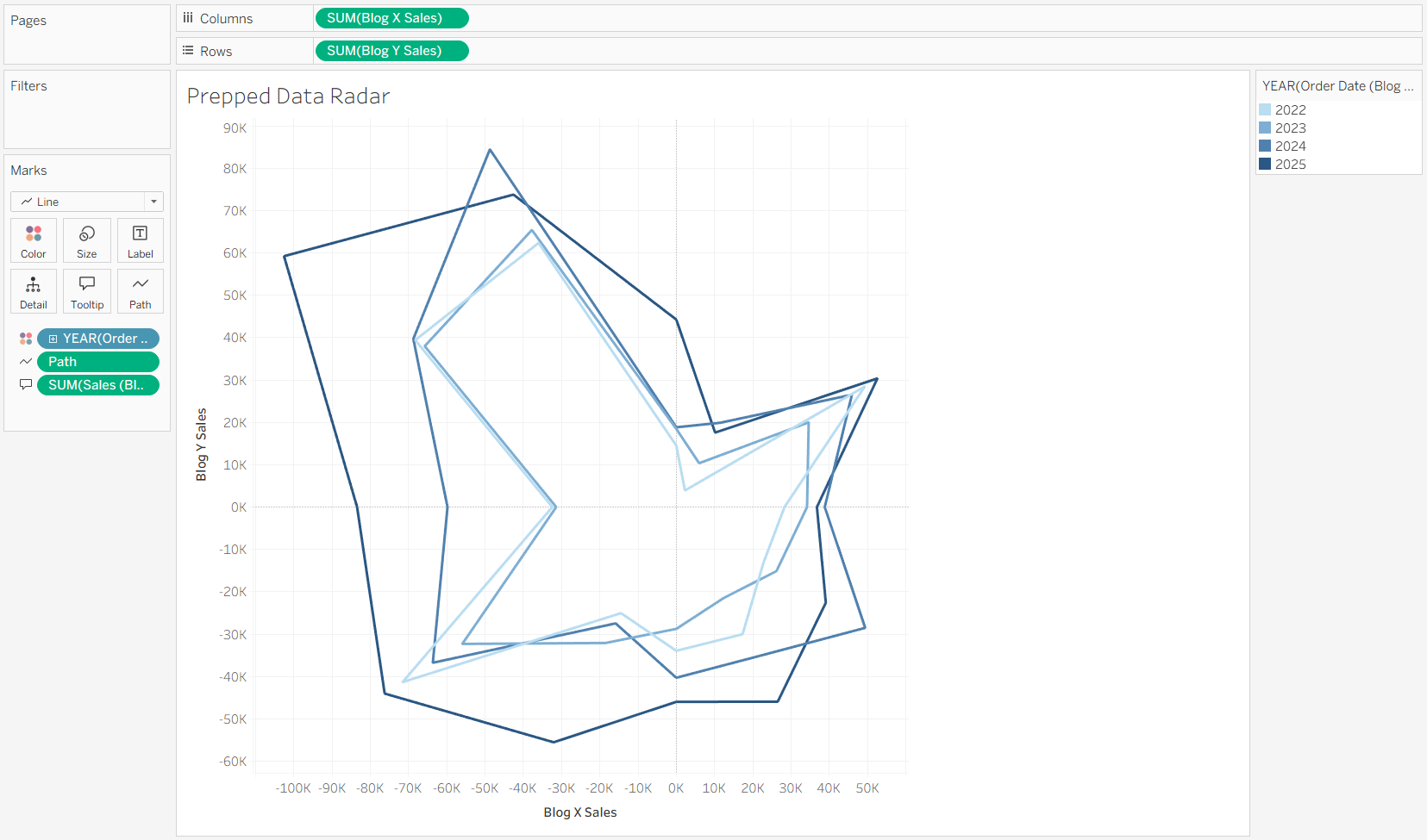
Those can then be put onto columns and rows respectively, changing the mark type to a polygon. The year of the Order Date is put onto details to split up our marks by year, and the month of the Order Date onto the path so Tableau knows that we want to connect our lines based on the month number. You'll initially see a single blob, so we can turn down the opacity of the polygon to show only the outline, which will be for year by year.
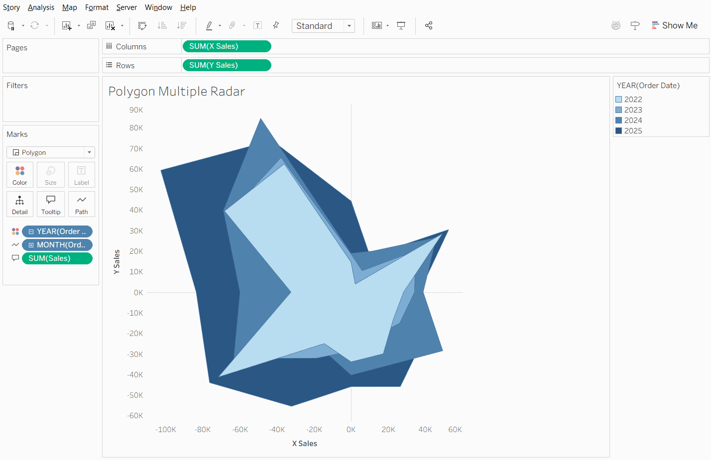
However, this has a few issues with displaying the data the way we want to. It's hard to know which line is which year. The color mark doesn't work as well here as the color impact the fill of the polygon, which may lead to issues with overlap.
Something we can go ahead and do is change the mark type from a polygon to a line. This will let Tableau change the line based on the year, but there is a glaring issue. December doesn't connect to January, leaving a gap in the line that causes the line to be incomplete.
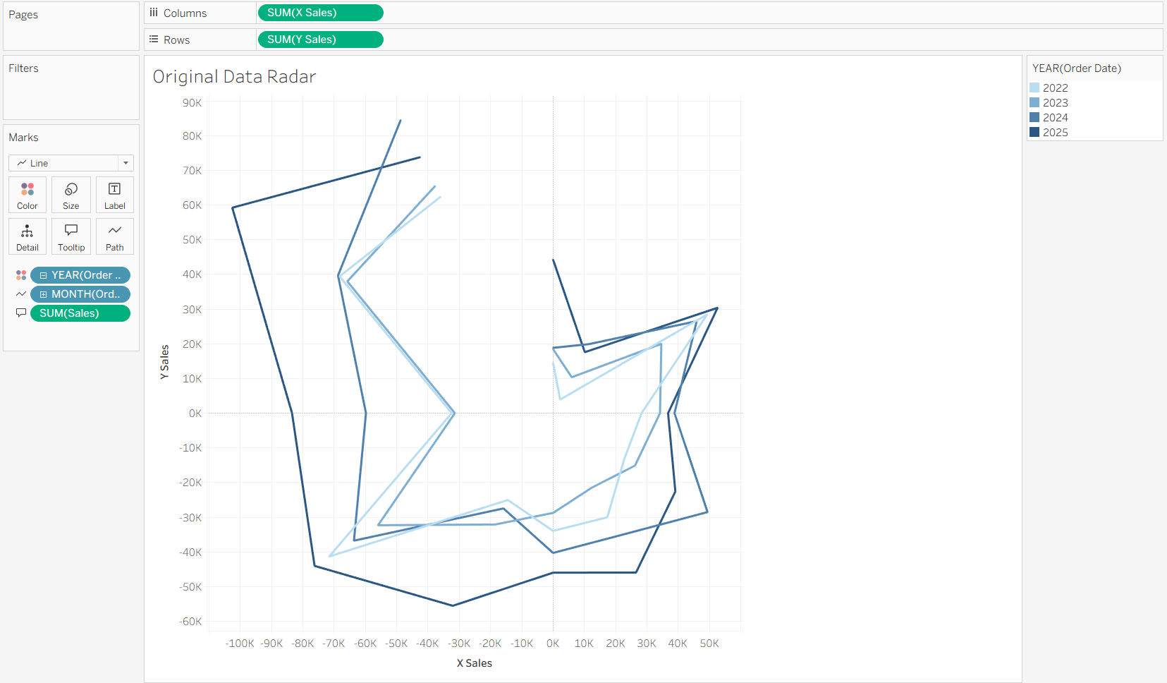
In order to connect our data together, we'll need to do some data preparation. A new data source will need to be introduced so that the lines can be connected together. The workaround I found was to create a duplicate row for January and introducing a field specifically for the path order of the radar chart. We know that we want the data to be at the month and year level, so we can aggregate already to the month-year level, and add in the extra field for the path. The path will be based on the month number, but having the duplicate January row's path be set to 13.
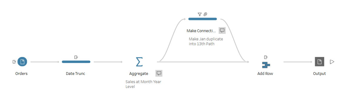
We can then bring the output of that flow into the Tableau workbook, relating it to the original dataset based on the Order Date, using a date truncation to the month level for the original data source. This allows us to use the same data without causing duplicate data in other sheets. By using the same calculations as before, we can create the same radar chart as before, but using the new path field. This closes the radar chart, allowing to a clear indication between our different years and how they do each month in an interesting way.
To help with the axis, a custom background would need to be made. This is where a background image can be used to show what the axis looks like. This can be set within Tableau as well using the background image option under the maps section, which I cover in this previous blog.
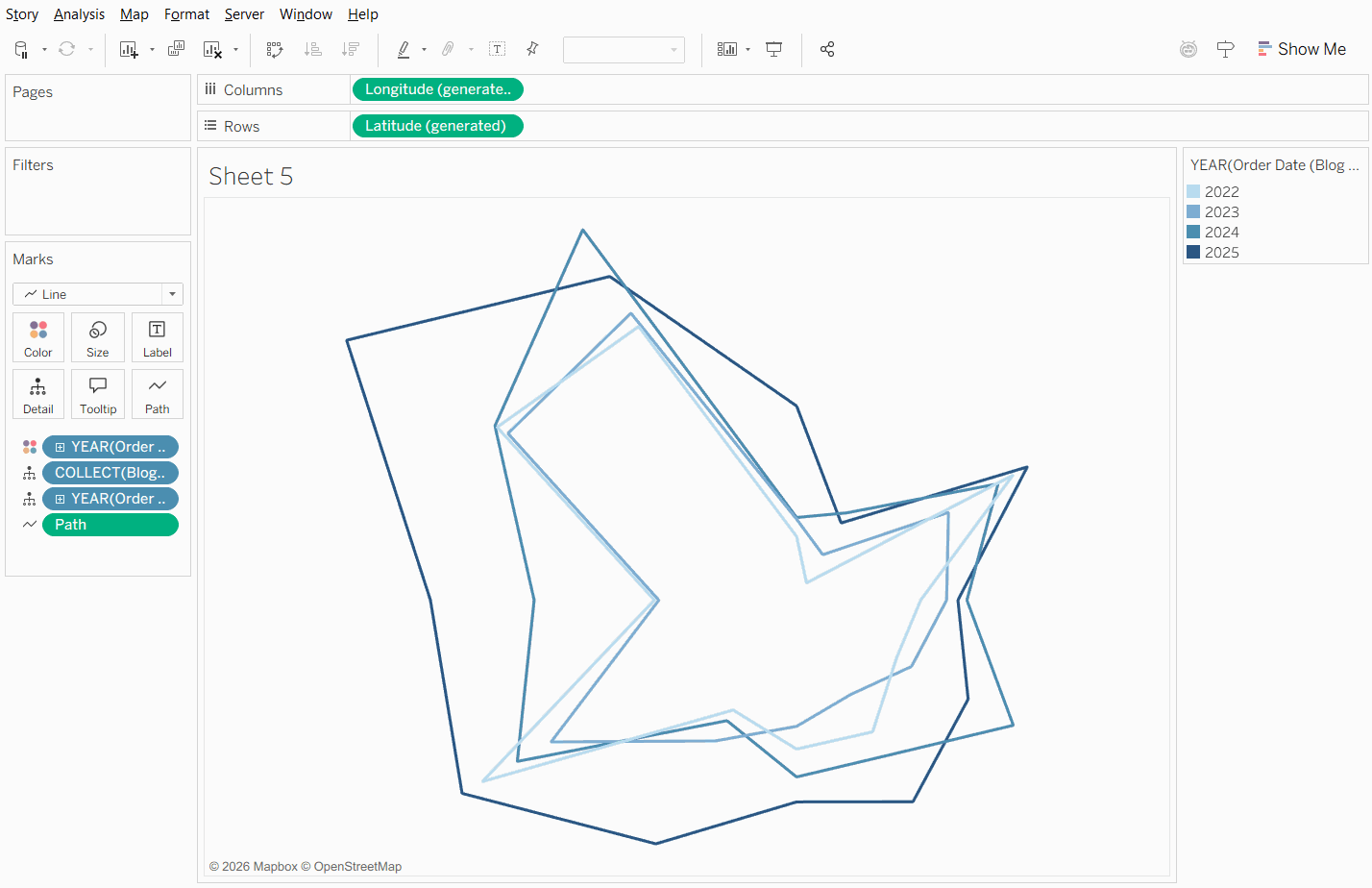
Another trick with this chart type is due to the fact that we create points for each month and year based on an angle around a central point. Since we have a X and a Y point, we can turn that into a spatial point using the MAKEPOINT option with the X point being the longitude and the Y point being the latitude. The issue with just doing that is the scale of the points, which is too large for spatial points when trying to put it on a map. We can edit the calculation to be scaled based on the maximum sales based on the data source that was introduced. The new calculation would then be:
X Sales: SIN(RADIANS([Month Angle])) * ([Sales] / { FIXED : MAX([Sales]) } )
This will set the magnitude of the sales to be between 0 and 1 based on the monthly sales. This will then allow Tableau to correctly display the marks by month. Map layers can be used for extra details, such as showing the center point, and can be changed back to a standard chart format by changing the map background to none.