


And onto the final day of training at the DS! Today's dataset is on Goodreads, which is a book website that allows users to find, track, and rate books. I've been getting back into reading over the past couple years, especially with the time I have on the train to work each day. So overall, this is a project and dataset is something I'm really glad to be working with.
The brief is to use Goodreads data to create an infographic dashboard that should be closer to data journalism than business analysis. My first thought was to my application dashboard as that focused more on the story rather than having it be a business dashboard. We need to make sure that the final dashboard is nice and polished, so having a good plan and sketch, with plenty of research, was top priority. Given that it was infographic, having a small amount of interactivity would be important, so the insights derived from the dashboard should be immediately noticeable.
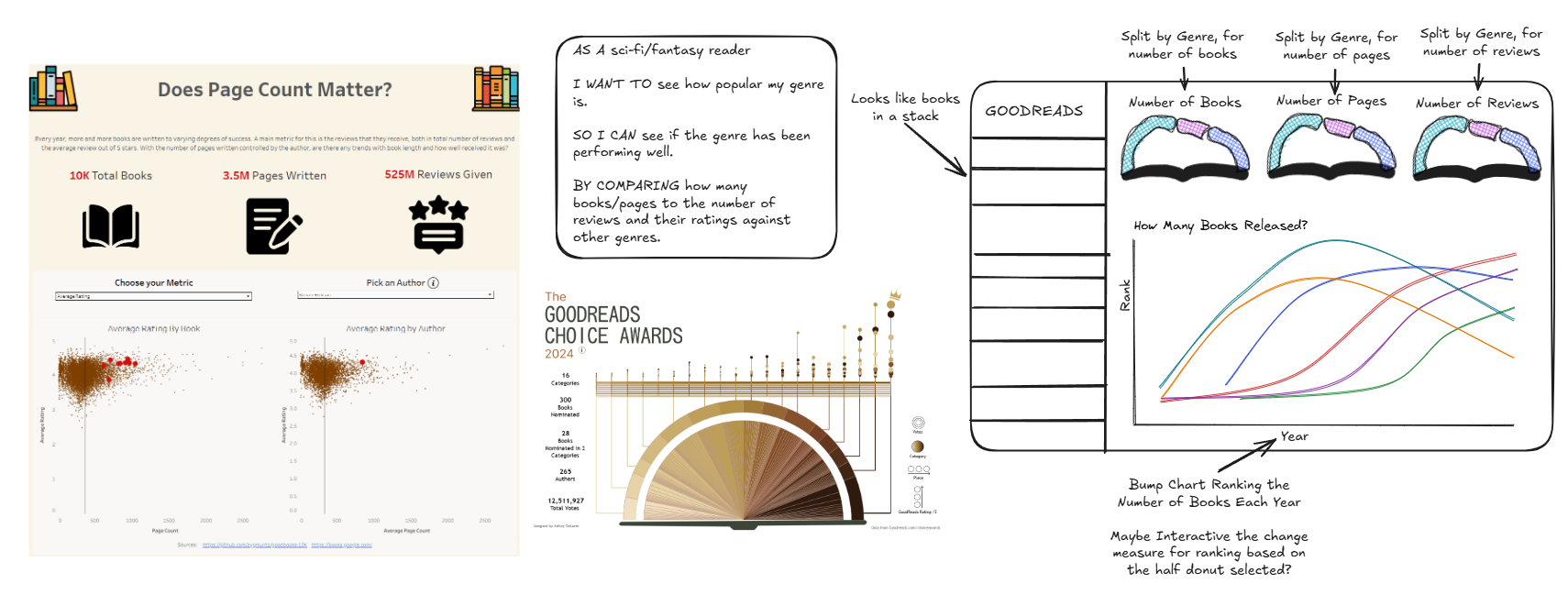
To start with the sketch, I made another user story which was pretty easy to do given my personal interest with books. I found inspiration from two vizzes: a previous one I made using some different Goodreads data, and a Viz of the Day also based on Goodreads. I really liked the look of the half-donut chart and how it looked like an open book and decided to focus on that. With that in mind, I ended up with my sketch and a place to start.
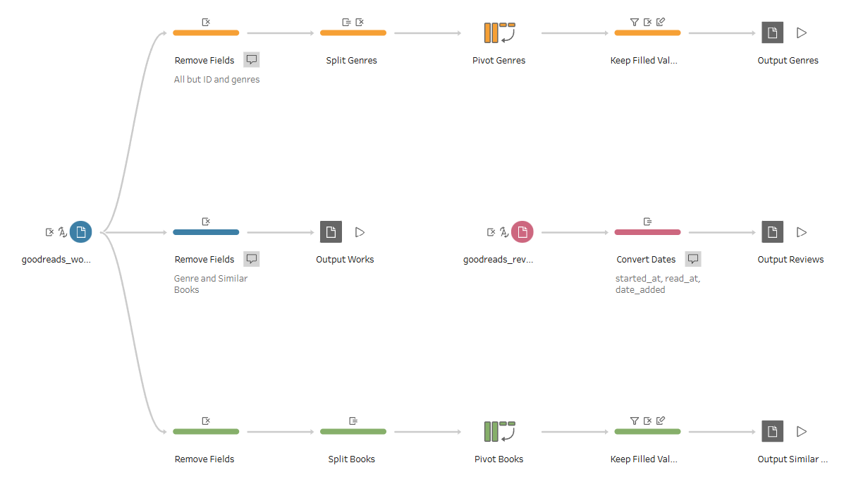
At the same time, I was looking at the data to know what fields I had to work with. Luckily there was a data dictionary provided, which made understanding each field much easier. There were two files, but some data preparation was needed to convert dates into date types and to split up some fields into multiple rows. I first did this in Alteryx to give myself some initial data to work with, but eventually converted the flow into Tableau Prep as the brief requested. This workflow creates four different Tableau extract files: works, reviews, genres, and similar books. Genres and similar books were initially fields in the works table, but were multiple values separated by commas. So I decided to split them off into different tables by splitting each value into rows and letting it be related in Tableau through each book's work ID.
Now that everything was in place, I could begin to make the dashboard itself. Making the bump chart was simple enough, and the half-donut chart too with a little tinkering. The issue started to show up when I couldn't easily get the half-donut chart be displayed horizontally rather than vertically. If I had more time, I would have liked to have figured it out since I think it looks better flat rather than on its side. Also choosing what metrics to show was another problem since the ones I initially thought about ended up looking too similar, so I changed things there as well.
I used figma to design some of the more custom elements of this dashboard. The book spines for the half-donut charts and the book stack on the left pane were both designed in there. I think it was good experience for me to use that kind of tool, which I something I consider to be on my weaker side. A little more polish could be done there as well, such as with the texturing of the books and the colors chosen, but I think it's good enough for the time I had to work within.
But in the end, I was able to make the dashboard in time and present it successfully. We had more of an audience for this project compared to the others, but the experience I had throughout the rest of my training really helped with getting it done. And with this done, now it's time to get ready for my placements!
