


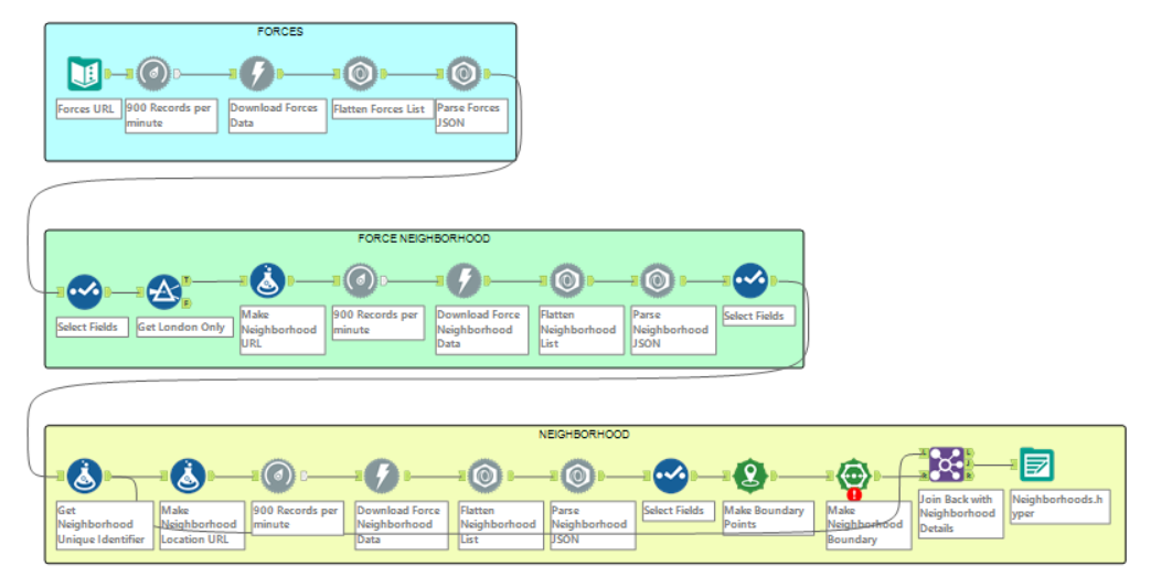
Now onto our third day of Dashboard week, we've been assigned a brief relating to using UK Crime data. The challenge with today's brief is the use of spatial data and APIs in Alteryx. We needed to use four different API calls to retrieve the data that we would use to make the dashboard. These were relating to:
- UK Police Force
- UK Police Force Neighborhoods
- Neighborhood Outline
- UK Crimes at a Location
We used Alteryx to pull the data from the UK Police API. An issue that we ran into early was the rate limit of the API. You are limited to 15 requests per second, but Alteryx doesn't have the granularity to be able to limit the request to this amount. A few solutions were tried: the Throttle tool, the Download tool's built in throttle configuration, and even an iterative macro. In the end, the built in throttle and simply waiting at a sub-optimal request rate provided the data that we needed for the dashboard.
There were even more issues when trying to get the details about the crimes happening in each neighborhood. Trying to get by location didn't work since you had to specify a specific spot, and getting it at a street-level was also difficult to work with due to the
The brief wants to have functionality using Tableau's spatial fields and maps, so that was given consideration when the sketch was made. I started again by making a user story based on police chief and the fields provided by the crimes data. I also looked at what publicly available dashboards there were using this same data for inspiration. This led to the sketch that focused on interaction and exploration using the data. Alteryx has nice functionality with spatial data, so the spatial data was processed there, while in Tableau is where functionality like map layers was used. I would have been nice to try and apply some more Tableau spatial functionality to the maps, but I was restricted by time.
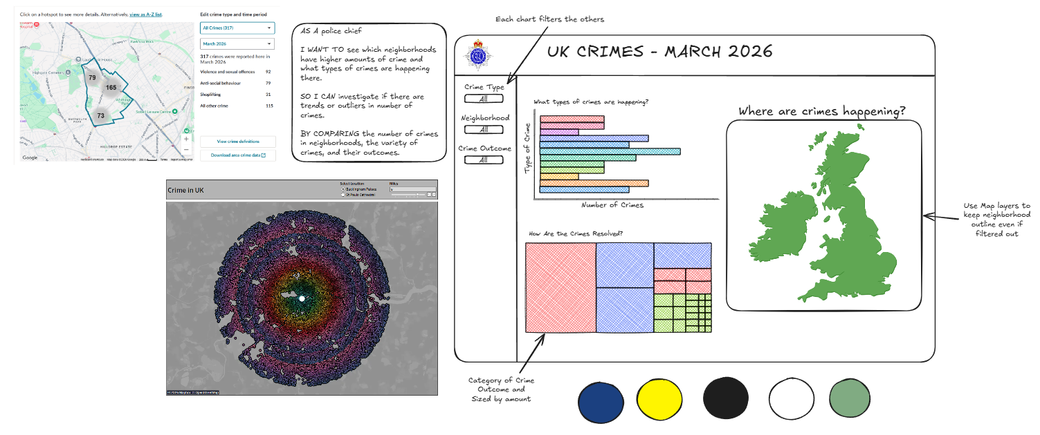
I had the sketch made and after spending more time on the data preparation and cleaning I was able to make the dashboard. The data was slow to load, so I made a different workflow to add a field for each crime for which neighborhood they were located in. This let me use a relationship rather than a join, which sped up the dashboard dramatically. So I made a simple dashboard based on my sketch in time, with some few tweaks to make it look good. And now onto the final day!
