Have you ever faced challenges in positioning your charts in Tableau as per your desired layout? I can certainly relate to that struggle, and I used to assume that using floating charts was the only solution for good design, which is not true. Floating charts and elements offer ease and speed in design, but there is always the risk of losing or misplacing charts when adding elements to your dashboard or sharing files with others.
Fortunately, this week at The Data School, we delved into the concept of containers, and I must say, I am truly impressed. Containers are a simple yet powerful tool that can greatly enhance your dashboard development experience. They provide a way to organize and structure your visualizations within Tableau.
In this blog post, I aim to share the basics of containers so new users to Tableau can easily grasp how they function. By understanding the fundamentals of containers, you'll be equipped with a valuable technique to effectively arrange your charts and optimize your dashboard's visual appeal.
Containers in Tableau serve the crucial purpose of grouping charts and related elements together in a tiled layout. By placing them in a container, you ensure that they remain connected and can be repositioned without disrupting their internal arrangement.
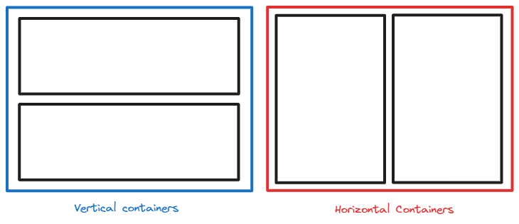
To help illustrate the concept, we will use sketches for how containers can be used in Tableau. As shown in the figure below, the dotted black box represents the dashboard itself, the blue box represents a vertical container, the red box represents a horizontal container, and the black box symbolizes a chart or element.

Vertical containers enable the vertical stacking of charts or elements, while horizontal containers facilitate horizontal stacking, as demonstrated in the figure below.
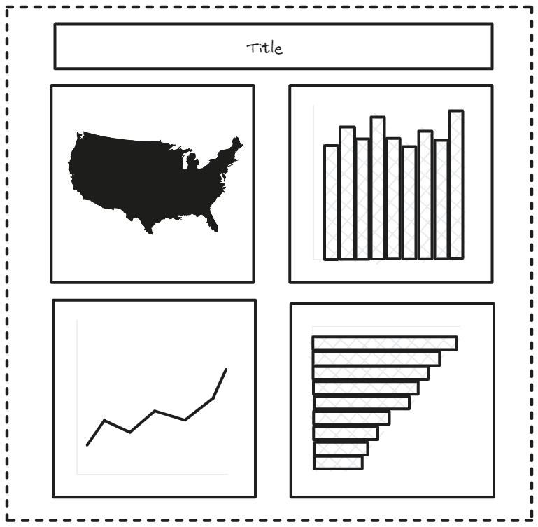
For instance, suppose we aim to construct a dashboard incorporating the charts and elements presented below. To achieve a cohesive layout, we can employ containers to group them together effectively.
Let's start the process.
Step 1: To begin, let's drag a vertical container onto the dashboard canvas.

Step 2: Next, we can drag the title and place it within the vertical container.
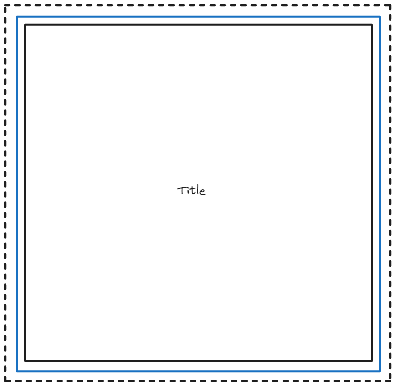
Step 3: Now, take the horizontal container and drag it inside the vertical container.
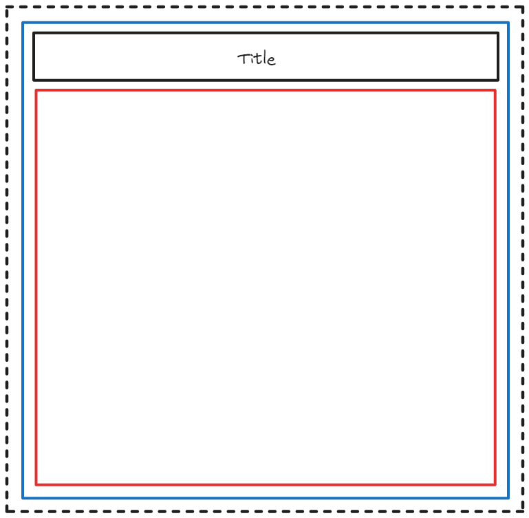
Step 4: Let's drag in another horizontal container and position it within the vertical container.
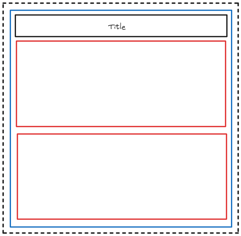
Step 5: Now, sequentially drag the map and column chart into the top horizontal container, ensuring they are stacked horizontally.
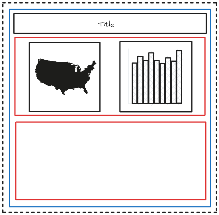
Step 6: Proceeding to the next step, drag the line chart and bar chart, one by one, into the bottom horizontal container, ensuring they are stacked horizontally within it.
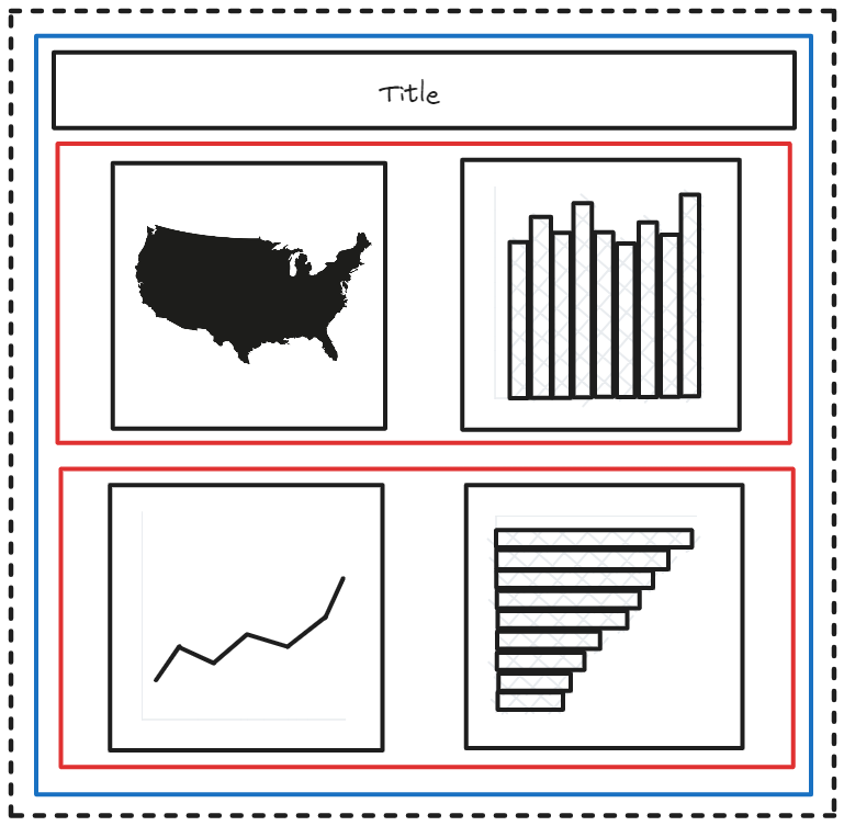
By following this process, we have successfully contained the map and column chart within the top horizontal container, while the line chart and bar chart reside within the bottom horizontal container. All three elements—the two horizontal containers and the title—are grouped together within a single vertical container.
I believe that these illustrations provided you with the concept of how containers work in Tableau. However, to truly grasp the utility of containers, I encourage you to practice using real examples in Tableau.
For further readings and expanding your concept on containers, I recommend exploring the following blogs written by other Consultants at The Information Lab.
Containers 101: Horizontal and Vertical Containers
