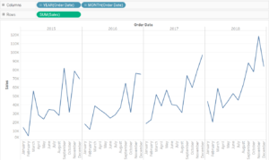
Cycle plots are great for comparing date values over time. Take this chart for example:

If we wanted to compare how each month performed in terms of sales over the last 4 years, this would be difficult to do with this kind of line chart. We would have to find the month data point, for example September, in each of the 4 line charts and then compare its value with the value from another year.
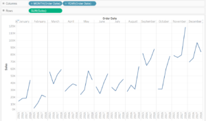
The cycle plot makes it a lot easier for you!
Just change the order of the month and year dimensions by dragging the month before the year.  Now you have created a nice cycle plot which helps you to analyze the development of sales for the respective month over the years.
