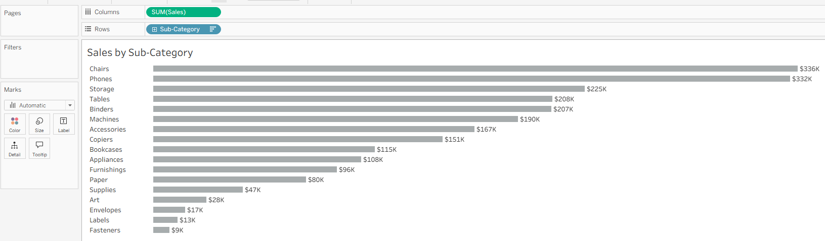
One of the main goals of data visualization is reducing time to insight. A cleaner look helps the viewer focus on what the charts are showing and avoids unnecessary cognitive load.
These quick formatting adjustments will give your chart a more impactful look.
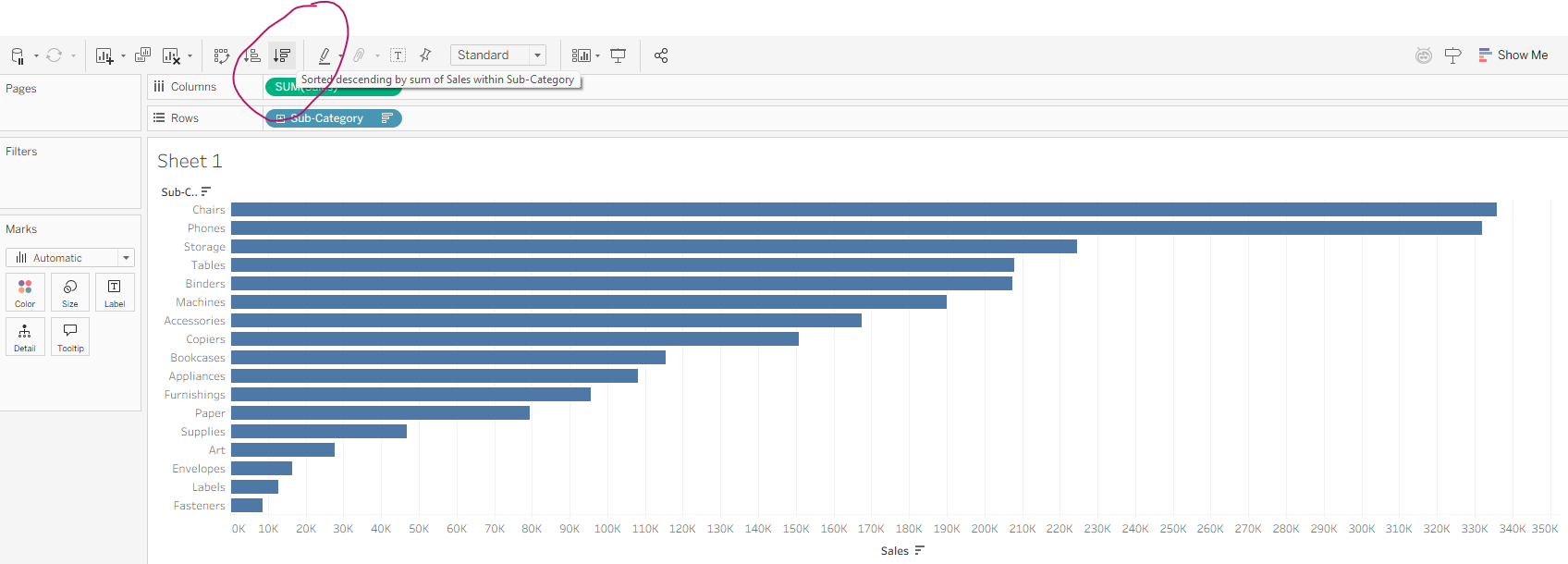
Sort
First, always sort your charts. This makes it much easier to see best and worst performers.
Labels
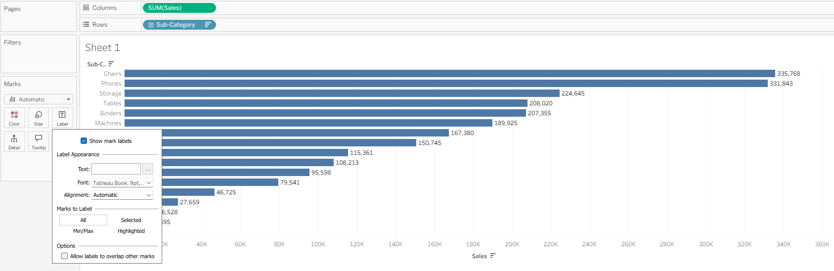
Clean up the labels. In a bar chart like this it can be useful to display sales numbers directly next to the bars.
Go to Marks card → click on Label → tick Show mark Labels
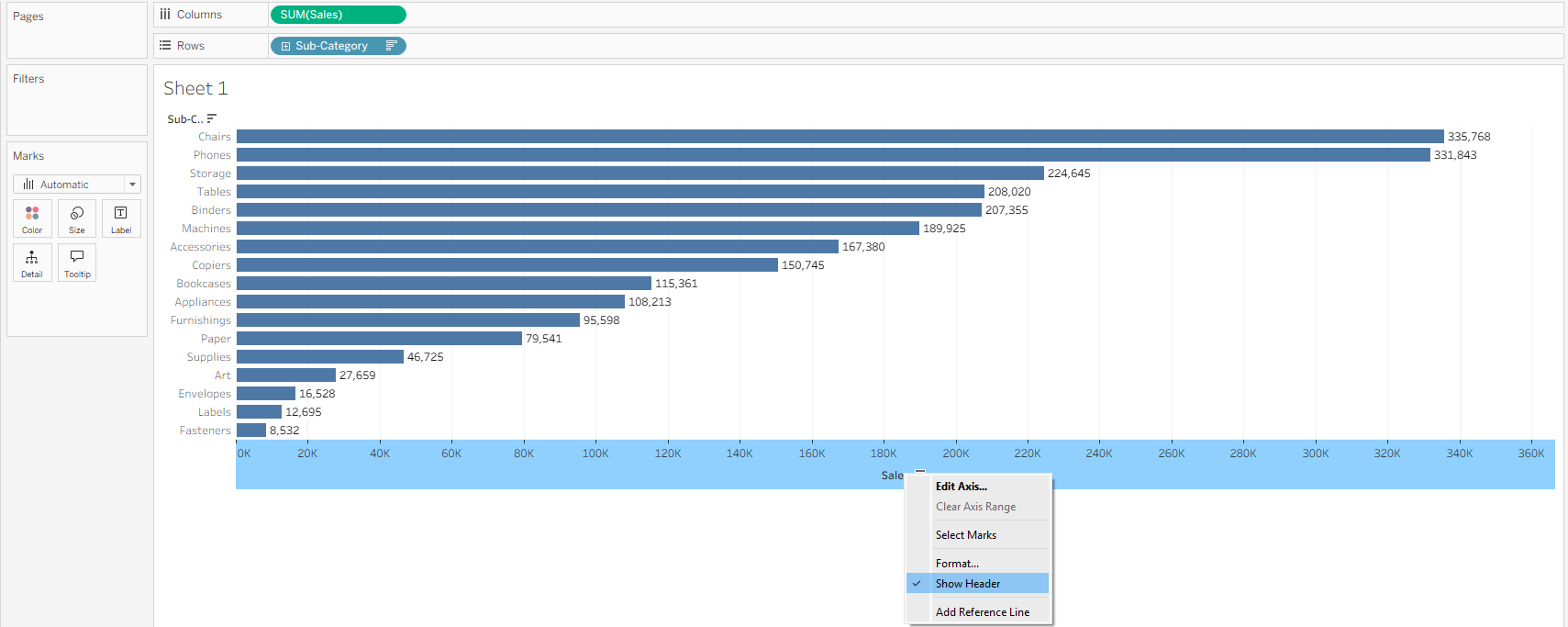
To avoid double-encoding (displaying the same information twice)
Right-click the x-axis → untick Show Header
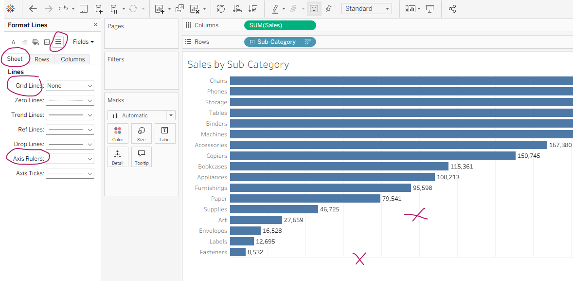
Lines
Remove unnecessary visual noise. In this chart grid lines and axis rulers don’t add value and distract from the data.
Right-click on the chart → in the pop-up menu select Format
In the Format Pane → select Format Lines and Sheet Tab
Grid Lines → select None (if it’s already selected, do it again to remove all)
Axis Rulers → select None
Text
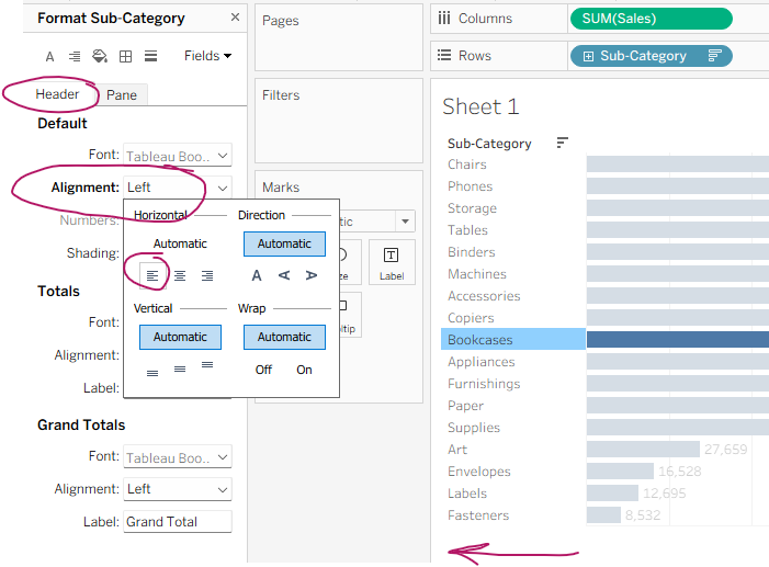
To improve legibility drag the left side of the bars to the right to allow for more space for Subcategory names, then align left.
Right-click on the row headers → select Format
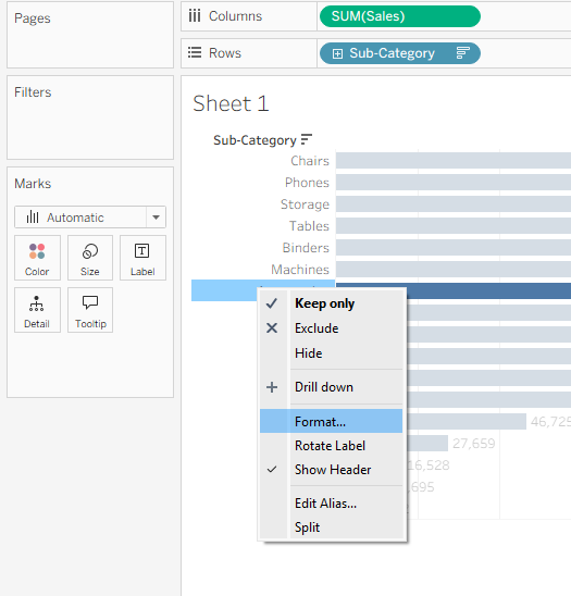
In the Formatting Pane select Header → Alignment → Left.
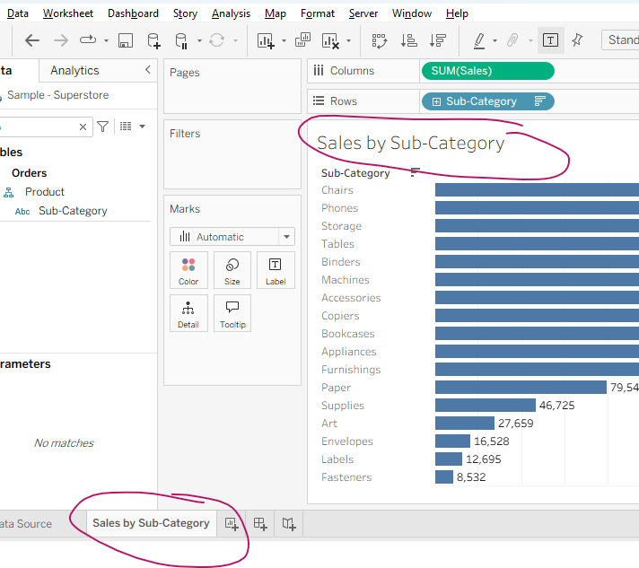
Title
Make naming your worksheet a habit, it will save time later when deciding which sheet to add to your dashboard.
Double-click on the worksheet tab at the bottom of the canvas and start typing. It will automatically update the title on the canvas.
Use clear, descriptive titles.
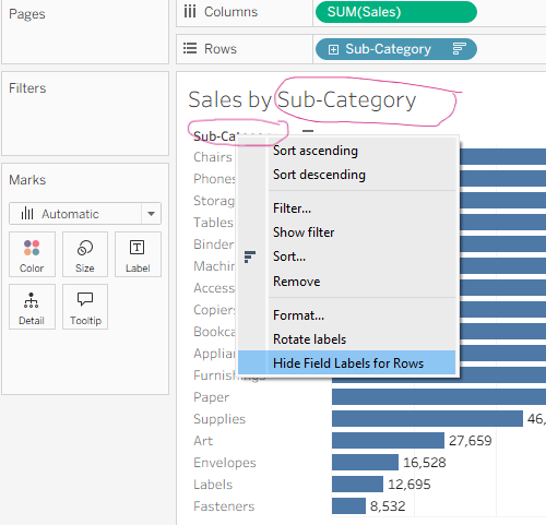
Once a descriptive title is present, you can safely hide the row header to avoid redundancy.
Right-click the field label (e.g., Sub-Category) → Hide Field Labels for Rows
Fonts
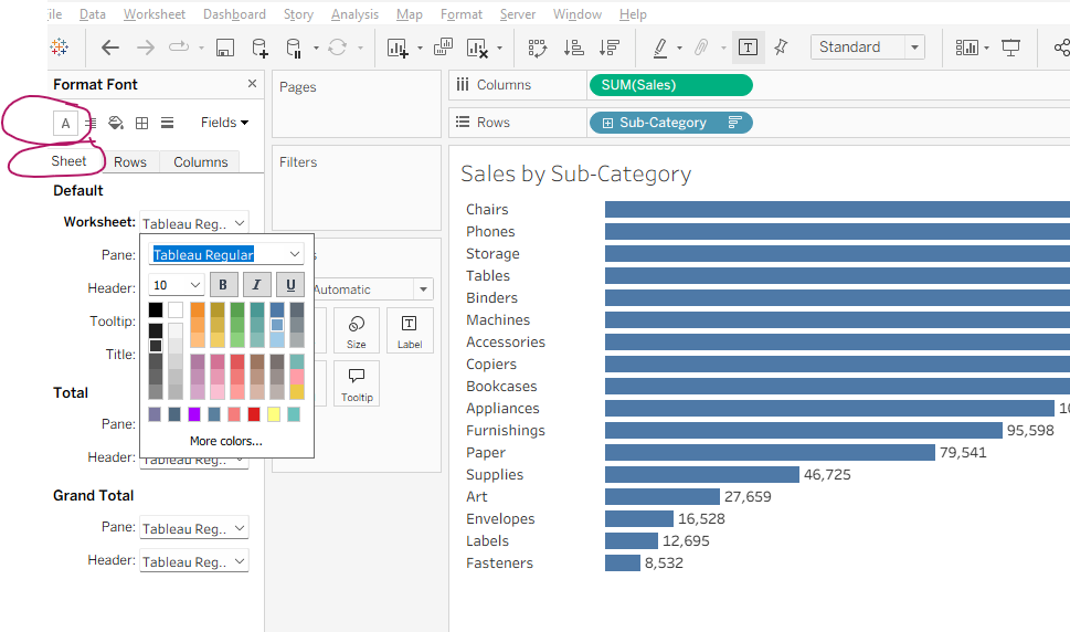
To ensure consistent rendering of your dashboard use one of Tableau built-in fonts.
Keep the minimum body text at size 10, larger size for titles.
Ensure the hue of the font is the same across your dashboard.
Avoid using more than 2–3 font styles per dashboard.
Right-click on the canvas → Format
Format Font → Sheet → Worksheet Pane, Worksheet Title
Color and Size
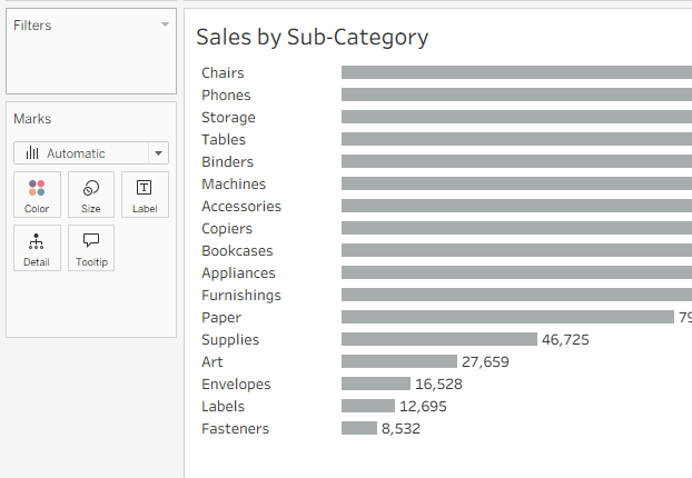
Color is a strong visual cue. Unless you want to draw attention to a specific element, use neutral colors for your charts, like grey in this example.
You can also adjust bar thickness to create more breathing room between bars.
Both color and size settings can be accessed from the Marks card.
Values
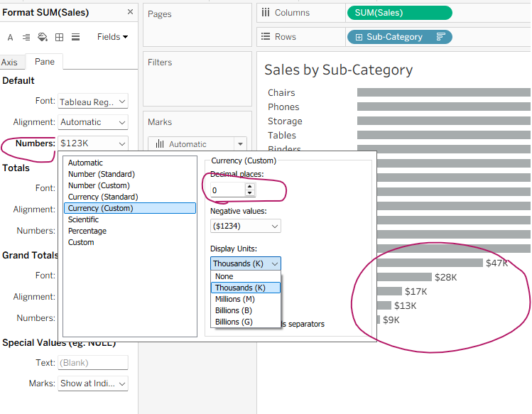
Format numbers to make them easier to read at a glance.
Right-click on the Sales pill in the Columns shelf → Format
Format pane → Pane tab
Numbers drop-down → Currency(Custom).
Round large numbers to 0 decimal places and select display units (e.g., $28K instead of $27,695).
With these steps, your chart will look polished, professional, and—most importantly—clear enough for quick insight.
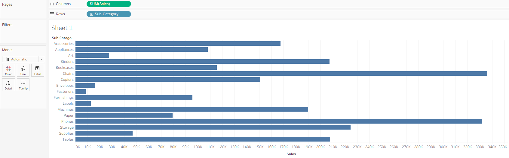
Before
After