


So today marked the first day of dashboard week where we were tasked with creating a dashboard on PowerBI using Chelsea FC Performance Insights data.
So first thing I did was create a plan to break up my day and to order my time well.
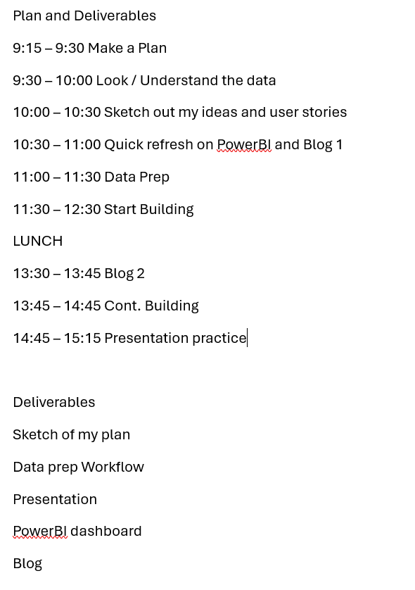
As usual however, I didn’t manage to stick to the plan. As a tip for my future self I need to be quicker assessing the data and sketching my ideas. I should also incorporate another step planning the data prep as this week I kept having to re-enter my Alteryx flow to edit the data. One last tip: ask for help.
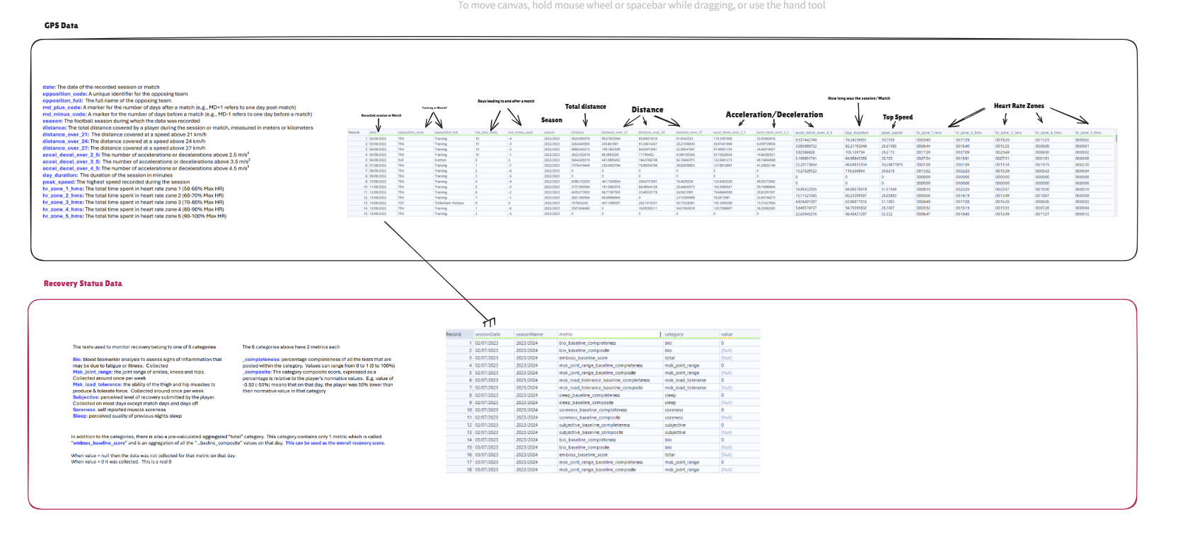
After creating a plan I dived into the data and decided to focus on GPS data and recovery data. The original idea I had was to be able to link intensity of metrics and injury data, thereby highlighting possible high risk movements. However, I abandoned that plan after some failed Alteryx attempts.
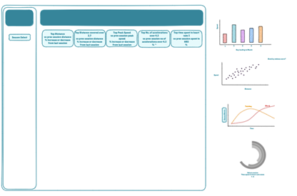
I decided to move on and created a dashboard sketch that overviewed only GPS data.
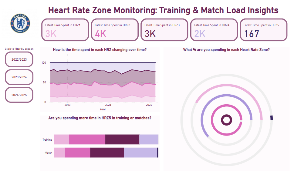
However, I decided to focus my scope even further and build a dashboard looking at Heart Rate Data. So I finally settled on this sketch:
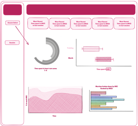
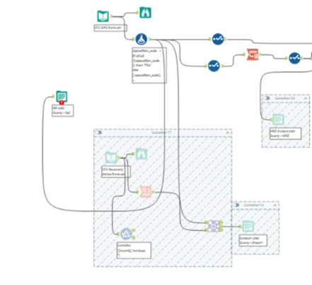
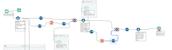
In order to create this dashboard I did some data prep in Alteryx:
- Filled in nulls with ‘training’
- Pivoted heart rate data
- Converted Time spent from HH:mm:ss to seconds
- Created total seconds per session
- Created percentage spent in each heart rate zone per session
I also created some calculations in PowerBI that returned the latest time (secs) in each Heart Rate Zone for the KPI's.
Unfortunately I didn’t manage to do everything I wanted to do – here are my next steps:
- General formatting
Need more direction on how to use dashboard
Need to format %
Specify seconds in KPI’s
Edit the navigation pane and sheets
- Include all charts
- Include filter for session
Data: https://github.com/Chelsea-Fc-Performance-Insights/Competition/tree/main/DATA