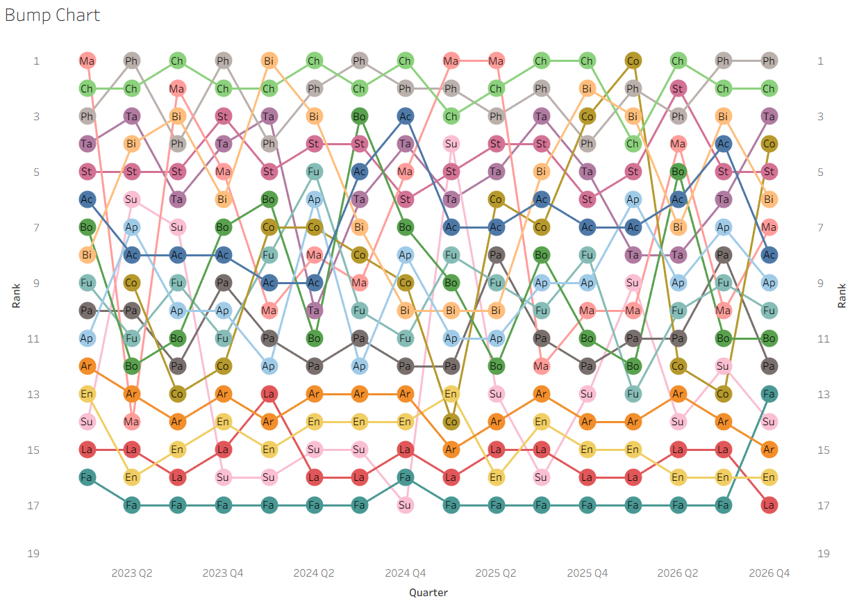
One fun and cool thing you can build with table calcs is a bump chart. Here's how!
For this walkthrough I am going to be using the Superstore dataset (clicking will download the dataset): https://public.tableau.com/app/sample-data/sample_-_superstore.xls
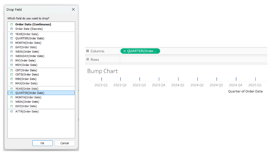
(1) To make a bump chart we combine some of the most interesting aspects of table calcs, in particular Rank. To start, we need a continuous time period so that we can track the changes to Rank over time. This is placed onto Columns:
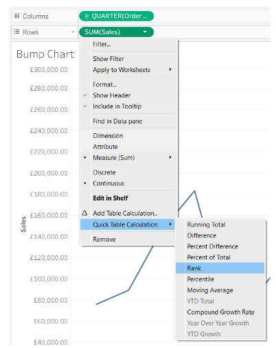
(2) Then we need to add what we will be measuring. For this example, we will be using Sales. We place this onto the Rows, right click and select Quick Table Calculation and Rank:
(3) We next add Sub-Category to Detail on the Marks card, before right clicking on Sales and Edit Table Calculations:
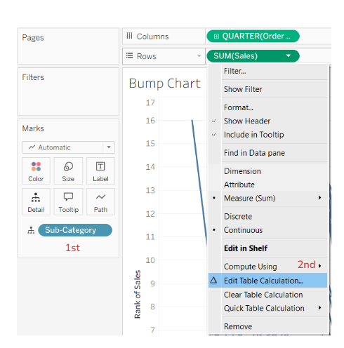
Note: Your chart will currently be a fuzzy mess of blue lines most likely. This is to be expected! Don’t worry, the magic happens soon…
(4) In the window that opened up, you then select the following.
Calculation Type
• Rank (because we want to rank our Sales by Sub-Category)
• Ascending (because we want the highest at the top)
• Unique (because we want every position to have a single Sub-Category)
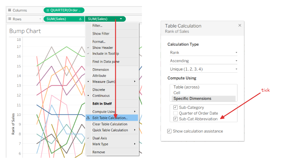
Then ensure Specific Dimensions is selected and untick Quarter of Order Date. The next click will show the magic on the page behind this menu. Tick Sub-Category…and voila!
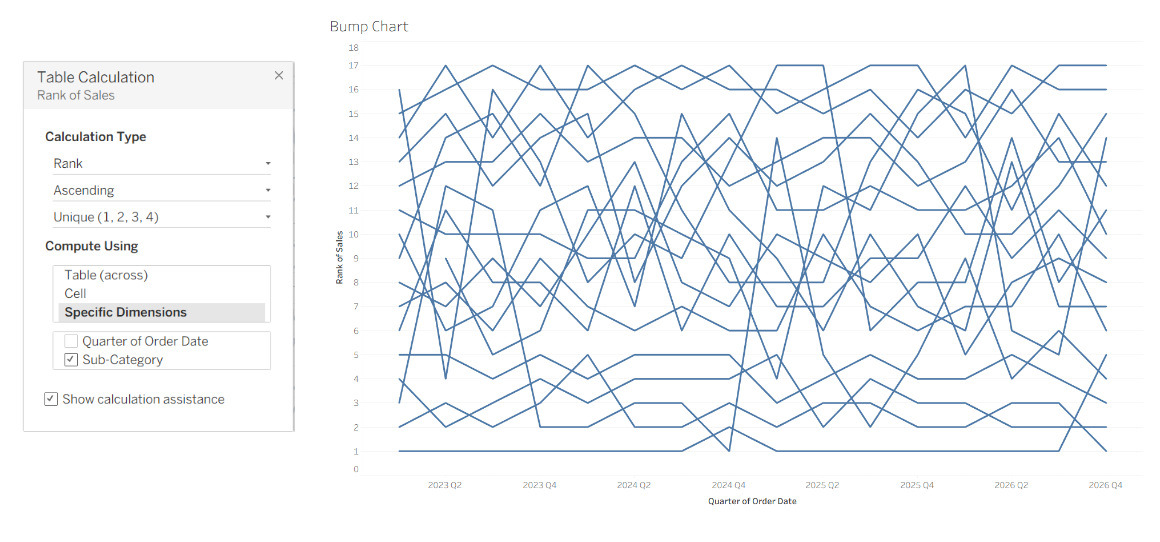
Ok, ok. We’re not quite there yet. But the main mechanics are working! We just need to make this more attractive and easier to understand.
(5) First duplicate SUM(Sales) on the Rows shelf (to do this, hold ctrl and drag the SUM(Sales) green pill next to itself - a little triangle should appear showing that this will be placed next to it):

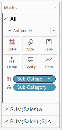
(6) And drag Sub-Category onto the Marks All card:
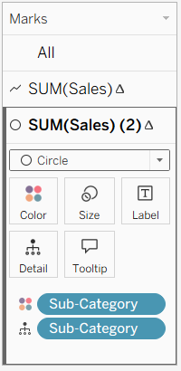
(7) Change the second Marks card to a circle:
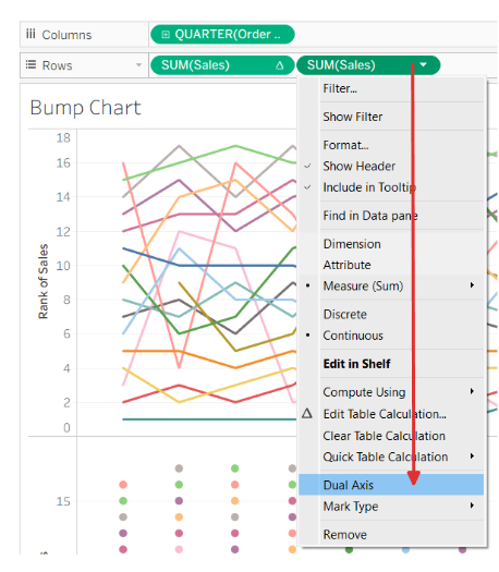
(8) Right click on the right side SUM(Sales) on Rows and make the chart Dual Axis:
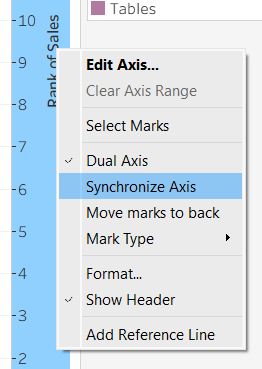
(9) Right click on the header to the right of the chart to Synchronize Axis (this makes the circles and lines match up nicely):
(10) This is your 95% complete Bump Chart!
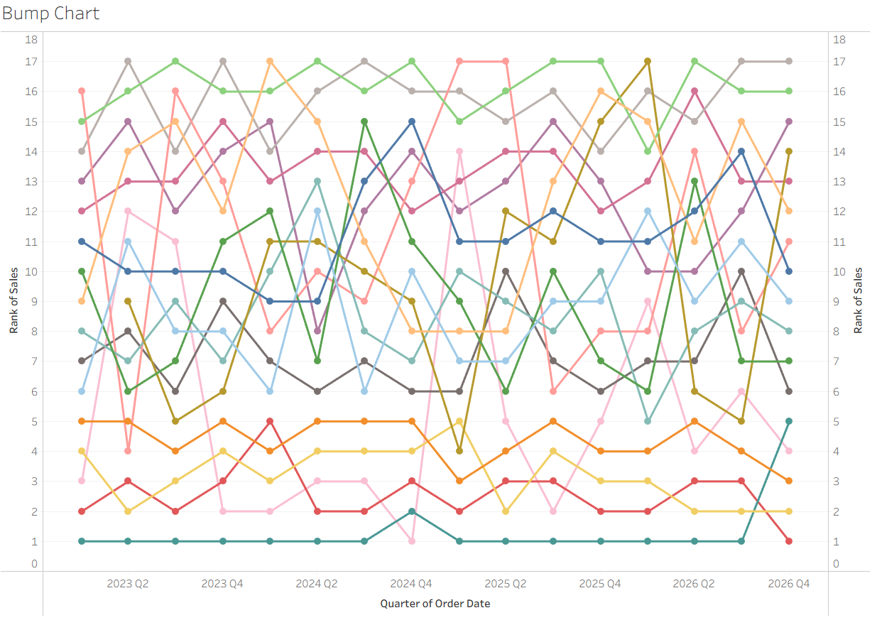
(11) If you want to go the extra step, we can go further...
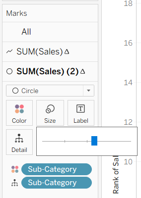
First change the size of the circle on the second Marks card:
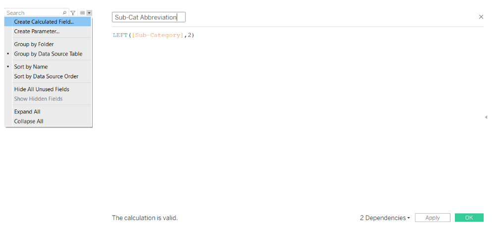
(12) Then right click on the carrot next to the search box on the left hand side of your screen and write the following calculation:
(13) Drag this onto the Circle Marks card (this will temporarily break the Bump Chart...but we will fix it!):
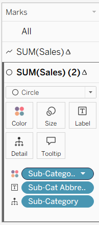
(14) Right click on the right hand SUM(Sales) again and tick the calculation we just added:
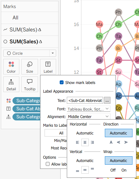
(15) Then go to the Circle Marks card again and click Label, changing the Alignment to Middle and Centre, this will place the Abbreviations nicely in the middle of our circles:
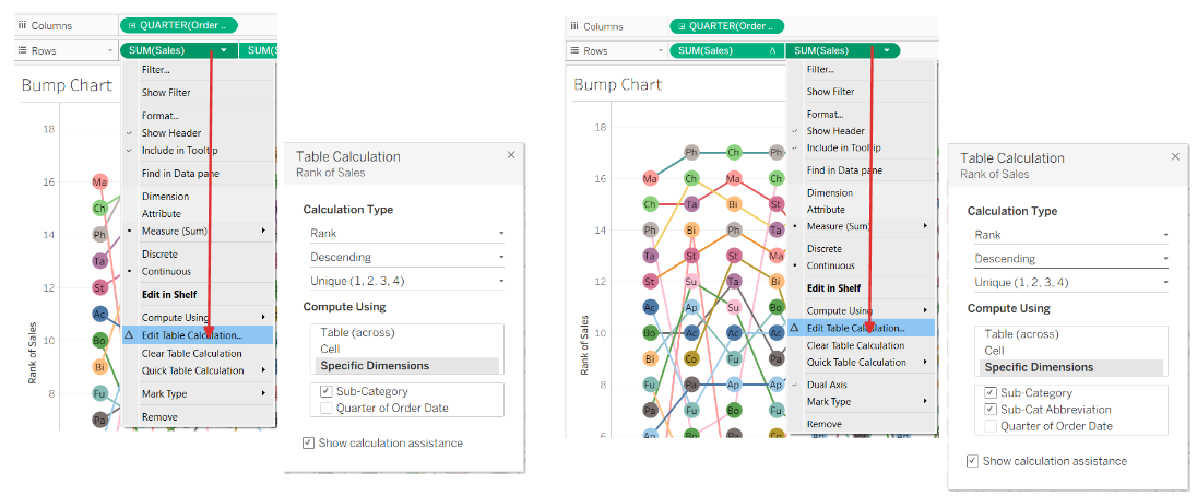
(16) At the moment we have the highest Sales at the top and the lowest sales at the bottom. However, the axis counts down rather than up. To complete this, we can edit our table calculations for each of our SUM(Sales) and change them to Descending:
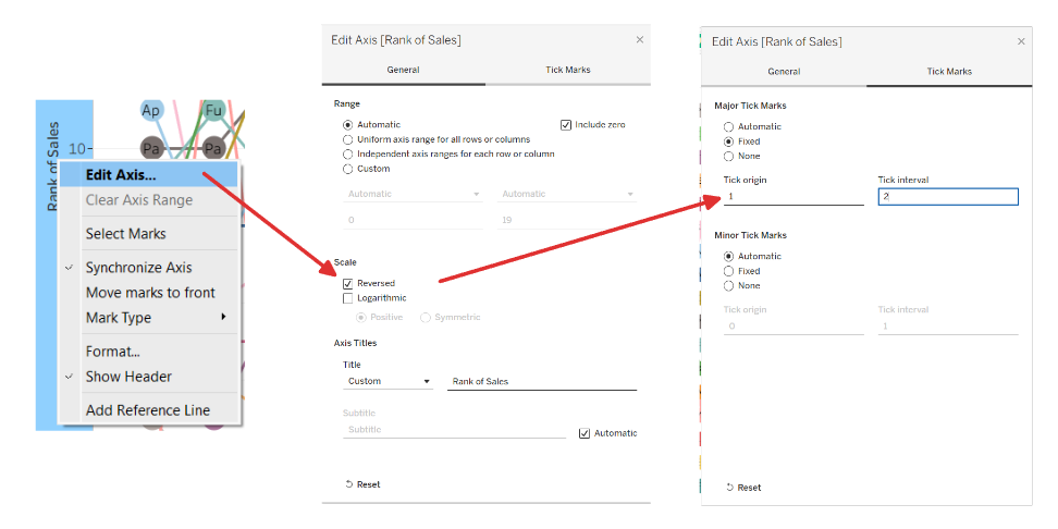
(17) We can then click on the left axis to edit, click the reversed scale and amend the Tick Marks to be Fixed from 1 and every 2 (1,3,5,7 etc). We can also do the same for the right axis.
(18) Voila!