


Padding and Rounded Corners
Hello there!
Why Padding??
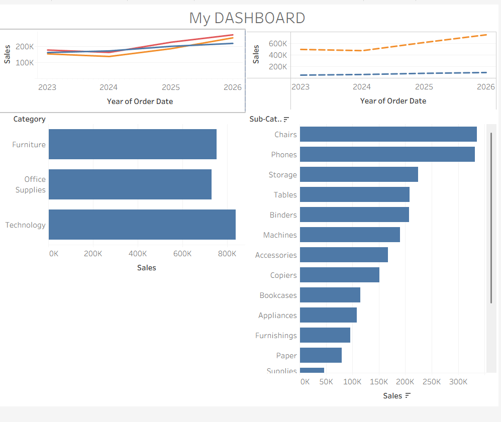
Padding allows our dashboards to breathe a bit. White space gives the viewer to digest the information without getting overwhelmed. Let’s look at an example of what a dashboard looks with and without padding.
Now let’s take a look at that same dashboard with some padding.
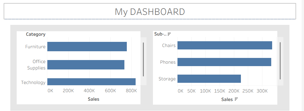
Not my best work but it sure looks a bit cleaner. Now, for the uninitiated, this would be enough, but you are not the uninitiated are you. Of course not, so let's add some pzazz to this. Rounded corners add an extra level of enhancement to your dashboard. And it’s easy to do. All you have to do is go to the same section that you went to for the padding and select the corners.
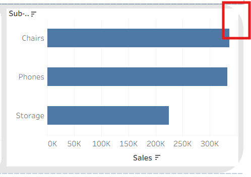
The number you put is just the angle that you want to have. The higher the number the higher the angle.
Lastly, when you round the corners you’ll realize that the corners of the chart or graph are poking out.
Image here of Pointing corners
All you have to do is add a little bit to the padding and there you go.
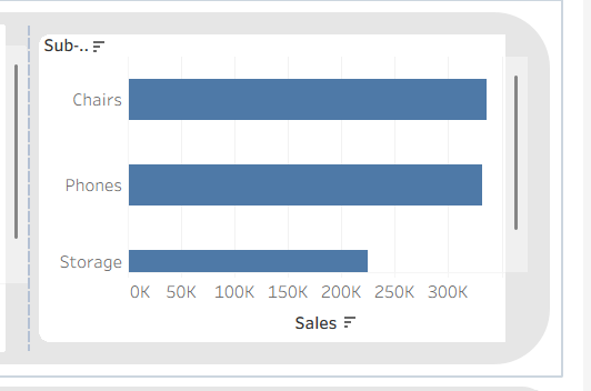
A little padding goes a long way.