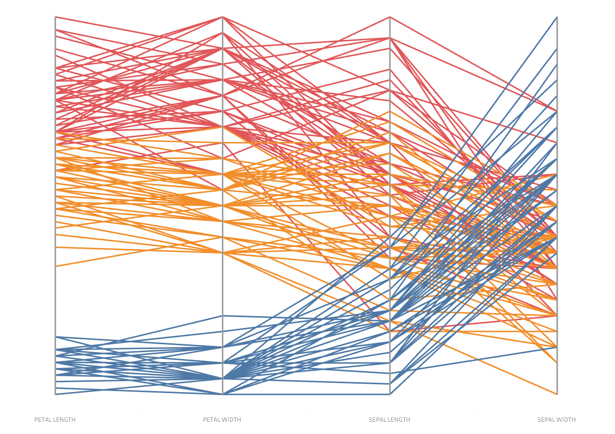
A parallel coordinates plot is a great way to compare how items rank across multiple numerical variables. Each axis is scaled from 0 to 1, where 1 represents the maximum value for that variable and 0 represents the minimum. All other data points are positioned relative to the max and min, making it easy to compare across different measures. For example, they can be used to compare sports team statistics (see Andy Kriebel’s video on ranking basketball teams by points scored, field goal percentage, and free throw percentage) or evaluate product performance (see Erica Hughes’s video on comparing food products by greenhouse gas emissions at different stages of production).
For this tutorial, we’ll use the Iris dataset, which you can find here. It contains 150 records of irises, divided into three species: Iris-setosa, Iris-versicolor, and Iris-virginica. Each flower is measured on four variables—petal length, petal width, sepal length, and sepal width. Our parallel coordinates plot will explore how these four measurements are similar or different across the three species.
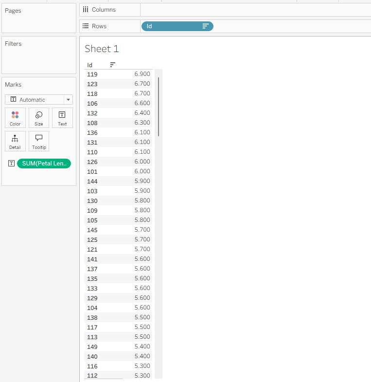
Let’s start by setting up a base table to check our core table calculation. Drag ID onto Rows, then drag our first variable—Petal Length Cm—onto Text. Finally, sort the table in descending order by petal length.
To scale the axis from 0 to 1, we’ll need a table calculation that measures how far each iris is from the minimum value for a given metric, then divides that distance by the full range of values for that metric. Let’s create a new calculated field for Petal Length Cm called PETAL LENGTH using this formula:
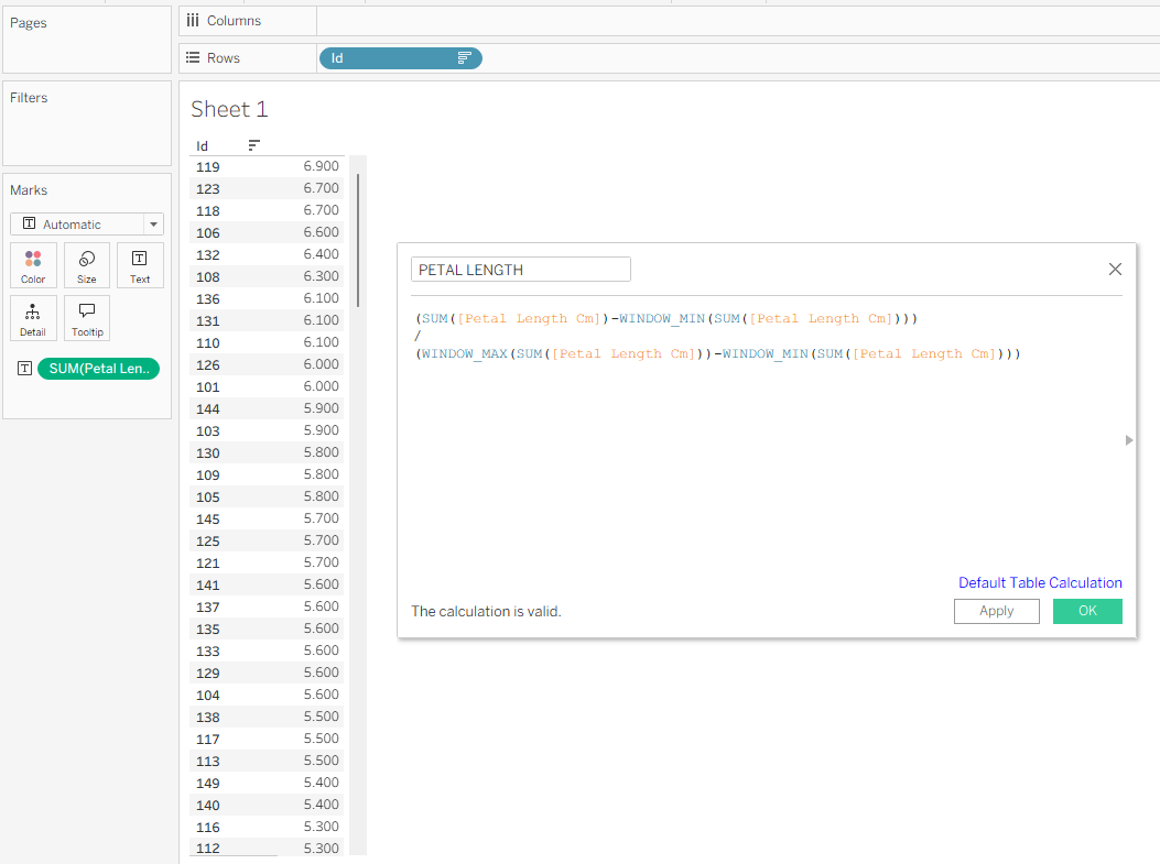
Since this is a table calculation, we need to make sure it’s computed along the correct dimension. In this case, that’s ID. To set it up, click the blue Default Table Calculation link in the calculated field dialog and under Compute Using choose ID.
Once that’s set, click OK and drag the new PETAL LENGTH calculation on top of the original Petal Length Cm measure. You’ll see the formula is working if the largest value is scaled to 1 and the smallest to 0. Next, repeat this process for the other measures. The quickest way is to duplicate the PETAL LENGTH calculated field, rename it for the next variable, and replace every instance of Petal Length Cm with the new measure. Do this for Petal Width, Sepal Length, and Sepal Width.
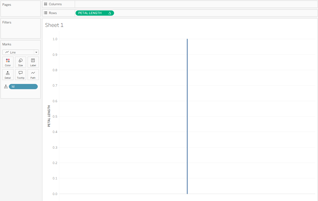
Now that the calculations are ready, we can start building the chart. Clear your sheet, then drag ID to Detail and Petal Length to Rows. You should see a single line running from 0 to 1.
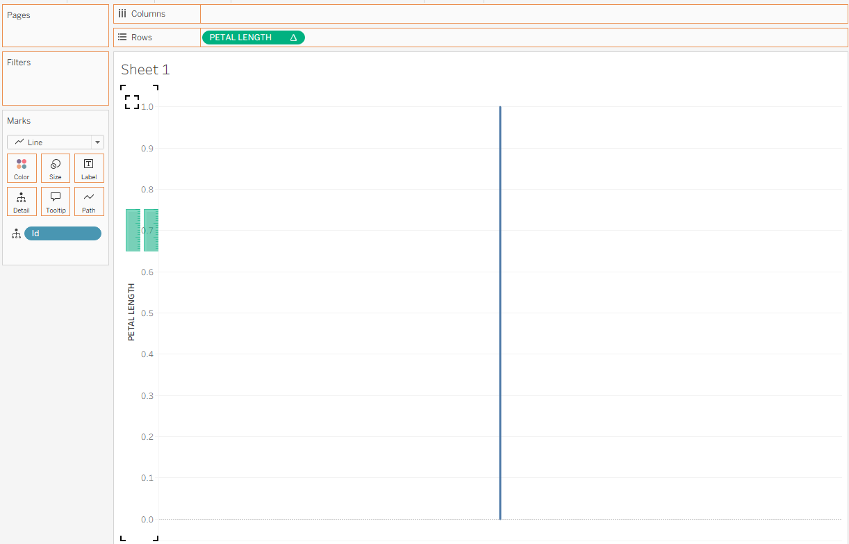
Next, drag the PETAL WIDTH field onto the PETAL LENGTH header on the sheet. You should see two parallel green lines appear, indicating that you’re creating a combined chart. Drop it onto the canvas.
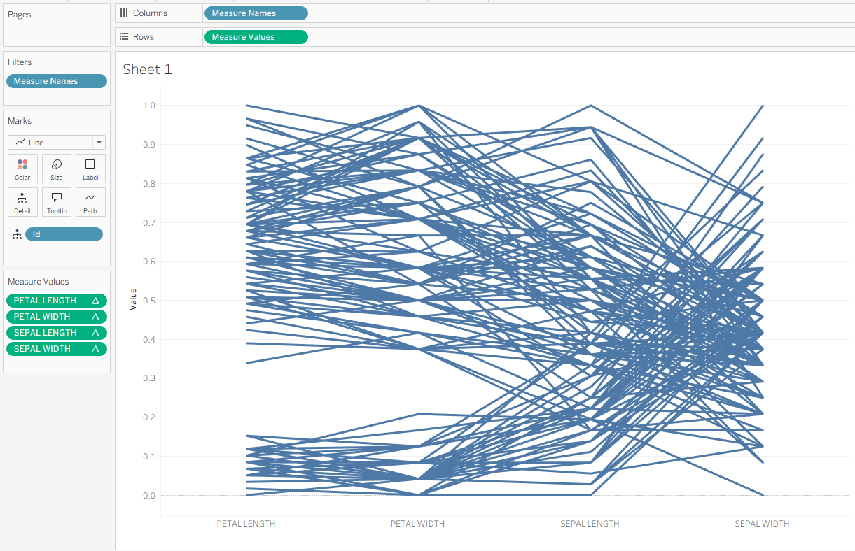
Continue bringing your variables to the canvas in the same way until you have a chart that looks like this.
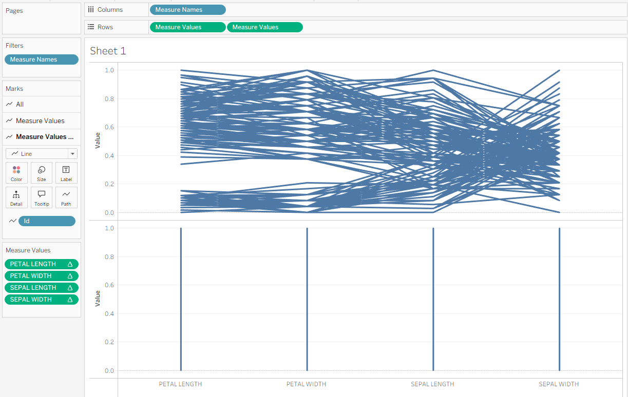
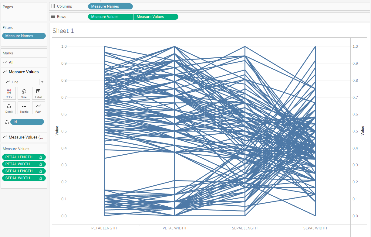
This forms the base of your parallel coordinates chart! To add visual clarity, we can draw lines connecting the values for each metric. Hold Control, then click and drag the Measure Values pill on Rows to the right to create a duplicate Measure Values (2) pill. On the Measure Values (2) Marks card, drag ID from Detail to Path. This will create one vertical line connecting the measures for each item.
Next, click the second Measure Values pill and select Dual Axis from the dropdown. This places the two charts on top of each other. Then, right-click the new axis on the right side and choose Synchronize Axis. Your chart should now appear like this.
Now let’s add some color to help highlight the patterns among the three iris species. On the All Marks card, drag Species onto Color. Your chart should now look like this.
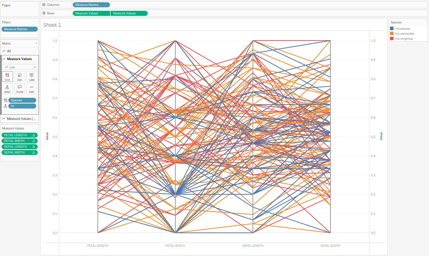
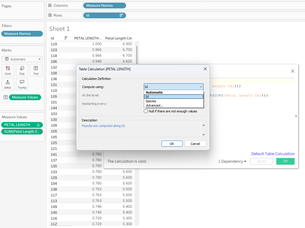
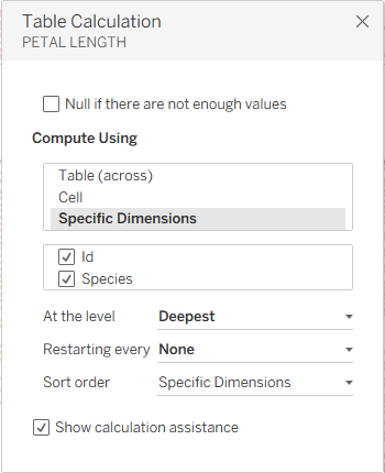
You’ll notice the lines shifted because the table calculation is restarting for each species — which we don’t want. To fix this, edit the table calculation for each measure on the Measure Values shelf by selecting Edit Table Calculation. Under Compute Using, select Specific Dimensions, then check Species (and keep ID checked). The lines should snap back into their correct positions.
You should now see a chart that looks similar to your earlier version but with three color categories representing each species. To finish up, tidy the view by renaming your variables for clarity, removing the axes on both sides of the pane, and turning off gridlines. Here’s the final result.