


For Day 3 of Dashboard Week, DS56 was tasked with building a spatial dashboard using the UK Police API. The challenge focused on combining APIs, spatial data processing in Alteryx, and interactive mapping in Tableau to create a dashboard that would allow the user to explore UK crime data.
The brief required us to work with several APIs from data.police.uk, including Forces, Neighbourhoods, Neighbourhood Boundary, and Crimes at Location. The goal was to create neighbourhood polygon boundaries, retrieve March 2026 crime data, and spatially analyse crime across the UK.
I decided to narrow my analysis to Greater London and the City of London Police areas. This reduced the volume of API calls while still providing enough data to create meaningful spatial analysis and a clear dashboard story.
Building the API Workflow in Alteryx
I began by navigating the Police API hierarchy in Alteryx, using the Forces, Neighbourhoods, and Neighbourhood Boundary endpoints to retrieve London neighbourhood data and construct polygon spatial objects from the boundary coordinates.
The most difficult part of the project was working with the crime APIs. My original plan was to use the Crimes at Location endpoint together with neighbourhood polygon coordinates to retrieve all crimes within each area. However, this introduced several technical challenges. The workflow frequently hit API rate limits, returning 429 “Too Many Requests” errors, while detailed polygon boundaries also created 414 “Request-URI Too Large” errors due to extremely long API URLs.
After experimenting with throttling requests and simplifying polygons, I ultimately decided to pivot to downloaded March 2026 street-level crime datasets instead. This provided a more stable workflow and allowed me to focus more on the spatial analysis and dashboard design.
Creating the Dashboard in Tableau
Once the crime data was loaded into Tableau, I created spatial crime points using latitude and longitude fields and combined these with the neighbourhood polygons generated in Alteryx.
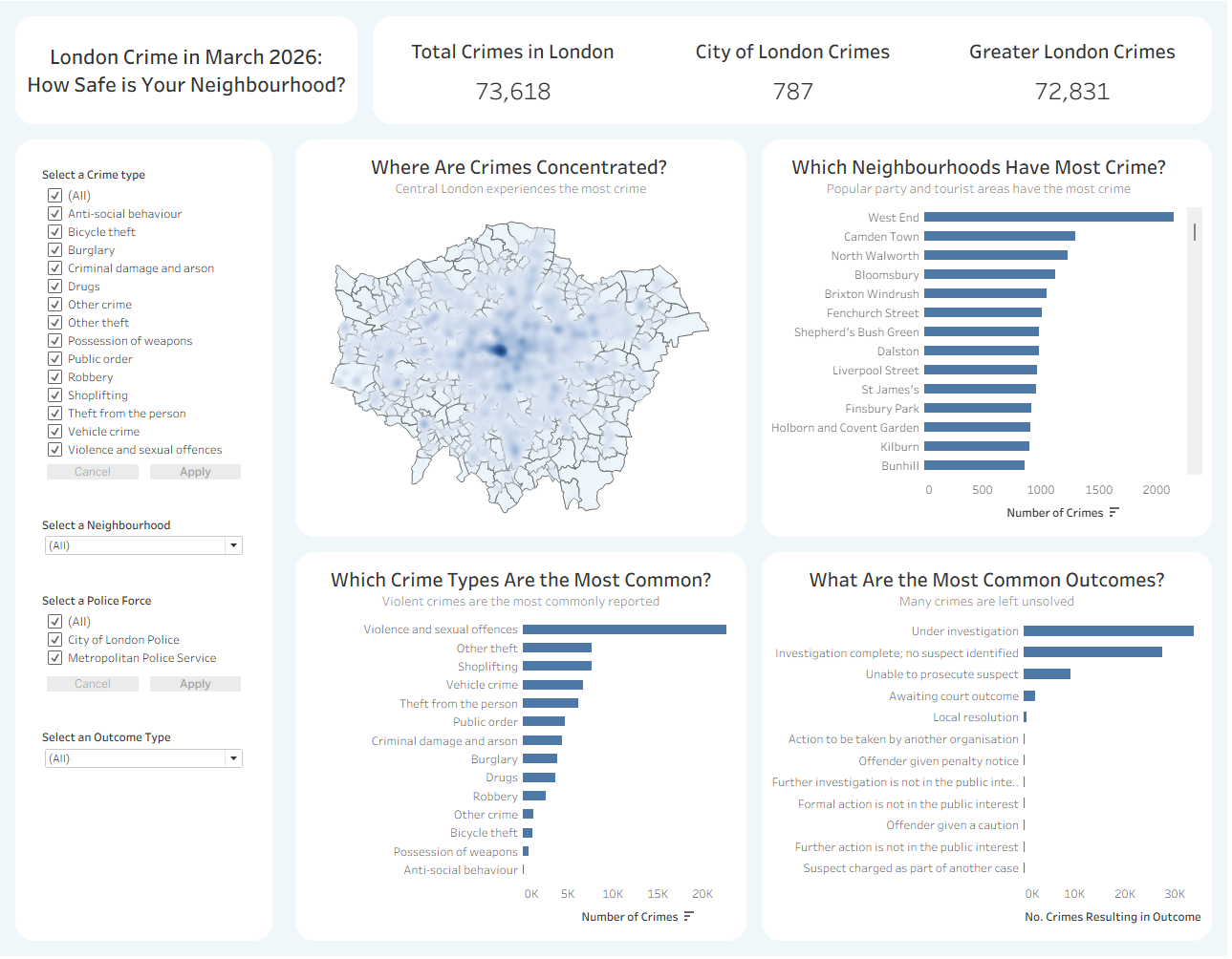
The dashboard was designed around a simple question: “How safe is your neighbourhood?”
The main map visualises crime density across London neighbourhoods, helping users identify areas with concentrated levels of crime. I chose to use density-based mapping rather than simply plotting points because the brief specifically encouraged us to move beyond basic maps.
Alongside the map, I added several supporting charts to provide additional context:
- Total crimes in London, City of London, and Greater London KPI cards
- A ranked chart showing which neighbourhoods recorded the highest crime levels
- A chart showing the most common crime types
- A chart analysing the most common crime outcomes
Interactive filters allow users to explore different crime categories, neighbourhoods, police forces, and outcome types. Selecting different crime types dramatically changes the concentration patterns on the map, making the dashboard more exploratory and interactive. This enables the user to search for their own neighbourhood and filter to the kind of crimes in their area they would like to learn more about.
Take a look below, or see it online here
Final Thoughts
Overall, despite the technical challenges, I enjoyed this task. I learned a lot about dealing with rate limiting APIs in Alteryx, and got further dashboard design practice. One more day to go in dashboard week!