


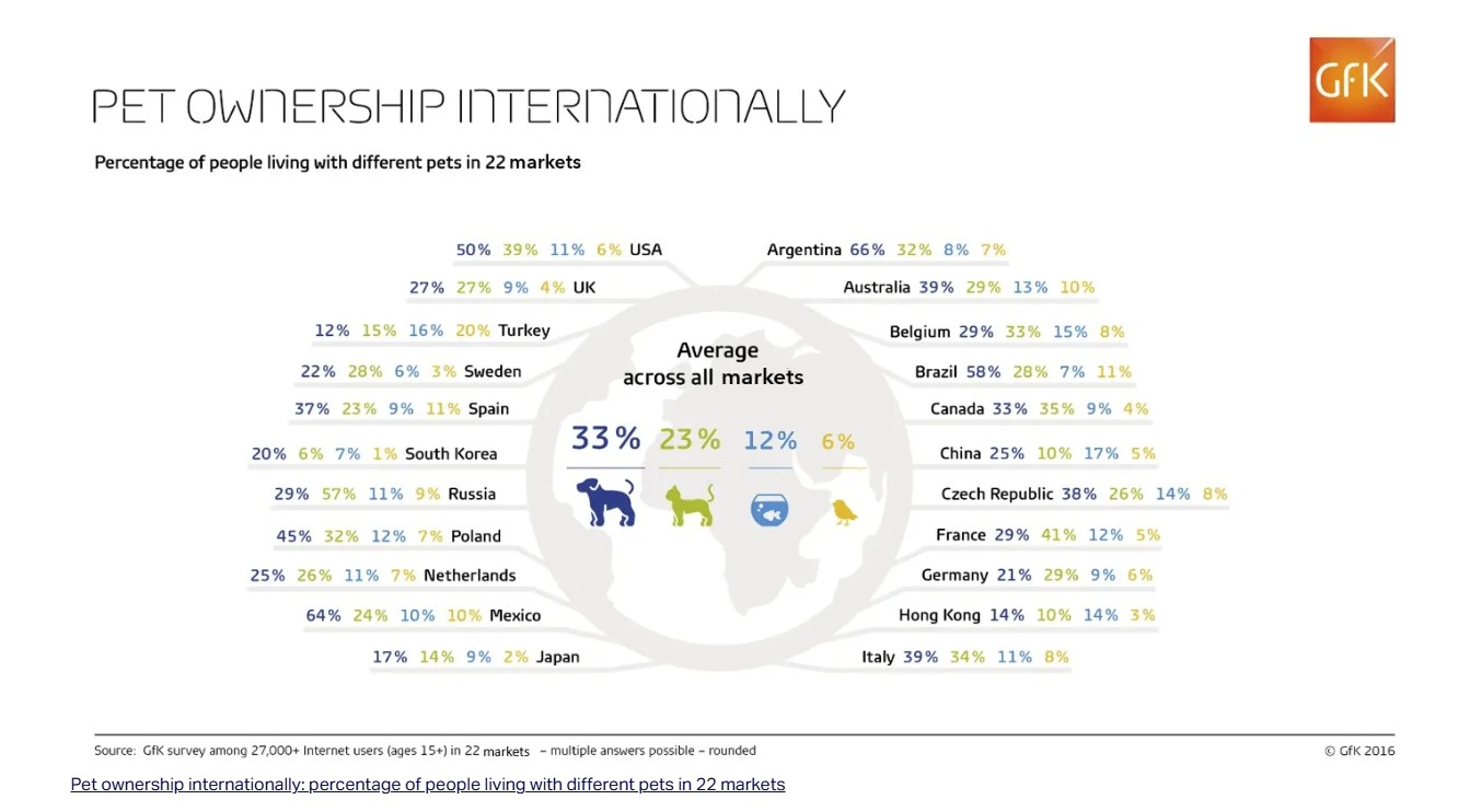
Today was Makeover Monday 2.0 about 'Pet ownership internationally'. Our task was to improve this visualization.
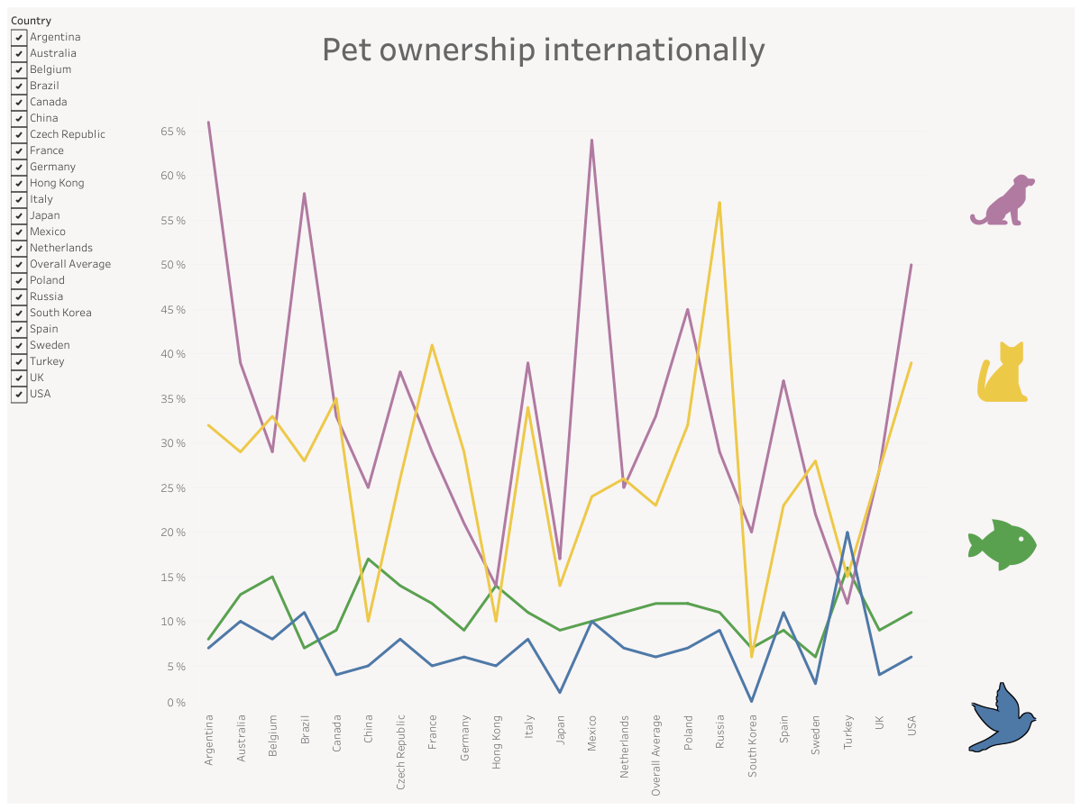
You can see my first version in the screenshot below.
What can I say about it? I didn’t use the correct type of chart and I didn’t use containers. I do like the filter and the color connection between the pet icons and the lines – but overall, it could have been much better. 😄
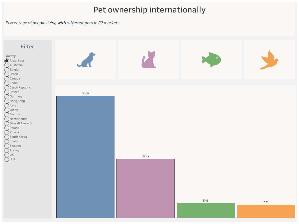
Now to my new version: I improved the chart – I’m now using a bar chart.
I also changed the type of filter: you can now click on a country and see the percentage of pet ownership in that country.
This time I used containers – for the first time! At first, I didn’t like them, it was difficult. But the more I used them, the easier it became. I actually like containers now – they make the dashboard look more professional and clean.
I’d like to say that Makeover Monday is sometimes not so easy for me – but it’s really helpful.
It gives you new challenges for your skills, helps you improve your time management, and in the long run – it’s worth it.
If you want to challenge yourself – go for it!
Thanks for reading! 😊