


What is a Radar Chart?
A radar chart, sometimes called a spider chart, is a visualization used to compare several attributes at the same time. Each attribute extends outward from the center of the chart. The farther a point is from the center, the higher that value is.
Once the points are connected, they create a shape that represents the overall profile of the subject being explored.
For this walkthrough, we will build a radar chart in Tableau using five Madden 26 quarterback attributes:
- Throw Power
- Short Throw Accuracy
- Medium Throw Accuracy
- Deep Throw Accuracy
- Speed
A quarterback with stronger ratings will extend farther toward the outside of the chart, while lower ratings will stay closer to the center. This makes it easy to see where a player is strong and where they may be weaker.
The values being compared should use the same scale. In this example, every Madden rating is measured from 0-100.
When Would You Use a Radar Chart?
Radar charts are useful when you want to compare the profile of several related metrics instead of focusing on one number. A quarterback's overall rating tells us how the player performs as a whole, but it does not tell us where that performance comes from.
Two quarterbacks can have similar overall ratings while having very different strengths. One may be stronger in Throw Power and Deep Throw Accuracy, while another performs better in Short Throw Accuracy and Speed. The shape of the radar makes those differences easier to recognize.
Outside of sports, radar charts can also be used for employee skills, product comparisons, survey results, or competitor analysis. They work best when the number of attributes stays relatively small so the chart remains easy to read.
How Does the Data Need to Be Structured?
Before we build the radar, the data needs to be in the right structure. Each player should have one row for each attribute, with the attribute names stored in one column and the ratings stored in another.
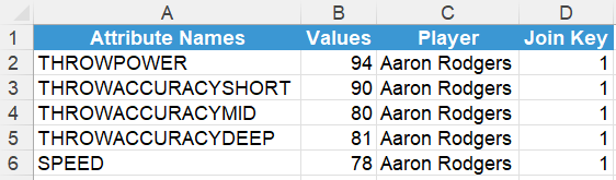
You may also notice the Join Key in the data above. We will come back to this later when we add the optional 20-100 scale.
If your data starts with each attribute in its own separate column, you may need to pivot the data in Tableau first so those attributes are brought into rows.
Once the data is in this structure, we can move on to the calculated fields.
Making Our Calculated Fields
Most of the calculations below are simply determining two things: where each attribute belongs around the radar and how far the player rating should extend from the center.
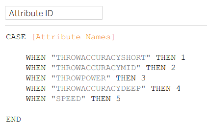
Attribute ID
First, give each attribute an ID. This controls the order that the attributes appear around the radar chart.
Attribute Angle
Next, use the Attribute ID to give each attribute its own angle. Since we are working with five attributes, the circle is divided into five equal sections.

If you change the number of attributes, this calculation will need to change to fit your shape!
Attribute Values
The Attribute Values calculation controls how far the player point extends from the center. Because the Madden ratings are measured from 0-100, we divide by 100 and work on a 0-1 scale.
This lets the outside of the radar represent a radius of 1 and keeps the remaining calculations simple.
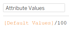
Dividing by 100 is not required. You could keep the original 0-100 ratings and use 100 as the maximum radius. Normalizing the values simply makes the remaining calculations a little easier to work with.
Player Attributes
Now we can turn the rating and angle into coordinates. Attribute X determines the horizontal position and Attribute Y determines the vertical position.
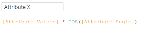

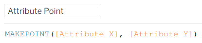
Once we have the X and Y coordinates, Attribute Point turns them into a spatial point using MAKEPOINT(). These five points will eventually connect to create the player's radar shape.
Background
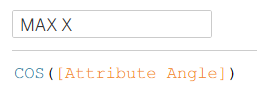
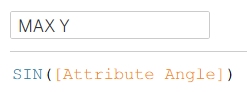
The background uses the same attribute angles, but it always extends to the maximum radius. MAX X and MAX Y create the outer coordinates for each attribute.
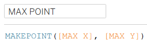
MAX POINT combines those coordinates into the five outside points that represent a score of 100.
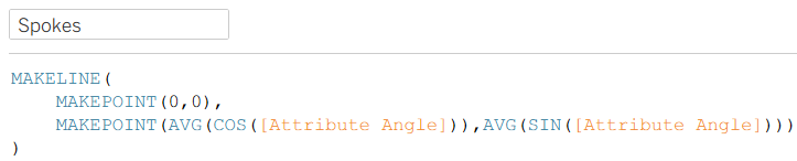
Spokes
The Spokes calculation creates the lines that extend from the center of the radar toward each attribute.
Grid Lines
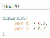
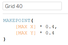
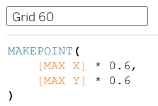
To make the radar easier to read, we can also create smaller versions of the maximum pentagon to show the value progression throughout the chart.
Grid 20
Grid 40
Grid 60
Grid 80
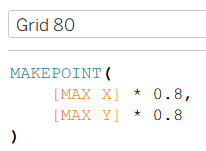
We do not need a separate Grid 100 calculation because MAX POINT already represents the outside 100 boundary.
Outer Label Points
Finally, if you want to label your attributes and ratings around the outside of the radar chart, we can make one last calculation.
The Outer Label Points calculation creates a point at the outside of each attribute axis. We will use these points later to place the Attribute Names and ratings around the chart.

Building the Radar Chart
Now that we have finished creating our calculated fields, we can move on to building the radar chart!
We will build the chart one layer at a time using Tableau Marks Layers, starting with the background and working our way toward the final visual.
Step 1: Build the Background
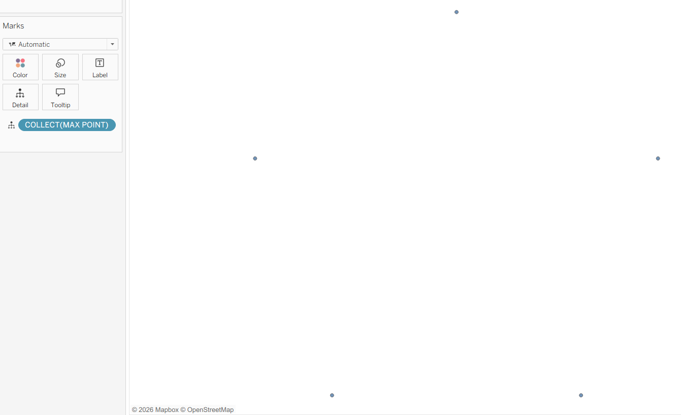
To begin, place MAX POINT on Detail. You should see five points in the view.
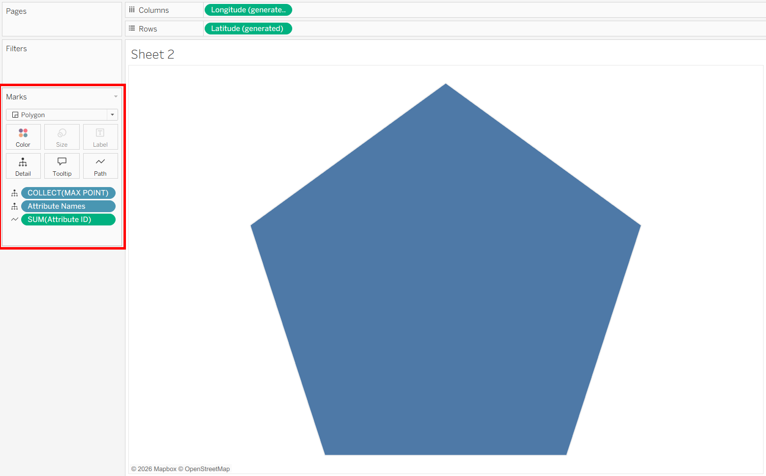
Change the Marks type from Map to Polygon. At first, the points may disappear, but don't worry, this is normal. Add Attribute Names to Detail and Attribute ID to Path. The five points should now connect to create the outside pentagon.
Step 2: Add the Player Attributes
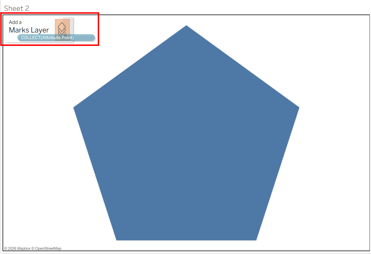
Next, drag Attribute Point onto the view and drop it on Add a Marks Layer.
Set this layer to Polygon, then add Attribute Names to Detail and Attribute ID to Path, just as we did for the background.
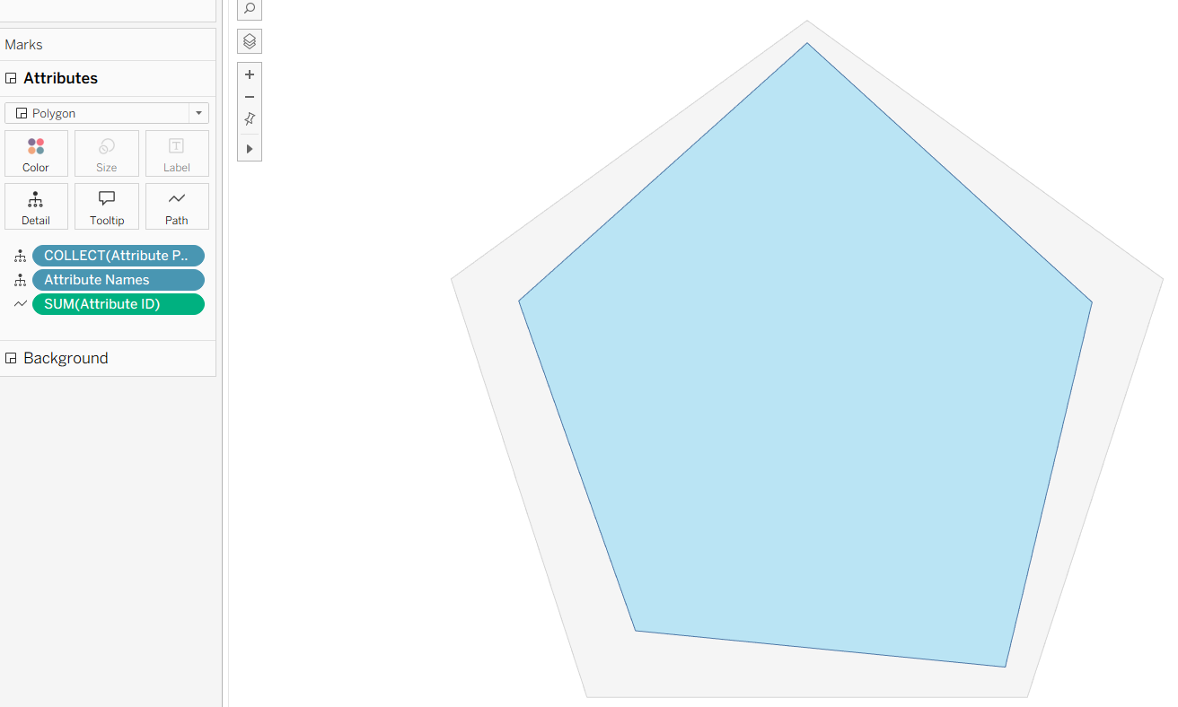
At this point, we should have the background radar with the player's attribute radar sitting on top of it.
If you cannot see both shapes clearly, change their colors in the Marks pane so they are easier to distinguish.
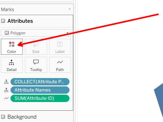
With some simple formatting, you should now have something similar to this:
Step 3: Add the Spokes
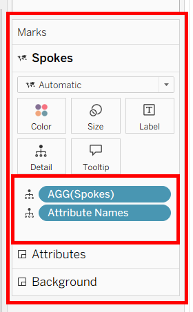
Now add Spokes as another Marks Layer and place Attribute Names on Detail. Keep the spokes light so they do not compete with the player shape.
Step 4: Add the Grid Lines
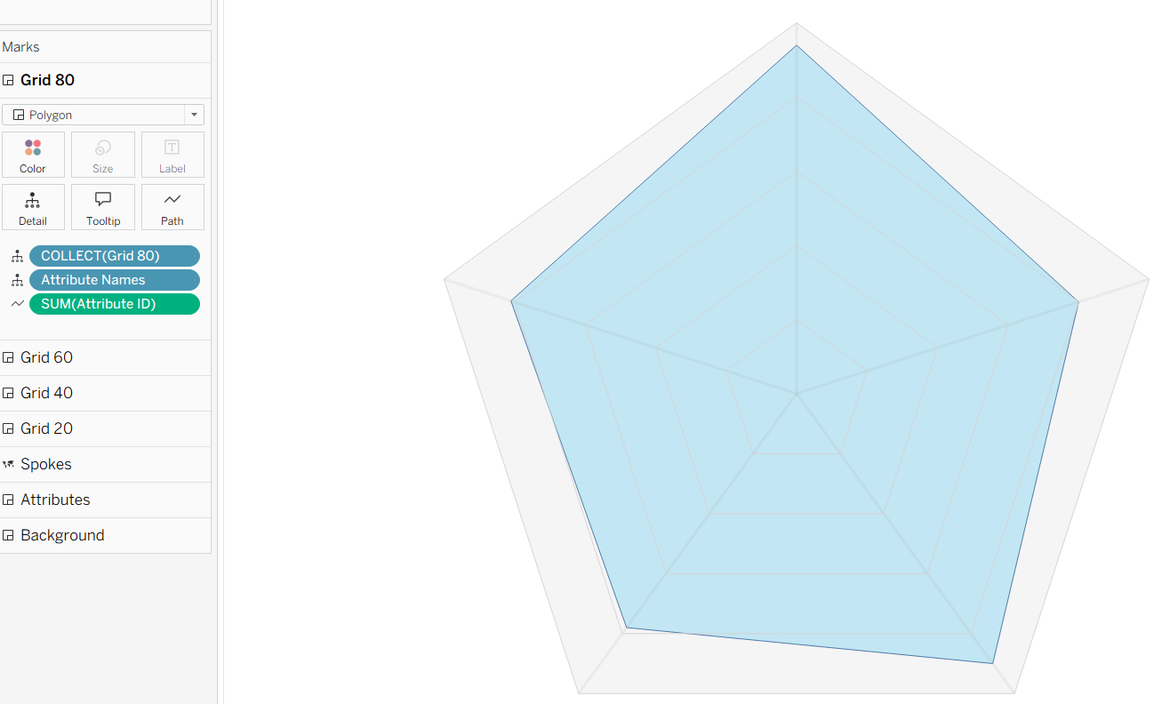
Add Grid 20, Grid 40, Grid 60, and Grid 80 as separate Marks Layers.
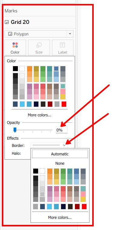
For each grid, use Polygon with Attribute Names on Detail and Attribute ID on Path.
The grid polygons may appear filled in at first. Open the Color card, set Opacity to 0%, and turn on the Border.
Repeat the same formatting for each grid layer.
If you have followed the steps so far and added each grid line, you should have something similar to this:
Step 5: Add the Attribute Labels
Now that we have created our Outer Label Points, drag the field onto the view to create another Marks Layer.
From there, place Attribute Names and Default Values onto Label. This will display each attribute name and its rating around the outside of the radar chart.
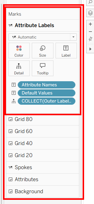
You can also shorten the aliases in the final view, such as changing THROWACCURACYMID to Mid Accuracy, to keep the chart cleaner.
Optional: Add the 20-100 Scale
Remember the Join Key we saw earlier in our original data? If you want to add the 20, 40, 60, 80, and 100 values along one of the spokes, we will need one small helper table.
The helper table contains Grid Position values from 1-10, along with the same Join Key used in our main data.
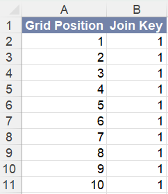
In Tableau, go to the Data Source page at the bottom of the window. We can then create a relationship between the player data and the Radar Grid table using the Join Key, as shown below.
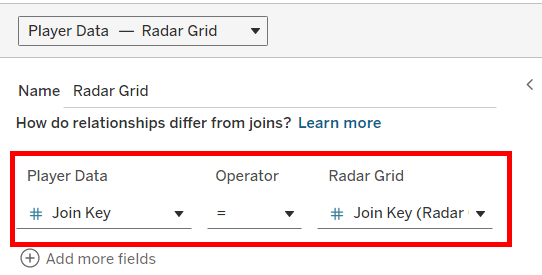
This gives us the additional positions needed to place the scale labels along the radar chart.
Now we have two additional calculations to create.
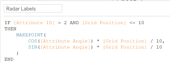
Radar Labels
The Radar Labels calculation creates points along one of our attribute spokes using the Grid Position values from 1-10.
In this example, we use Attribute ID 2 to choose the spoke where the labels will appear. Dividing Grid Position by 10 places each point between the center and the outside edge of the radar.
If you want the scale to appear along a different spoke, simply change the Attribute ID in this calculation.
Value Axis
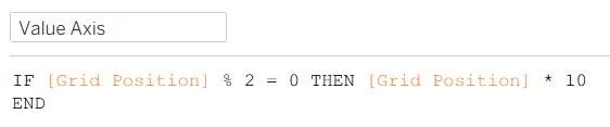
Next, the Value Axis calculation determines which of those positions should actually display a value.
By keeping only the even Grid Positions and multiplying them by 10, we create our five scale values:
20, 40, 60, 80, and 100.
If you wanted to use different intervals, you could adjust this calculation to fit your chart.
The Finishing Touches
As we have done with the other layers, drag Radar Labels onto the view to create another Marks Layer. Then place Value Axis on Label.
You may see several dots appear on the chart. That's okay. For this example, we can hide them by changing their Opacity to 0% and turning off the Border.
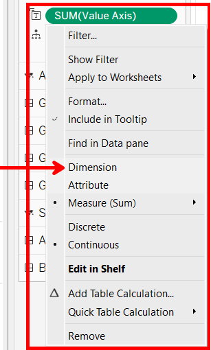
To display the scale values correctly, make sure Value Axis is set as a Dimension. You can do this by right-clicking the Value Axis pill on the Radar Labels Marks card and selecting Dimension, as shown below.
Congratulations! You Now Have a Radar Chart
After a little formatting, you should now have a complete radar chart that can update for any player in the data.
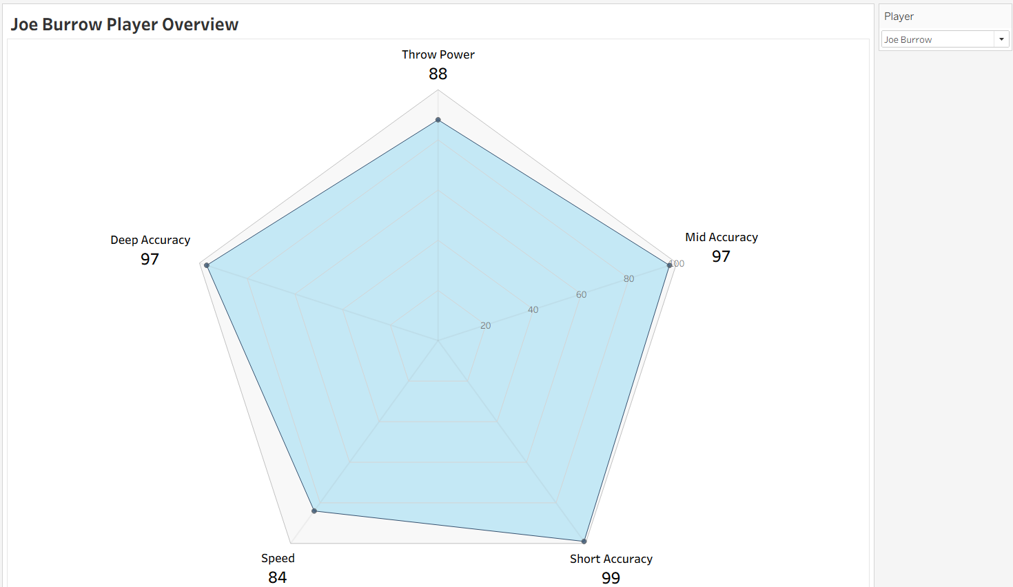
Radar charts are not a native Tableau chart type, but spatial functions and Marks Layers give us a flexible way to build one. Once the setup is in place, the same chart can be reused for different players or completely different types of data.