For our fifth and final day of dashboard week (and training), we were tasked with creating a dashboard either focused on an analyst level so exploratory and specific, or focused at c-suite executives. I went for the latter, so this entailed creating a dashboard that provides a top level overview of key, clear and actionable insights.
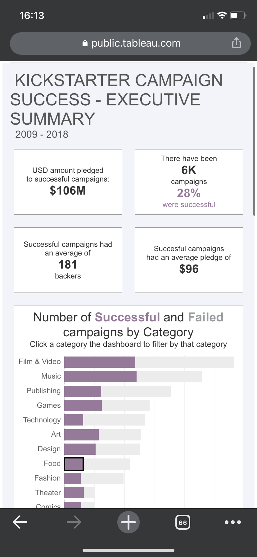
Another key requirement was multi-device functionality. The dashboards had to be optimised and fully functional on the mobile view.
The dataset we had was all about various kickstarter campaigns.
My initial list of questions to consider were:
- Proportion of projects successful
- Number of projects
- Total amount raised
- Success %
- Avg ( median) goal $
- Avg failure amount missed %
- Avg backers per project (split by success)
- Avg amount pledged
- Top categories
Another key requirement today was to fully sketch out both our views and ideas to show Jenny before we got stuck into the data. This was massively helpful as my initial idea was too much of an overview without any real point of focus. With a few pointers from Jenny, I tried to really focus on metrics of success rather than a bit more of a wishy washy overview.
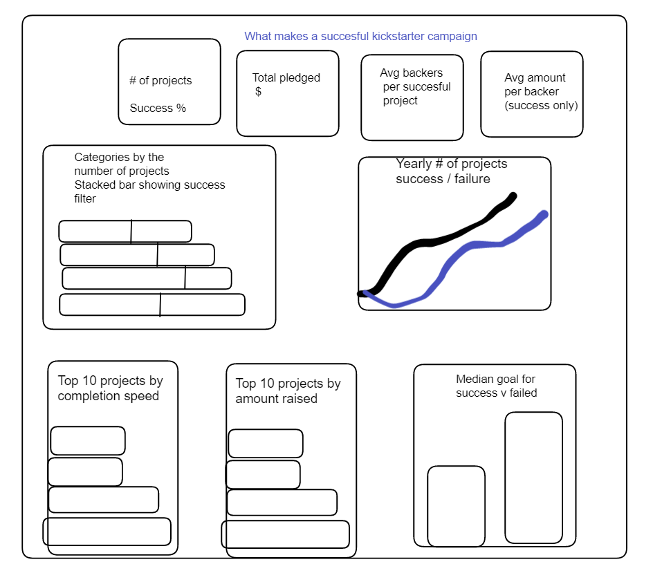
My initial sketch was like this:
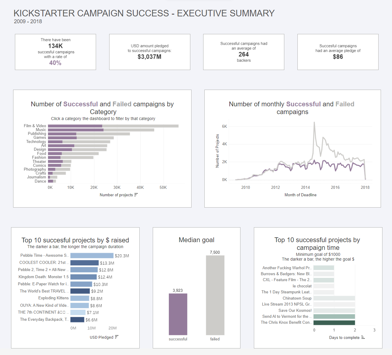
My user story was that of an executive who approves and checks up on kickstarter projects, so needs quick and easy references to top level stats, to give them more information and context before any potential meeting.
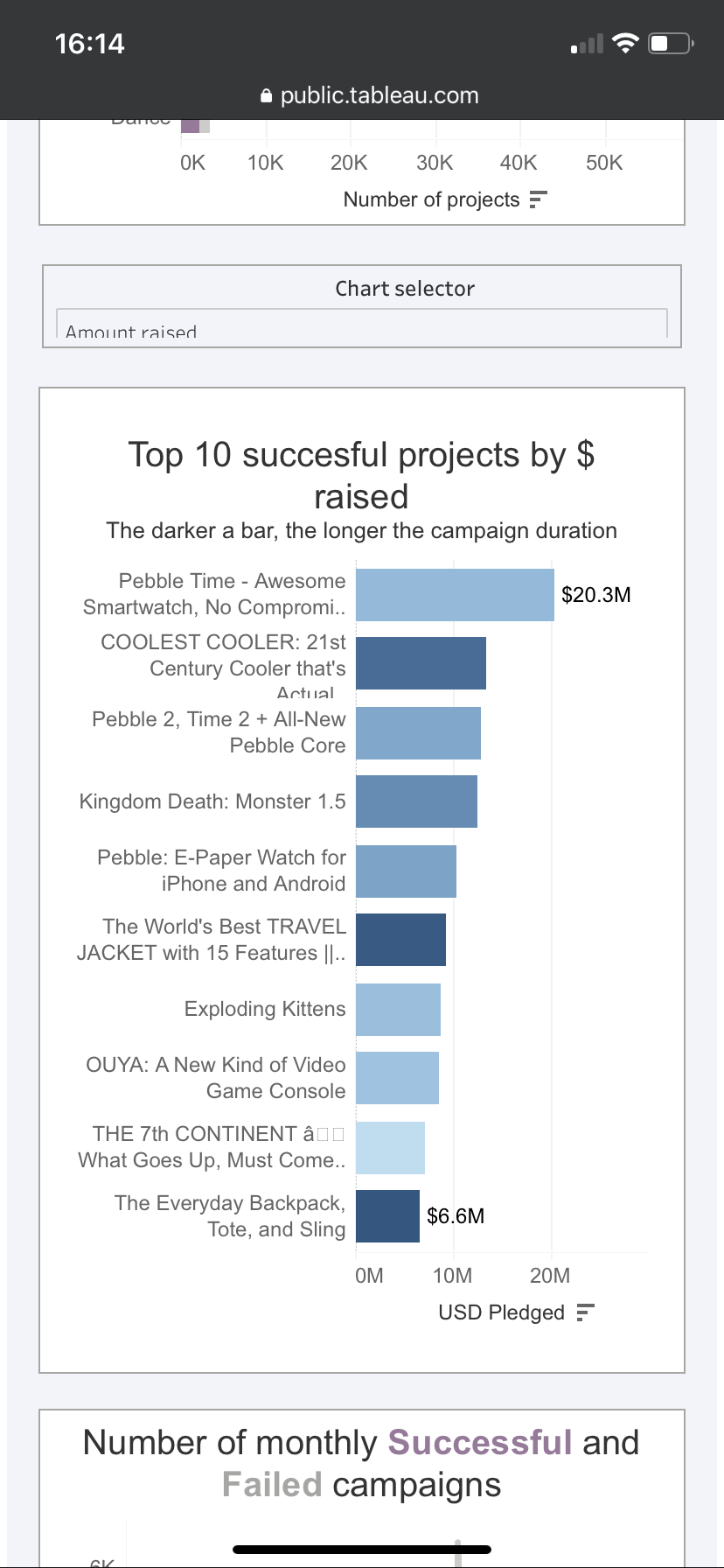
I decided to keep interactivity to a relative minimum, with the only real filter being a categorical one, so if one had a meeting with someone proposing a gaming project, they would have easy access to key metrics relevant to that particular category in terms of number of backers, average pledge amount, success %, top projects in that category, shortest successful campaigns in that category and median goal amount.
I was able to create all of the charts in my plan in decent time which gave me a sufficient amount of time to focus on the design and mobile view in particular. In my initial sketch, I had planned to do a very long scrolly dashboard but after playing around with that view, I had to pivot slightly. If the dashboard is too long, by the time you reach the bottom it’s hard to keep in mind what you saw at the top.
To get round this, I decided to use dynamic zone visibility to switch charts. However, this created issues of its own, given that anything on the mobile view has to be included in the default view to be able to be added to the mobile version. Thankfully, I found this fantastic blog:
https://interworks.com/blog/kallenspach/2019/10/30/how-to-build-mobile-friendly-tableau-dashboards/
Which details a hack where you add a floating vertical container to your dashboard with any sheets you want just for the mobile view, then add a show/hide button to hide the contents of that container. Next you change the show/hide button to a text button and change the colours so it can essentially be invisible on your desktop view. I hid mine in the corner of one of my viz’s. I duplicated all the sheets I wanted to use dynamic zone visibility for and hid them in my floating container. This allowed me to then use a chart switching parameter but crucially just for the mobile view.
I spent quite a while trying to format the mobile version to ensure nothing was to squashed and had room to breathe, similarly to the desktop version.
This was a good challenge that really brought together a lot of the lessons learned this week in terms of scope, planning, analysis and what's achievable within the time frame. I was relatively pleased with my final result as you can see below.
The main feedback I recieved was to give some context when filtering so if I could show the difference from the overall to the filtered category this would've given a clearer and more obvious insight into the numbers I provided. This was an addition I realised would've been beneficial but by the time I had thought about it, I didn't have quite enough time to fully execute so decided not to pursue it at the time.
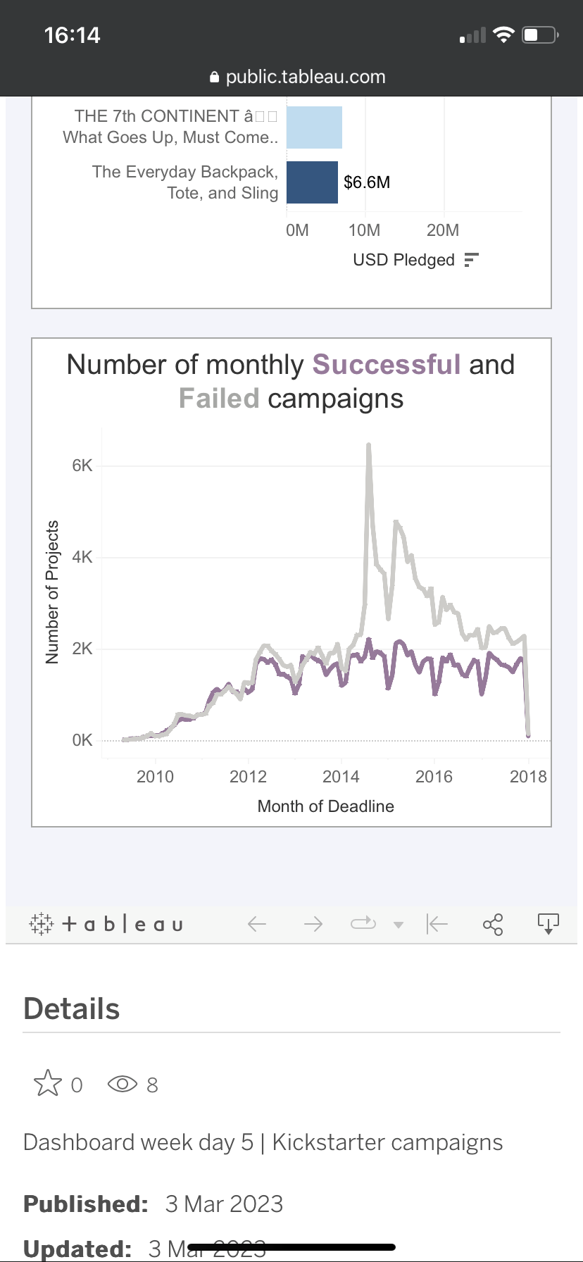
This was my final result for both the mobile and desktop view: