


For day 3 of dashboard week, we were asked to create an infographic. An infographic is:
- A data-rich visualization of a story.
- A tool to educate and inform.
- A way to build brand awareness.
We had a dataset all around the deaths of the Marvel group, the Avengers. We had a special rule in that we had to draw out our ideas before exploring the data.
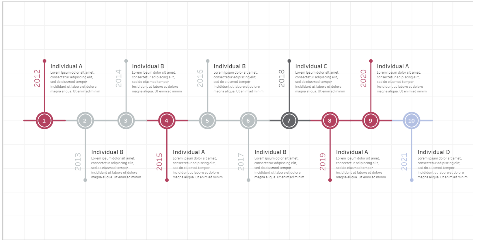
Before getting started, I had a look at different infographics and decided very early on that I wanted to do a timeline of deaths. I've seen some long scrolly timelines before and was a fan of that style of viz. I came across this example of a timeline on Tableau Public which I thought looked fantastic:
My initial sketch was like this:
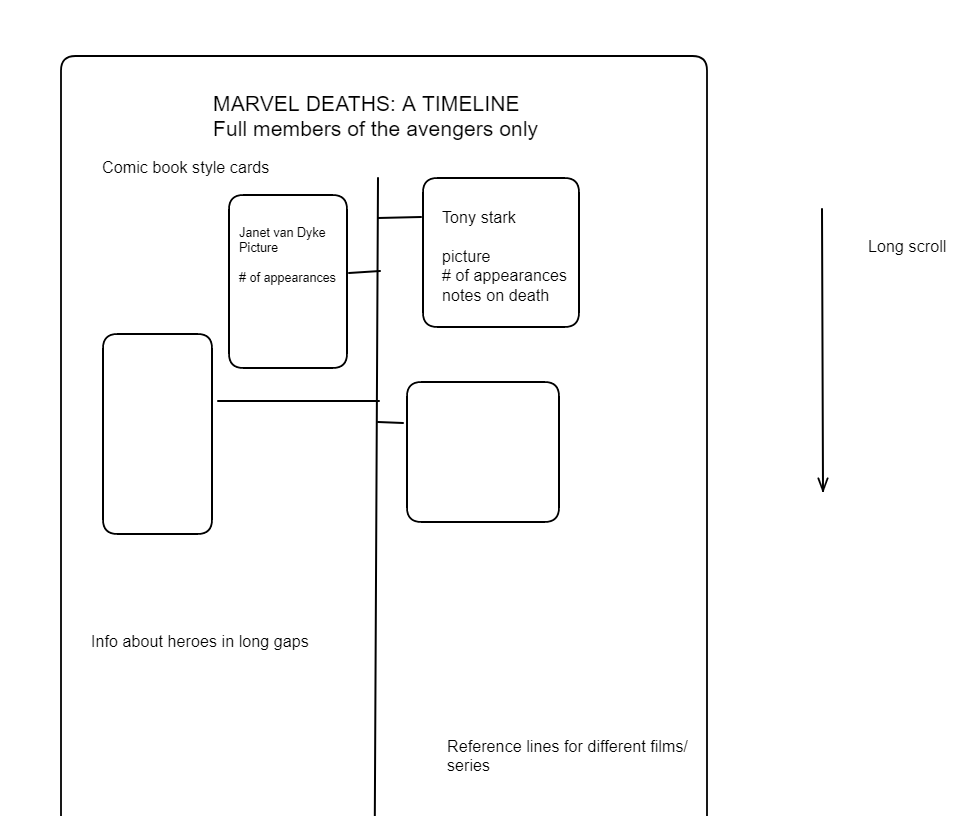
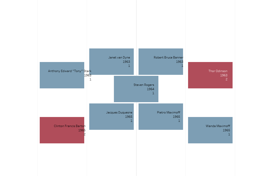
I wanted a long timeline with comic book style cards coming out, each with a picture of the hero in question, notes and number of appearances.
I downloaded the workbook of the timeline to try and reverse engineer but it quickly transpired that it required quite a lot of hacky solutions. For those 10 dots, there were 90 marks and 8 different map layers. I spent likely far too long trying to figure out and replicate the process, without much success.
After realising that this would not be feasible, I tried to find an alternative way to achieve something similar. One potential option would've been to create the bulk of it in figma then have each card as it's own sheet. Given that I decided to look at the full avenger members only, this would've required creating 60 odd sheets so I decided against it. In retrospect, this may have been a better option had I just limited the scope of my analysis. I could've ended up with a good looking, simple chart.
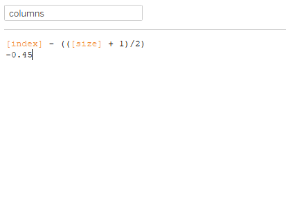
What I ended up doing was using this formula in order to offset every other mark based on their index so for each year, I wanted an even split to the left and right for each mark.
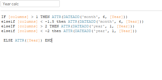
I then used this calculation to slightly offset when there were more than 4 marks in any one row:
I then had my marks looking like this:
I then played around with images a significant amount, using the url in the dataset to scrape the page for the image URL, then downloading those images as blob files in Alteryx. My workflow looked like this:
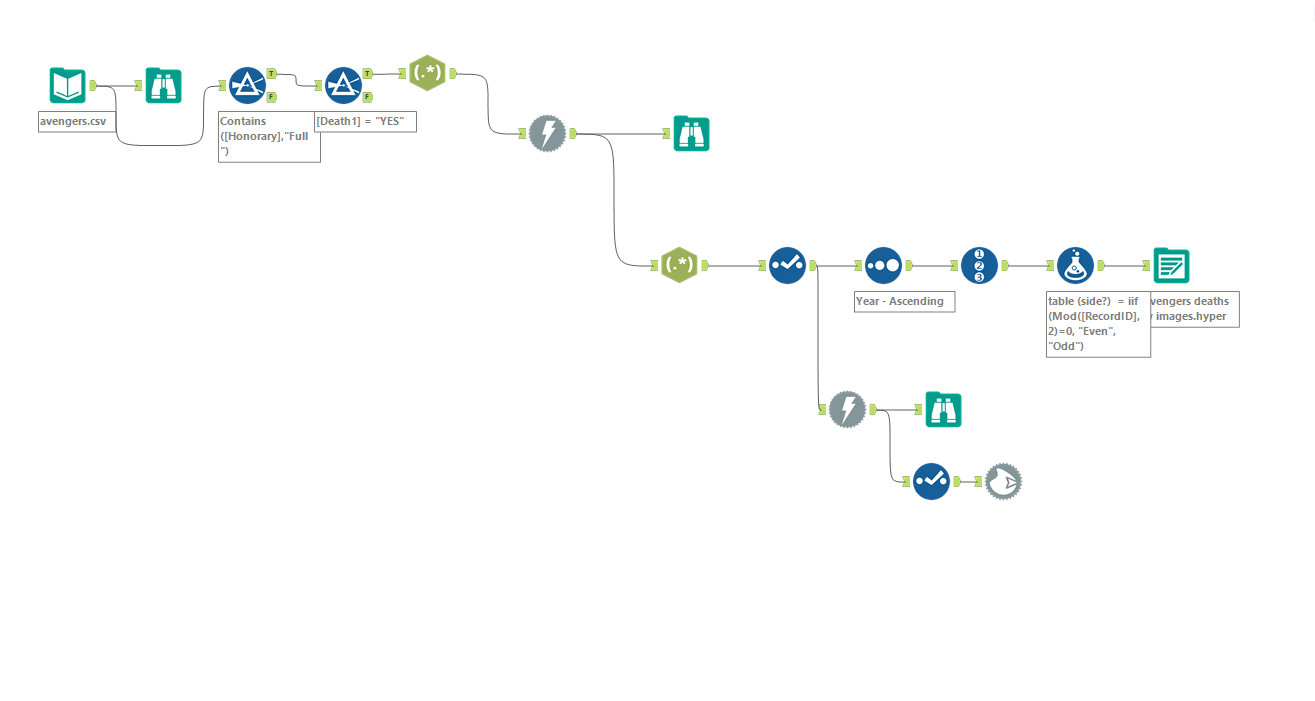
This created another kettle of fish to deal with. Only around half of the images came through properly, given my somewhat poor comic knowledge, matching up the missing ones gave me some serious difficulty. After spending more than half an hour putting images in the wrong folder and freaking out when my shape repository wasn't updating, I had to just leave some mismatching images.
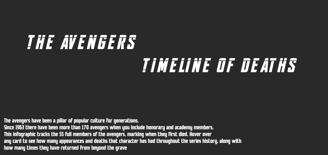
I tried to play around with Figma for the first time in order to create a background and title using the marvel font which I was relatively pleased with:
I tried for a long time to format using the (few) images that worked on those marks but wasn't able to get it to a place I was happy with.
During my presentation, I mainly focused on what I intended to do and what went wrong as I was pretty unhappy with my final dashboard.
For the future, I need to try and realise when I reach a point of no return sooner, so I can pivot in that situation to something more feasible, or do something I know is achievable from the beginning.