


Week 2 presentation at the DS. My task was to update my final interview viz based on what we learned the past few weeks.
BEFORE

Things I focused on improving
- User story to specify the rationale behind the dashboard: As a lifeguard in Australia, when looking at shark incidents, I want to see the circumstances of the encounters so that I can be more prepared for these situations.
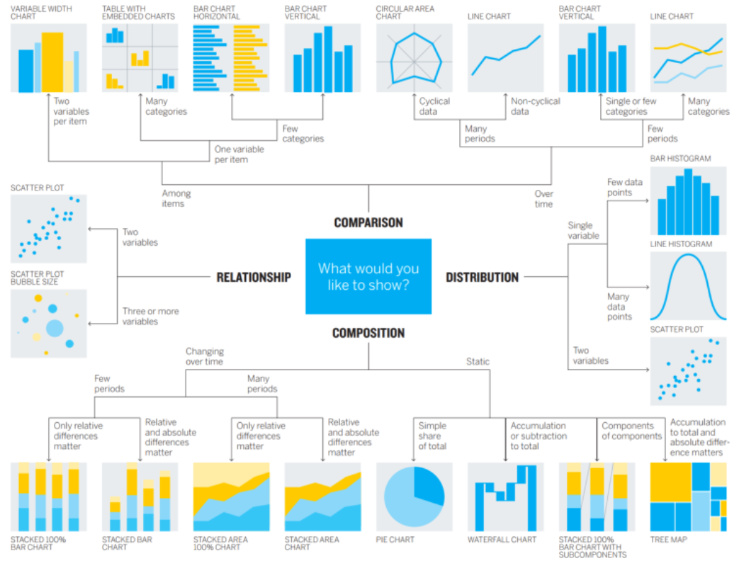
- Chart Choices- follow the diagram below before creating charts
- Best practices- Remove anything unnecessary
- Plan- sketch the layout
Things I changed
- My user story: I am a lifeguard looking at shark incidents, I want to see the circumstances of these encounters so I can be more prepared in the future for these situations.
- Chart Choices:
1. Chart: Number of incidents across years. I wanted that chart to show WHY a lifeguard should investigate this topic so I removed the provocation and fatality filter because I just want to show that it's been increasing in recent years.
2. Chart: State with the most incidents. I wanted that chart to show WHERE most of the incidents happen. The bar chart already shows this, therefore, the map is not adding too much to answering the question so I removed it.
3. Chart: Hours when the most incidents happen. I wanted that chart to show WHEN most of the incidents happen. I grouped the data into hours so there are less points; turned into a bar chart since it's not a continuous measure and visually easier to interpret; and instead of using a pie chart to highlight a specific period of the day I just highlighted the hour on the bar chart that has the most incidents.
4. Chart: Activity that victims were doing. Information about the fatality is already included in the KPIs so I removed it. - Best practices & Plan: I removed the text boxes since they don't add too much, they are just repeating what already can be seen on the charts. After, I changed the layout since without the text boxes there is a lot of empty space.
AFTER
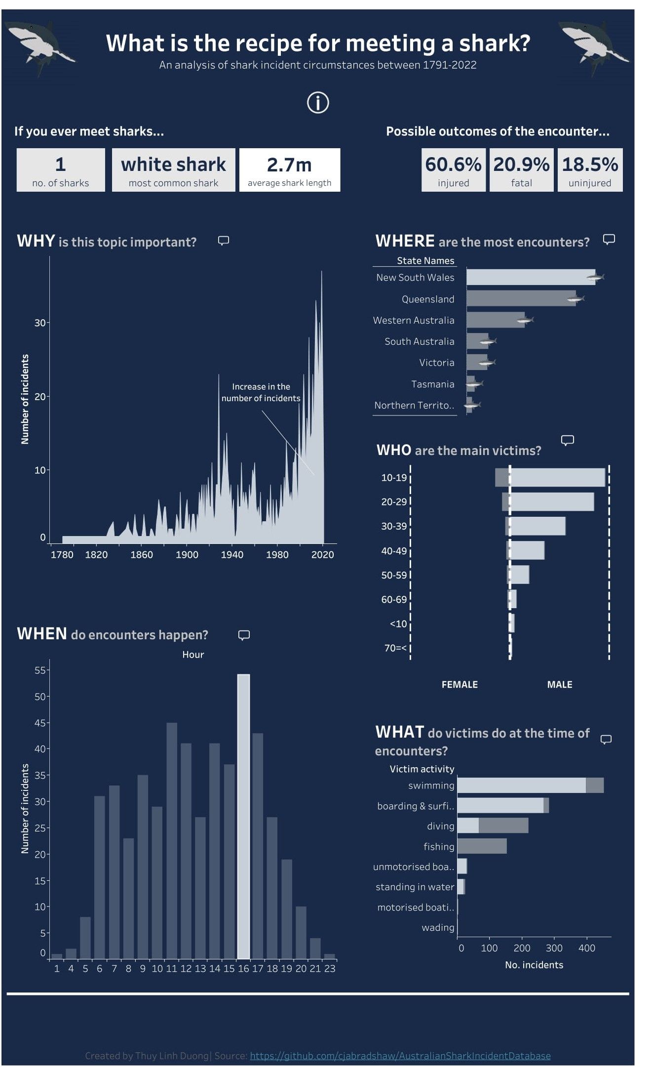
If I had more time I would've worked on formatting a bit but that's for another day. :)