Did you know that there is an entire API for Rick and Morty data? Yup, there is, and we analyzed it today. Axel Fuhrmann and Talita put it together for no other reason than their love of the show and ability to do so.
It's Dashboard Week here at the Data School, where in our final week of training we soon-to-be-graduates are given a topic or dataset and tasked with putting together a whole dashboard - every day. That includes the start to finish process of data prep, wireframing, dashboard creation, presentation, and writing up a blog like this one.
The previous two days I have set out to do a lot more than I was able - so today I sought to change that. By laying out a plan I knew could be within scope from the very beginning, I was able to get a useful, complete dashboard done in time to present at the end of the day. But first, let's talk about the data prep!
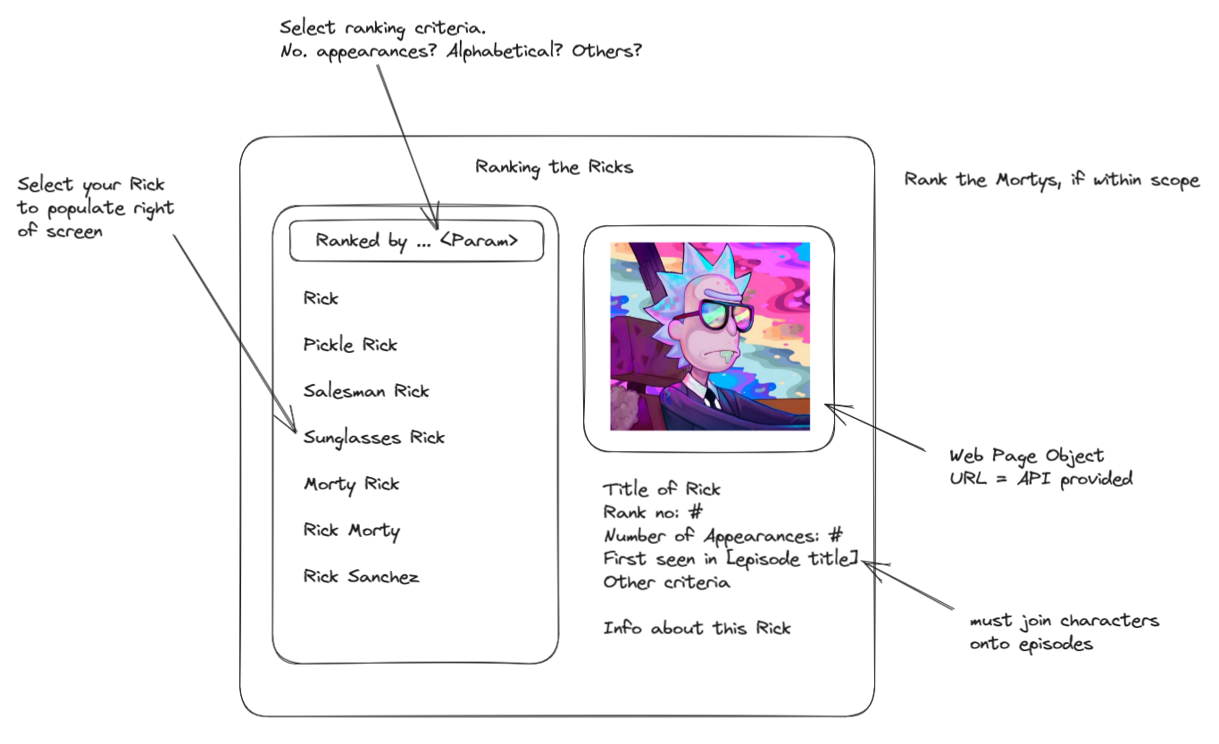
The Wireframe

I thought of something simple. Unfortunately, I'm familiar with the show, so I know that there is occasional mention of "our" Rick being the "Rickest Rick" in all existence. I say - let's put that to the test using one of the only metrics derivable from the data: how many episodes has each Rick appeared in?
By selecting your Rick from the list of every Rick ever to make an appearance, you would then be able to see a photo of him on the right along with some info.
Data Prep in Alteryx

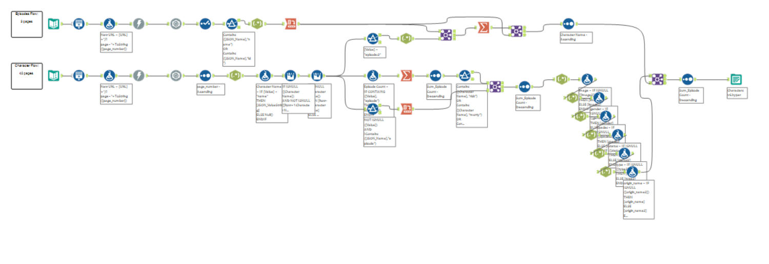
The Rick and Morty API comes in three parts: characters, locations, and shows. I knew that my little idea wouldn't need more than the character data, and eventually a join onto the episode data.
The below series of transformations represents my downloading from the API and parsing the character data while the above is the same with the episode data. I narrowed what could have been excessive data prep down to simply deriving a list of unique characters, the sum of their episode appearances, and the first episode they appeared in.
The Dashboard

It was a welcome change of pace to get this done in time. Given the time limitations of Dashboard Week, half the challenge is managing our scope. As a novice months ago I found scope management nearly impossible. Now that I can use Tableau and Alteryx with relative ease, I find that I'm able to determine what's possible within a given timeframe and what's not. When you know yourself (and your technical skillset) well, it grants you a degree of foresight unavailable otherwise.
Check out the dashboard here, or don't! Either way, have a great week.
