Pie charts can be an effective visualization when showing part-to-whole relationships. Often we see data as 100 percent and we want to know how a certain portion is relative to the total. Pie chart can be useful when we think of proportion in relative terms, however it is not the best visualization to represent an exact portion (e.g 19% vs 21%). Further, it becomes more confusing when there are too many slices and too many things to compare to. So be careful and be intentional when using this chart.
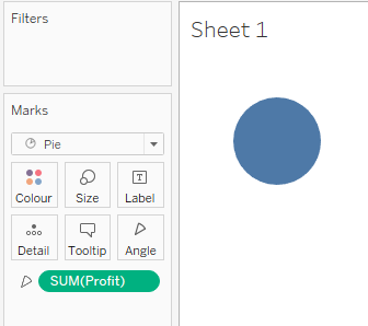
In Tableau, it is easy to create a Pie Chart. Simply change the Marks card to "Pie" and the property "Angle" will appear, where a Measure is typically dragged to and will determine how big the slice is. For example to get the Share of Regional Profit in the Superstore data set, we drag Profit to Angle.

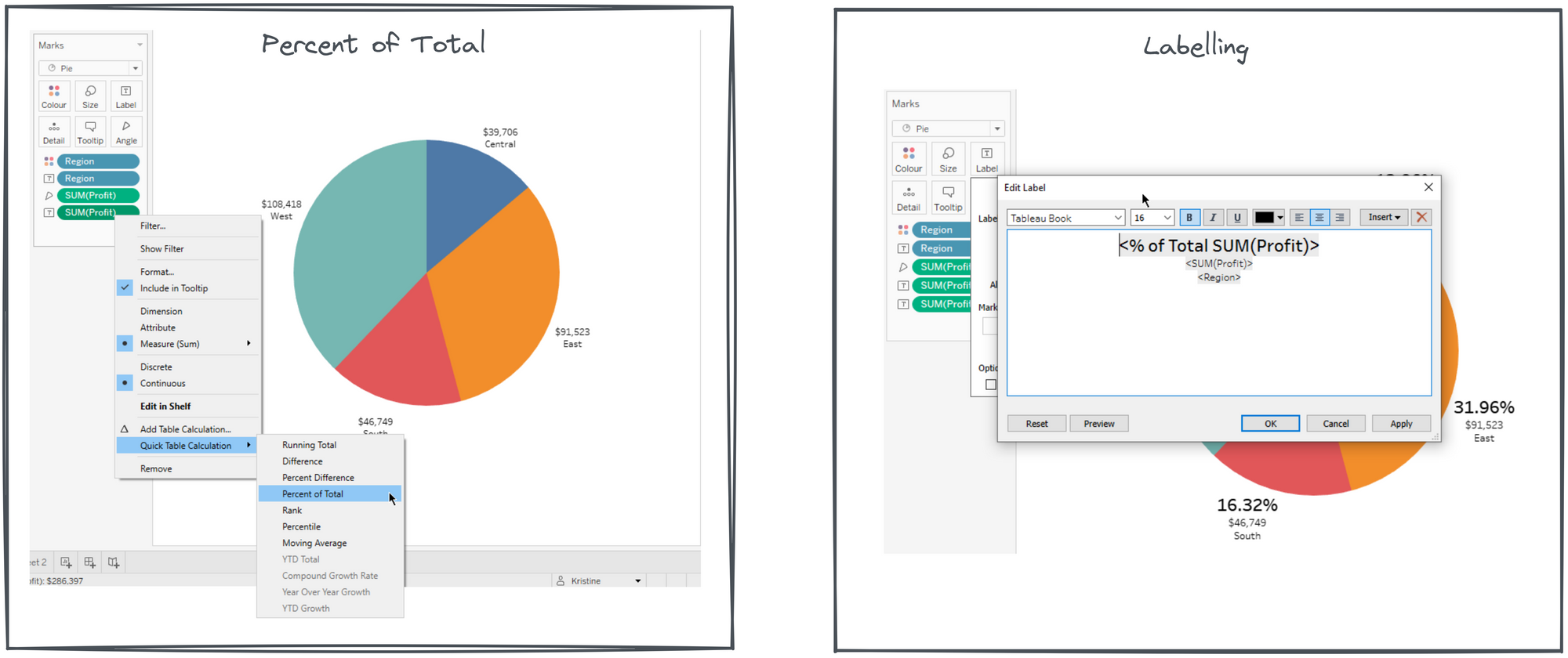
By default we see a big circle, the 100%. And to determine what slices up the pie, it is typically a discrete Dimension that we drag onto color. To identify what the slices are and how big they are, copy Profit and Region by pressing CTRL drag them to Label. And to show the labels in percentage, click on Profit and add a Quick Table Calculation and select percent of total, which will give us the profit percentage. And format the labels to give the pie more useful details.

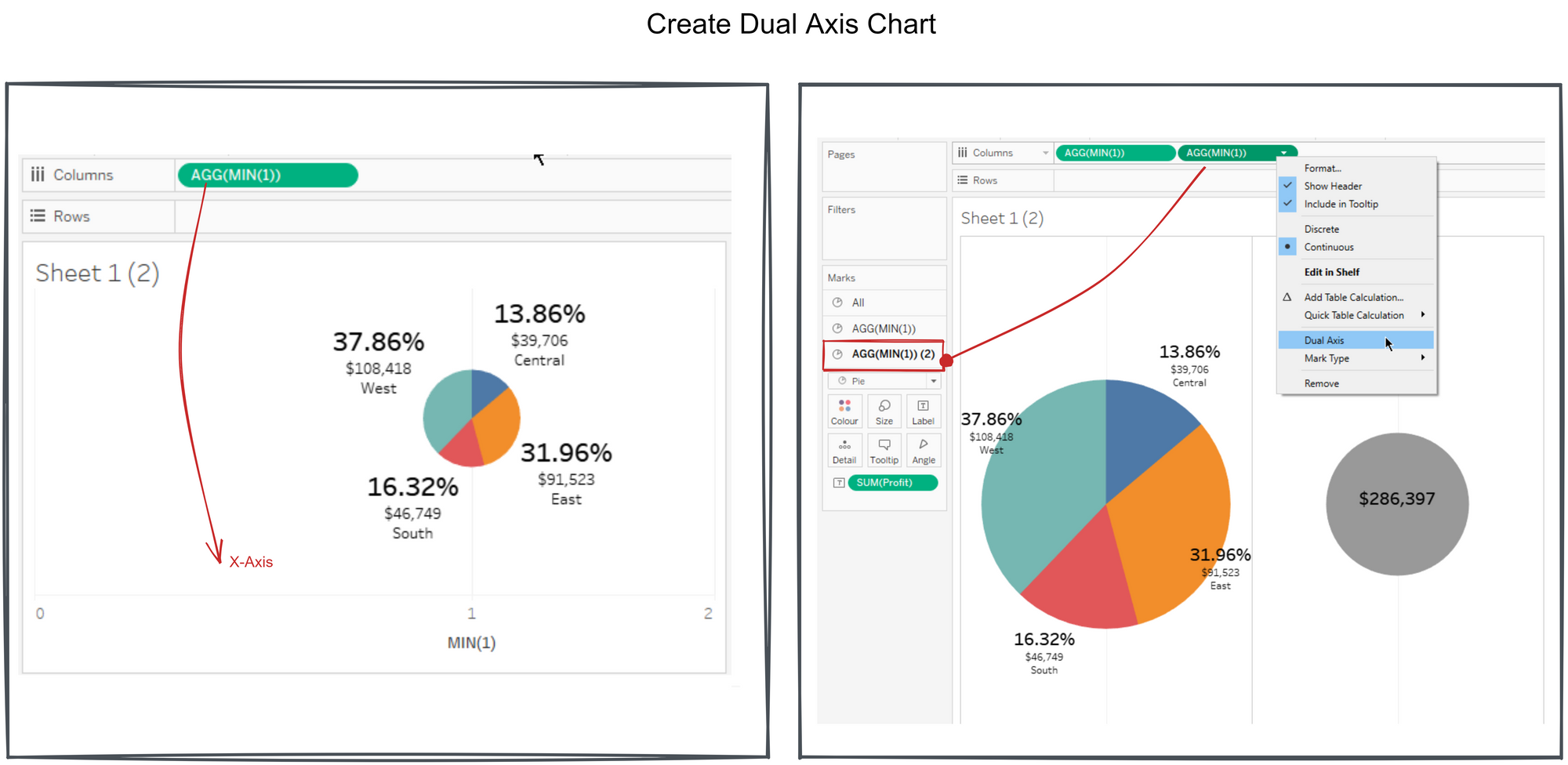
To make a donut chart or a pie chart with a hole in the middle, a Dual-axis chart is needed. Since there are no axis from our pie chart, create one by clicking an area in the columns and type in MIN(1), which may not really mean anything, but it is actually a continuous field that will give us an axis. Create a second axis by duplicate the first one, by pressing CTRL and drag beside it then we have 2 pies.
Resize the pie in the second axis and bring them together by clicking on dual axis. The middle circle or the second axis (right most) doesn't really have need to have any slices, so we just need to keep the sum of profit in the Marks card and adjust the size of the circle. Right click on the second axis, select dual axis to bring the 2 circles together and change the color to white.

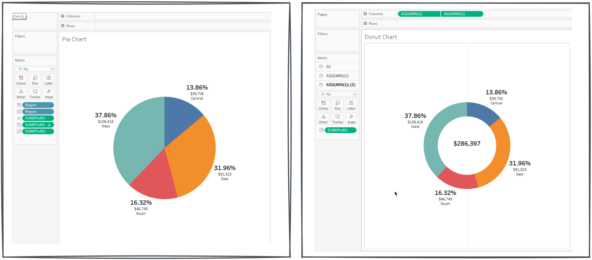
Clean the charts up by hiding the headers and grid lines.

I personally think a donut chart may seem to look less cluttered than a traditional pie chart. And the white space in the middle is useful for an additional information and focus, like a total or a trend. Nonetheless, visualization is an art. Always remember consider style and purpose when creating charts.
