


Makeover Mondays used to feel like a daunting task, as I imagine it was for many new data schoolers. While still developing my knowledge about what makes a good dashboard, it was really hard to look at a Makeover Monday visualisation and understand how to improve it.
My initial approach was simply to replicate the challenge chart and beautify it. That felt redundant, and needless to say, the feedback from my coach was highly constructive! Even with the feedback, I couldn't quite wrap my head around a better way to tackle these challenges.
The New Method: Finding the Story
After a little more guidance and practice, and taking notes from the Makeover Monday book, I now have a much more structured approach focusing on narrative and insight. Here’s how I approach the challenge:
- Explore the Original Viz: I ask myself - does the viz make sense? If it's not clear what the visualisation is showing, then there's definitely room for improvement. So what insight, if any, can I draw from it, and is that obvious?
- Explore the Data: I pull the data into Tableau and build some basic charts to see what insights can be drawn.
- Pick an Insight & Develop a Story: I select an insight that I find interesting or obvious, and then develop a simple user story to understand why someone might be interested in that particular insight, and what decision might this information help them to make?
- Start Building: Then I begin creating my charts, focusing primarily on highlighting the chosen insight, and making good use of colour and other formatting methods.
- Research & Context: I’ll also do some additional research to add more context to the insights and round out the story.
- Support My Charts: I support my visuals with a title, subtitle, and an introduction that both asks and answers the question that the charts will support.
A Deep Dive: Challenge #2018 Wk28 Volcano Eruptions
Recently, I was tasked with taking a Makeover Monday challenge and spending two weeks developing my improved version instead of the standard 1.5 hours, to really focus on honing my dashboarding skills.
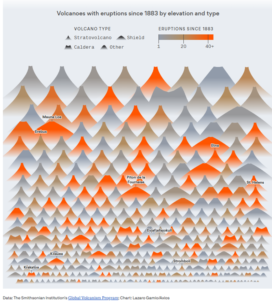
I chose Challenge #2018 wk28: Volcano Eruptions. I found the topic interesting, and the original visualisation (seen below I found hard to read with an unclear story.
Exploring the Data and Narrowing the Focus
Exploring the data in Tableau, I found a surprising amount of detail, much more than the usual Makeover Monday challenge. The dataset included volcano data broken down by subregion, region, country, longitude/latitude, type, tectonic setting, to name a few, and the last known eruption date, with dates stretching as far back as 9450 BC!
With so many stories to explore, I immediately decided to narrow my focus to one country and exclude the BCE dates, and I chose to focus on Japan. I was aware of the frequent earthquakes in the area and was curious if volcanic activity was also high. My research confirmed that Japan sits on the convergence of four tectonic plates, making it highly susceptible to tectonic activity.
To narrow the focus further, I researched when modern technology allowed for more accurate monitoring of volcano activity and discovered the key date was 1912. Focusing on last known eruptions from that date helped me start building a user story.
The User Story
My final user story was:
As a volcanology researcher, I want to analyse the historical frequency, location, and type of all confirmed and dated volcanic eruptions in Japan (CE), so that I can identify periods of high activity and map the geographical spread of past eruptions, and correlate activity with specific volcano types to better inform long-term risk assessment models.
The Build and Formatting
I built charts to show when activity occurred (trend), where it occurred (geographical spread), and the impact of the volcano type.
During the build, I found another interesting insight: the Stratovolcano being the most common type. I narrowed my story further to explore the behaviour of this specific volcano type across time and location in Japan.
Finally, it came down to formatting to highlight the key points:
- Colour: I coloured the Stratovolcano data in burgundy against muddy greys for all other data points. This was meant to evoke the effect of red lava and ashy ground against a sandy background.
- Text & Interactivity: I matched the colour of the Stratovolcano data with the text to highlight that type. I also added dashboard interactivity and labelling.
- Mark Shapes: I changed the standard circles into triangles to represent the volcanoes which I thought was a cute touch.
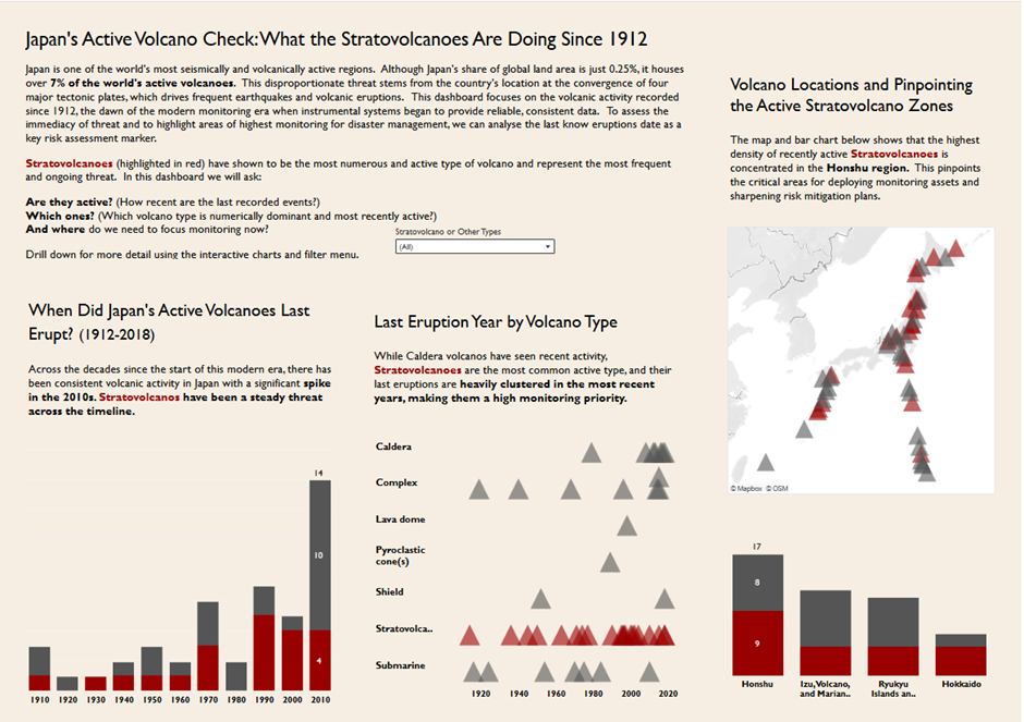
My final viz, Japan’s Active Volcano Check: What the Stratovolcanoes are Doing Since 1912, showcases the concentration of these active zones and their frequency over time.
By focusing on a strong user story and research, I was able to transform a daunting challenge into a focused and compelling dashboard!
Conclusion: The Power of Focusing the Story
Moving past the initial difficulty of Makeover Monday required one crucial shift: moving from merely beautifying a chart to successfully finding and focusing a compelling story.
The challenge of the Volcano Eruptions data was the perfect test case. Faced with thousands of years of global data, the temptation to show everything was high. But by implementing the new process : exploring the data, locking in a region (Japan), establishing a date range (post-1912), and defining a sharp user story, I narrowed the scope to just the behaviour of the most common threat: the Stratovolcano.
Ultimately, the goal of any dashboard is not just to display data, but to inform a decision or answer a question. By taking two weeks to truly embed this process, the results speak for themselves: a clear, risk-assessment-focused viz ready to guide volcanology researchers.
I hope this new structured approach helps you transform your next Makeover Monday from a daunting task into a rewarding, story-driven success!