


Today is Day 2 of Dashboard week. The concept of dashboard week is to get things done in a day. Every day, I will be exposed to a new dataset and create a dashboard based on the requirements.
Brief for today
Create a visual aid to educate the public about food using FooDB, with the following requirements.
- One screen with 1920 x 1080 size
- Interactivity (action, DVZ, etc)
- No filters or dropdowns are allowed
Aim for the dashboard
Fibre is an essential part of a healthy diet but, it is often overlooked, and many people do not consume enough. I wanted the aims of the dashboard to raise awareness and encourage readers to pay more attention to their daily fibre intake.
Data prep
The data I used for today are
- Food.csv
- Content.csv
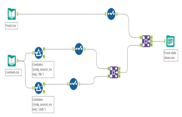
The original dataset stored each nutrient as a separate row. This meant that if a food contained several nutrients, such as carbohydrates, fibre, and fat, the same food appeared multiple times.
I needed to transform the data so that each food appeared only once. The different nutrients were then placed into separate columns, such as carbohydrate content with its corresponding values in grams. This structure made it much easier to compare the nutritional content of different foods in Tableau.
Sketch
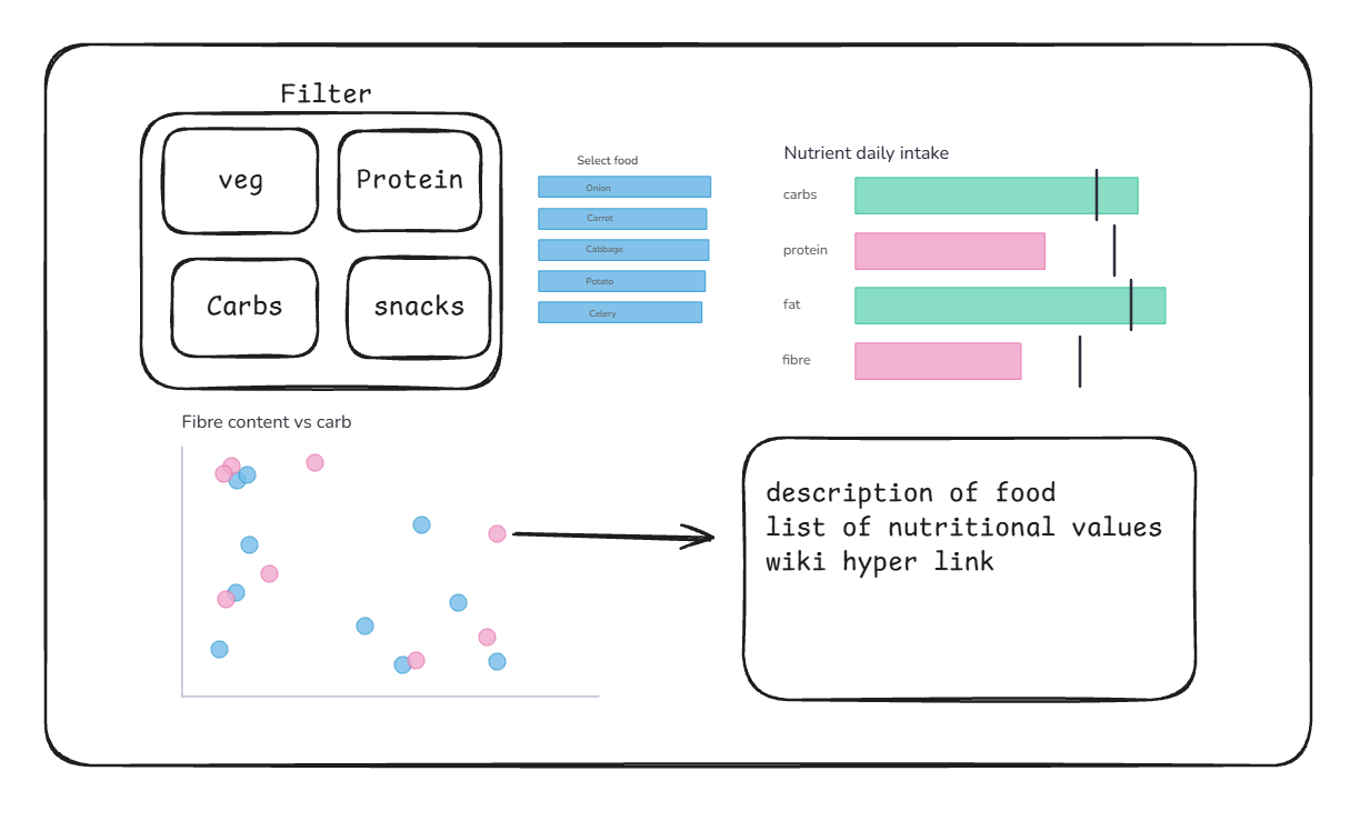
The idea was to have a category action to select what type of food to see the nutritional value for. After selecting the category, the selection (Select food) will pop up. When the user selects the type of food, it displays the grams of each nutrient the food contains and the reference line for the daily suggested intake.
The scatter plot will show the relationship between fibre content and carbohydrate content in each food. When the user selects a specific food, it will display the food's description, a list of nutritional values, and a link to Wikipedia.
The Dashboard
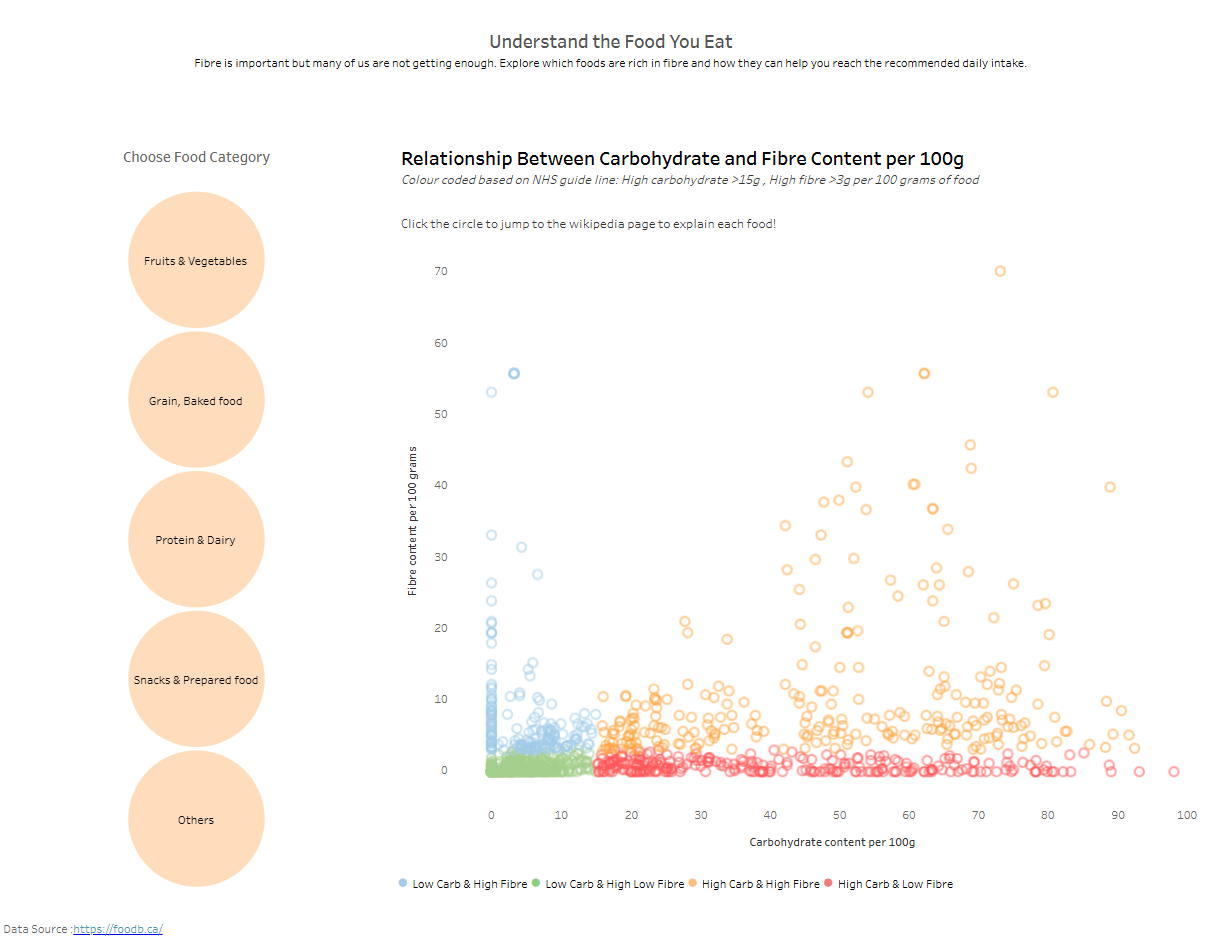
With the limited time, I had to cut a few charts from the sketch, but enjoy exploring my dashboard from here: Understand the Food You Eat