


Day 3 of Dashboard Week. Today's dataset was about Anime.
Brief
- Create static infographic on a series, genre, users or any story that is intersting
- Use visualisation tool that I didn't use for the previous day
- Use MyAnimeList Dataset
Plan
While exploring the dataset, I found that Doraemon was the longest-running anime series, beginning in 1979 and continuing to the present day.
The series has also been broadcast in more than 60 countries worldwide, showing just how far its popularity has reached. Because of its long history and global influence, I decided to focus my analysis on Doraemon.
Data prep
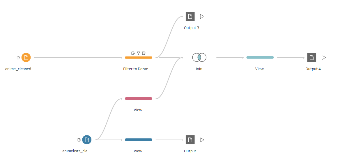
The data I plan to use are
- anime_cleaned.csv
- animelist_cleaned.csv
Sketch
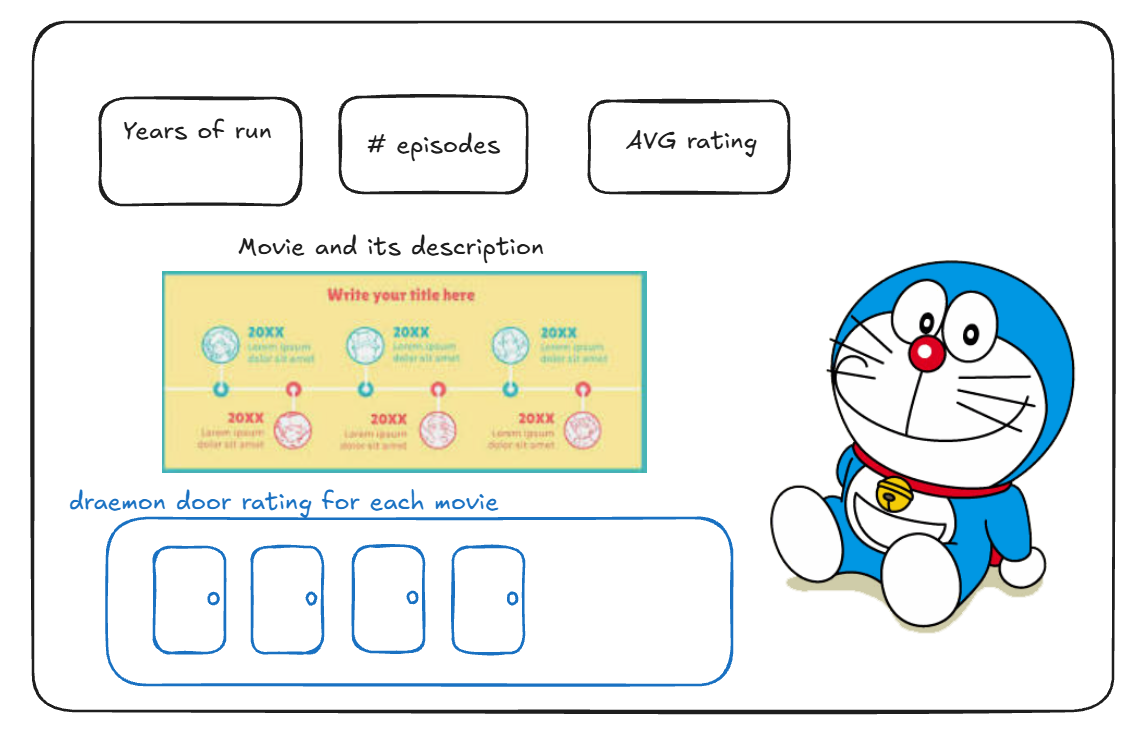
KPI cards to highlight the number of years Doraemon has been running, the total number of episodes, and the overall average rating.
In the middle, timeline showing the TV series and movies, along with their descriptions and ratings. To make the rating visual more connected to Doraemon, I was planning to make Dokodemo Door (Anywhere Door), one of Doraemon’s most iconic magical tool, which can take you to anywhere you wish. The number of doors represents the rating, so a higher-rated title is displayed with more doors.
For more information about Doraemon have a look at this wikipedia page
Dashbaord
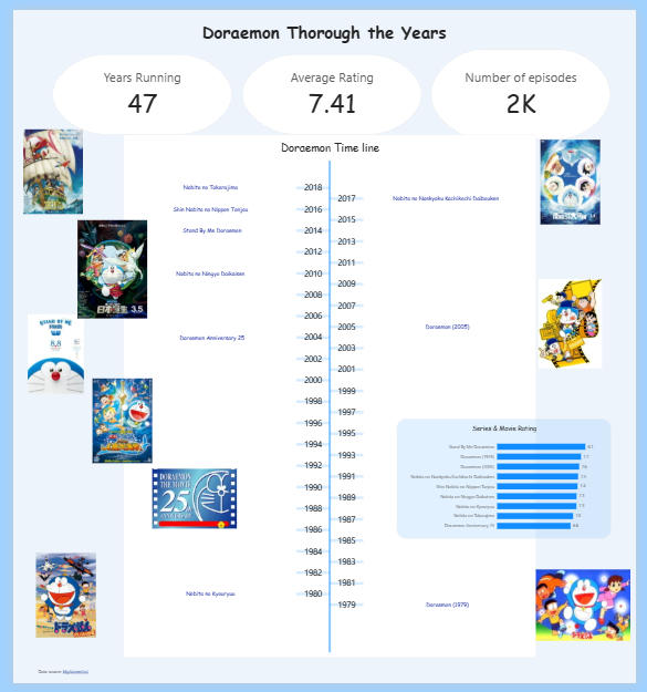
This is what I made! Access from here Doraemon Through the Years