


Since learning how to add 'transparent' into the colour legend in tableau, I have ended up using it quite a bit in a variety of different ways, so I thought I'd take you through how to import one into Tableau, and some possible use cases.
I learned how to do this when I was completing a WOW (https://workout-wednesday.com/2023w11tab/), created by Donna Coles, and thought it was worth sharing.
A Step by Step Guide to Adding Transparent to the Colour Legend.
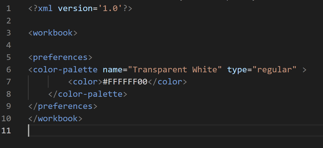
Normally, adding a custom colour is easy if you know it's corresponding hex code. With a transparent colour however, it's hex code is longer than 6 digits (#FFFFFF00). This means Tableau doesn't allow you to add it in the usual way, and instead you need to add it using XML.
- Open up your file explorer and navigate to your Tableau Repository.
File Path: C:\Users\User Name\Documents\My Tableau Repository
2. Open the file "Preferences.tps" with a text editor. To do so, you may need to download a text editor such as Visual Studio Code - (https://code.visualstudio.com/Download).
3. Once in the text editor, add in the following XML between the <workbook> and </workbook> markers:
<preferences>
<color-palette name="Transparent" type="regular">
<color>#FFFFFF00</color>
</color-palette>
</preferences>
Your code should look like this:
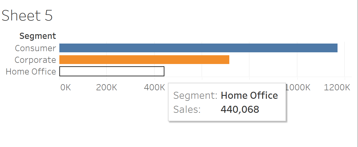
4. Close the text editor and open up Tableau - connecting to your data set of choice (I have used Sample - Superstore).
5. Create a simple chart - I have simply created a Bar Chart using Segments and Sales:
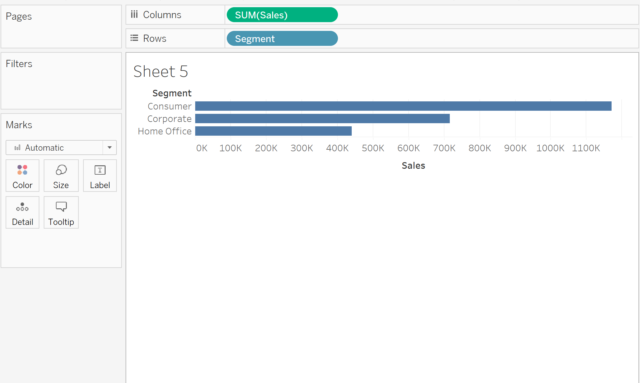
6. Next drag Segment onto Colour in the Marks card
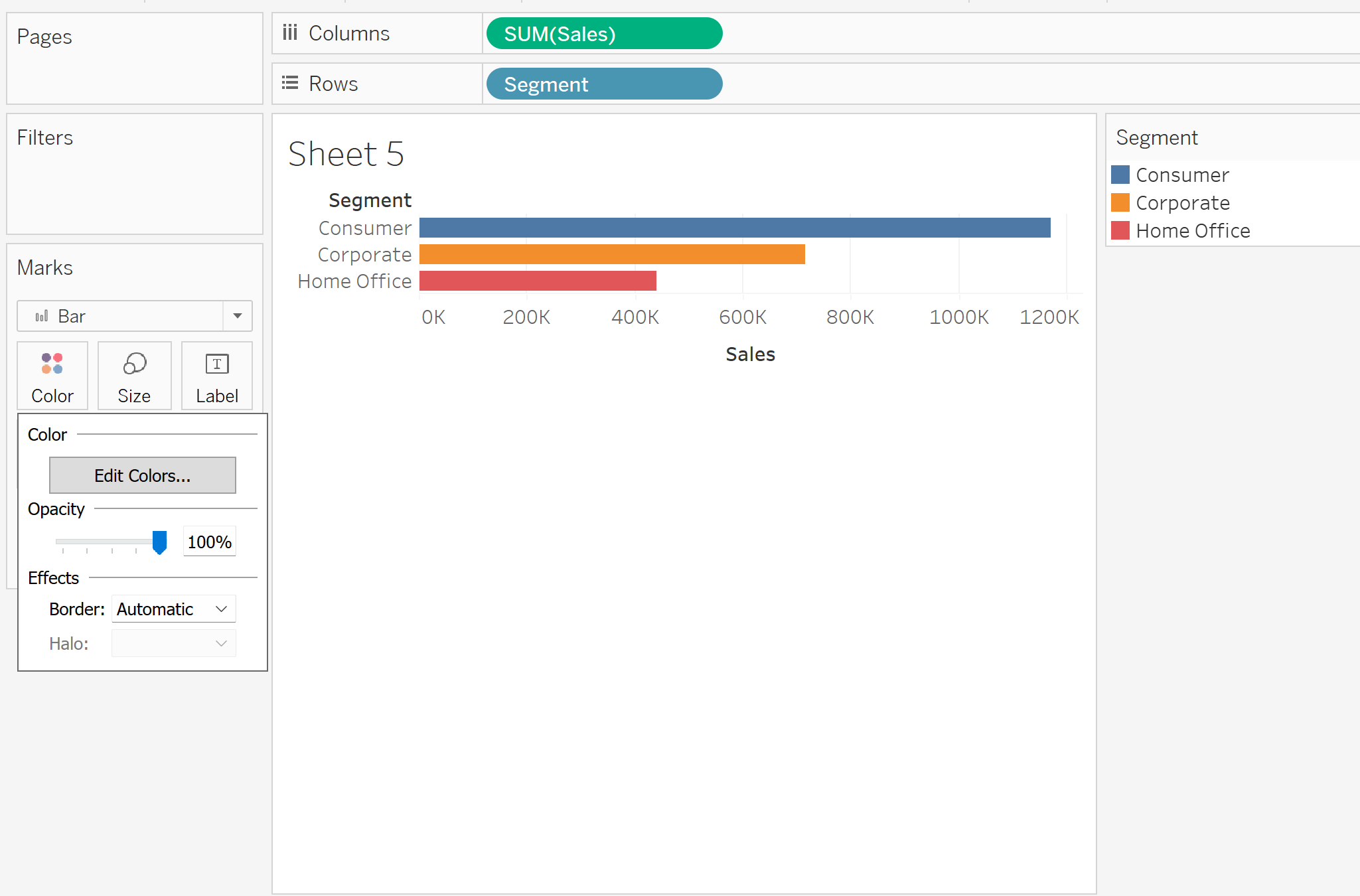
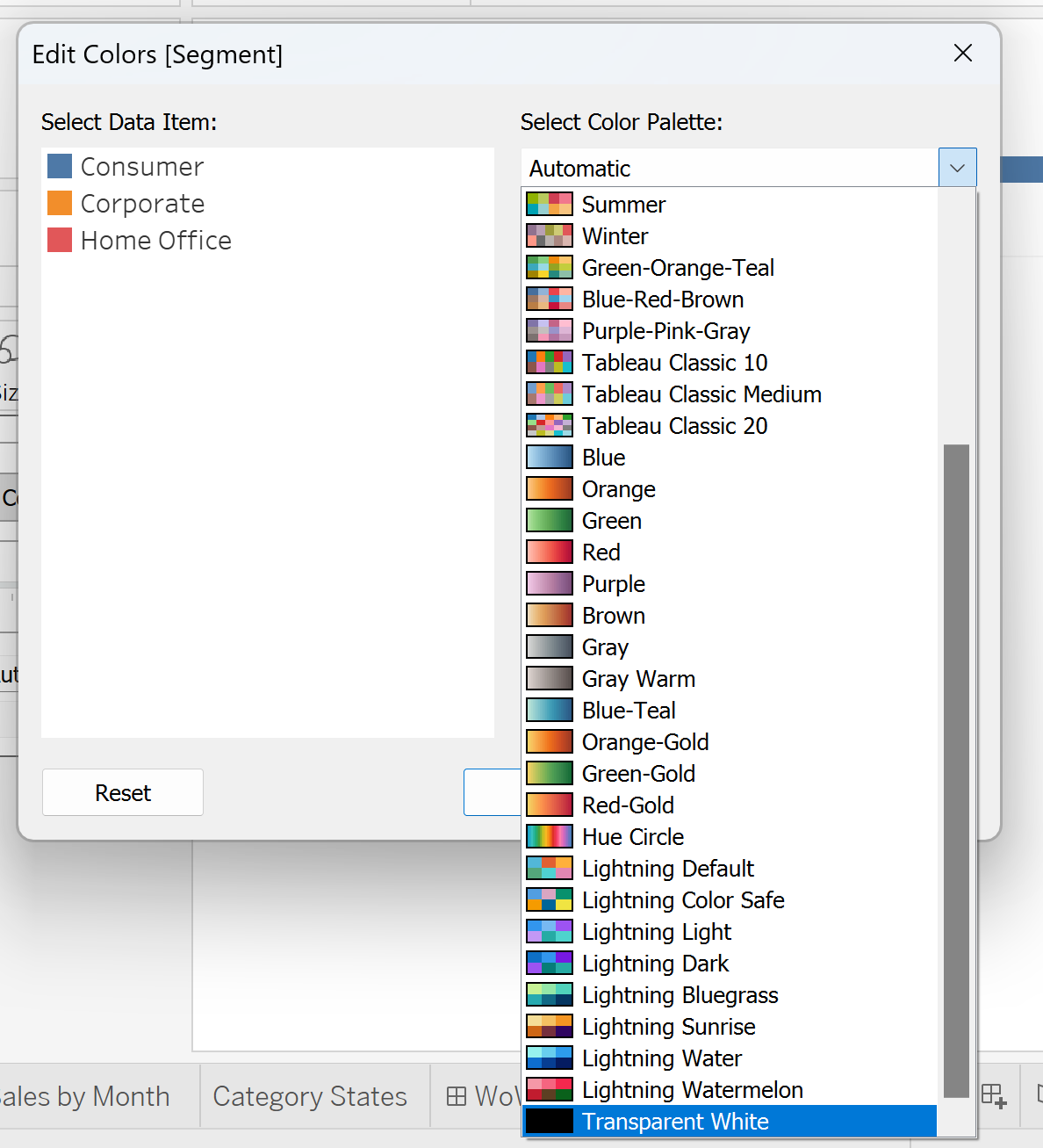
Select 'Edit Colours...'
Select the drop down, where it says 'Automatic' and scroll to the bottom. There you should see your newly created 'Transparent White'. Select this and assign one of your segments as Transparent.
Click ok, and you should see now your selected Segment has disappeared. In reality it is still there, seen if you hover over the bar, the colour is just transparent.
This is obviously not a good use case of transparent colours, however one way it can be useful is in using colour to communicate two different things to the end user.
Using Transparent Colours to show both a sequential colour palette and a 'selected area' on the same map.
In Week 11, 2023's WOW, we are asked to create a hex map that was coloured sequentially by Sales, but also could be used as a filter: as one state was selected, it turned Blue:
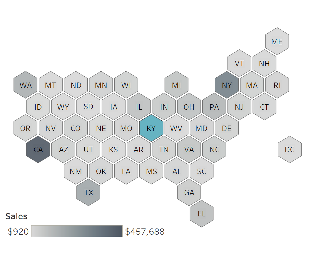
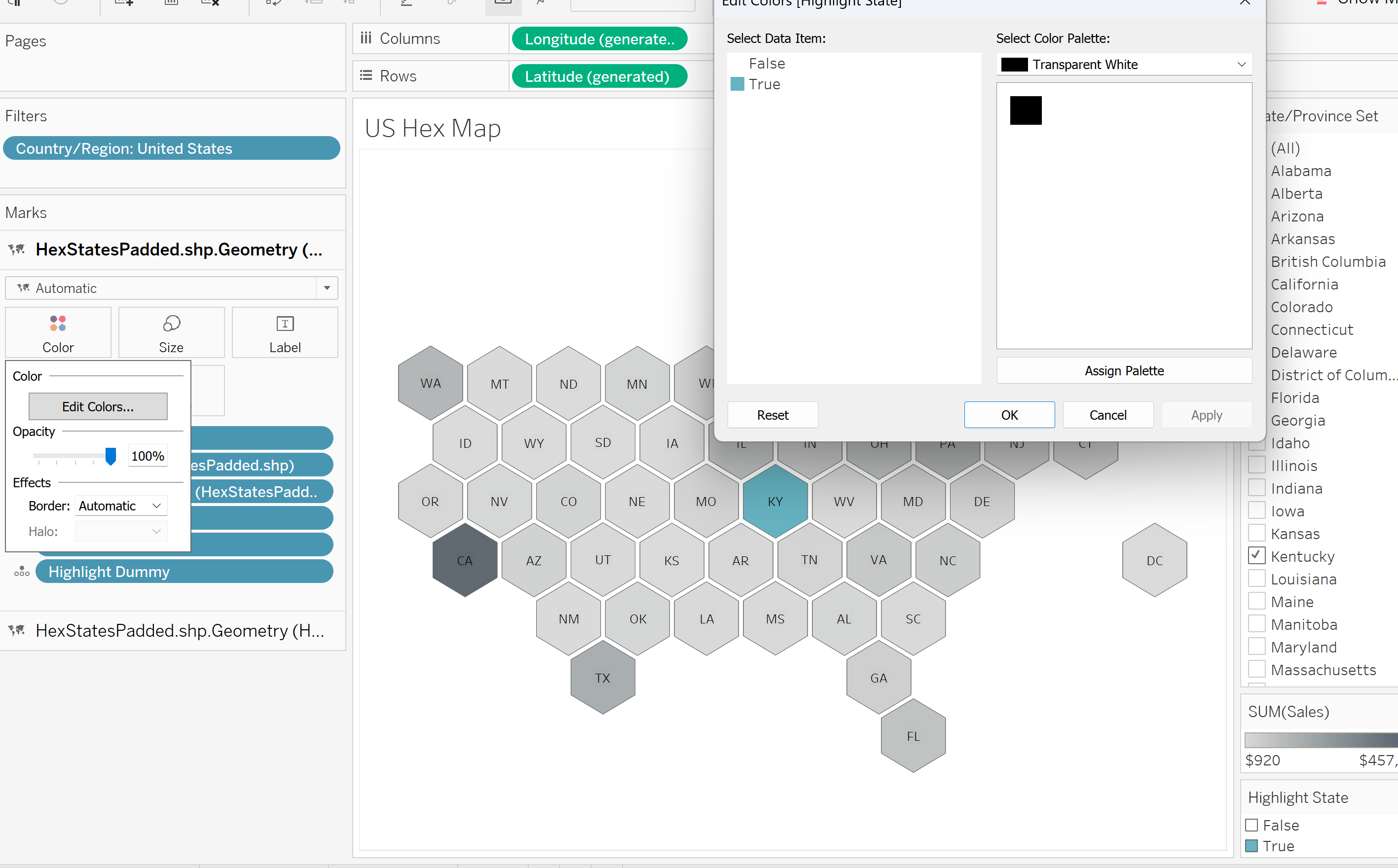
For this, used two map layers, one for the sequential colour palette and one for the Selected State. On the Selected State Layer, I added my 'Highlighted State' Calculated Field, which I created using a Set. I then put 'Highlighted State' onto Colour, and made 'False', meaning if the state wasn't selected, 'Transparent White', meaning when one state was selected, you were still able to see the Grey Sequential Palette Map Layer beneath it.
For a more detailed explanation on how to complete this WOW, you can go to this link: (https://workout-wednesday.com/2023w11tab/).
A second possible use case is with doughnut charts, where you want the middle of the chart to match the background colour of your dashboard. Especially if you're indecisive on your background colour, keeping the middle of the chart 'Transparent White' means you won't need to keep updating it down the line, as the background colour will show through.