When working with data, a lot of the time we would want to find the top performers or the worst performers in a given category. Rank charts can provide valuable insights by allowing you to quickly and easily compare data points. For instance, you could use a rank chart to visualize the top selling products in your company, or to compare the performance of different departments. In addition, the inclusion of a range of time allows you to see how a particular highlighted category rank over time.
In this example, I've used the Sample Superstore dataset, and I want to visualize how my regional managers, bringing in profit, are doing month by month. To make things easy, I'll be using ranking them by their the profit they're bringing on a scale of 1-4 since there are only 4 regional managers.
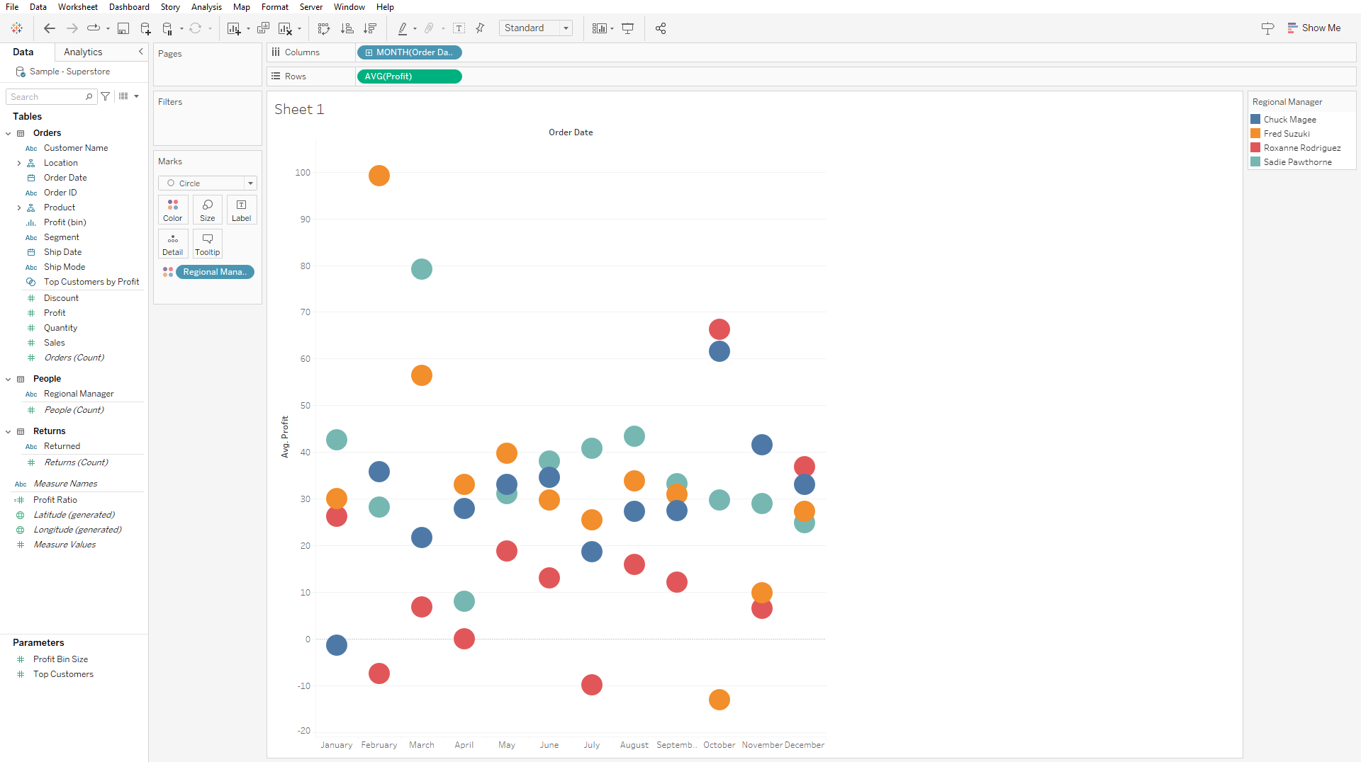
To start, place your pill of time range onto Columns, you can decided whether you want this to be displayed as discrete or continuous. In the example below, I've opted to use a discrete month field to limit my range to only 12 months of the year. I also have AVG(Profit) in my Rows and Regional Managers in Color.

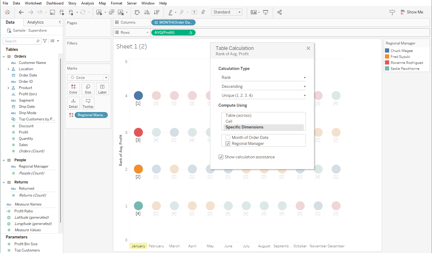
Now that we have our pills positioned, the only thing left is to rank them. To do this, I've opted to right click on my AVG(Profit) pill and added a Table Calculation. Afterwards, I've selected on Rank, clicked on descending and computed the ranking using regional manager.

Thankfully, Tableau highlights the table/pane/cell while you are configuring so you can see if you are doing the calculation like how you intended it to be. Computing using regional manager essentially means that for each month, we want the rank for each regional manager within the given month.
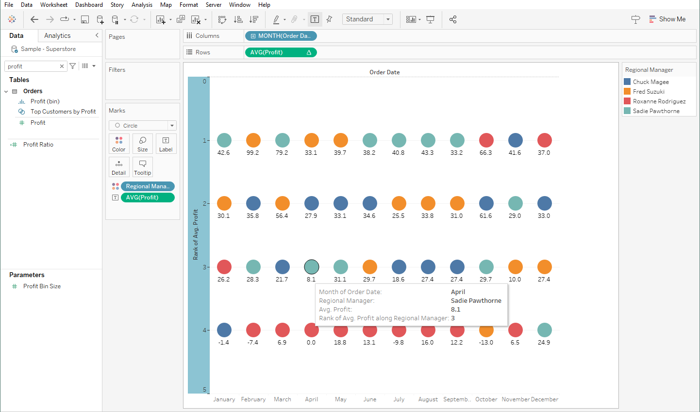
When you're done configuring it as well, you'd also want to reverse the axis so that 1 is on top and 4 is at the bottom. Having the AVG(Profit) put into Text will also help you see if you have the configuration done right.

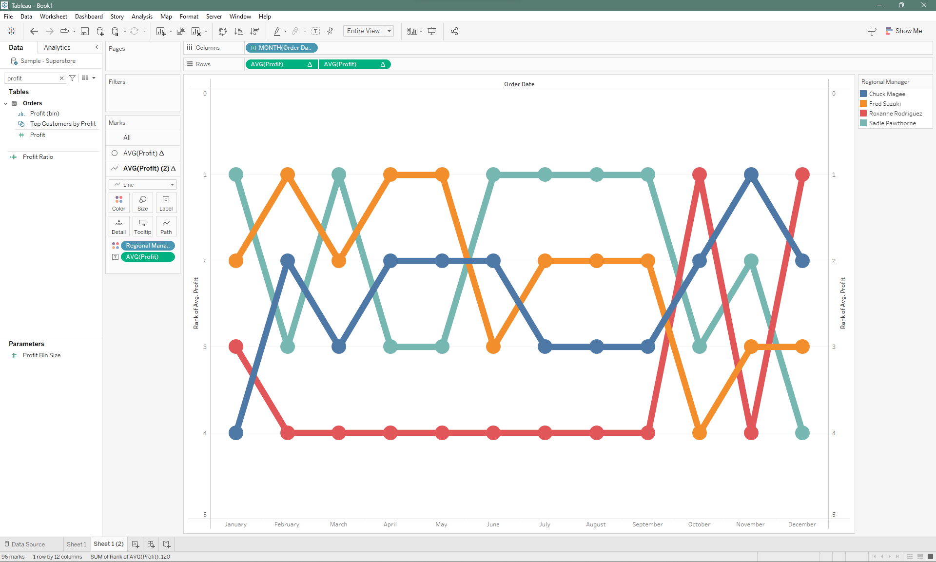
Technically, at this point, you'd have a completely functional rank chart, but there are a couple of things we could do to beautify this chart and make it easier to read. One of those things is to add a layer of lines with the same color so that you can see how each regional manager's rank go up or down each month.
To do that simply duplicate your existing AVG(Profit) pill on Rows so it retains the table calculation you made earlier. Make sure to dual axis and synchronize the axis as well. Then you can change the mark from a circle to a line.

There you have it, now you have a rank chart that quickly shows you have a category performs in relation to its counterparts.
