


As we wrap up our first day of Power BI, here is my favourite feature so far. While I will definitely need more time to become an experienced user, I really appreciate how easily you can go from one chart type to another.
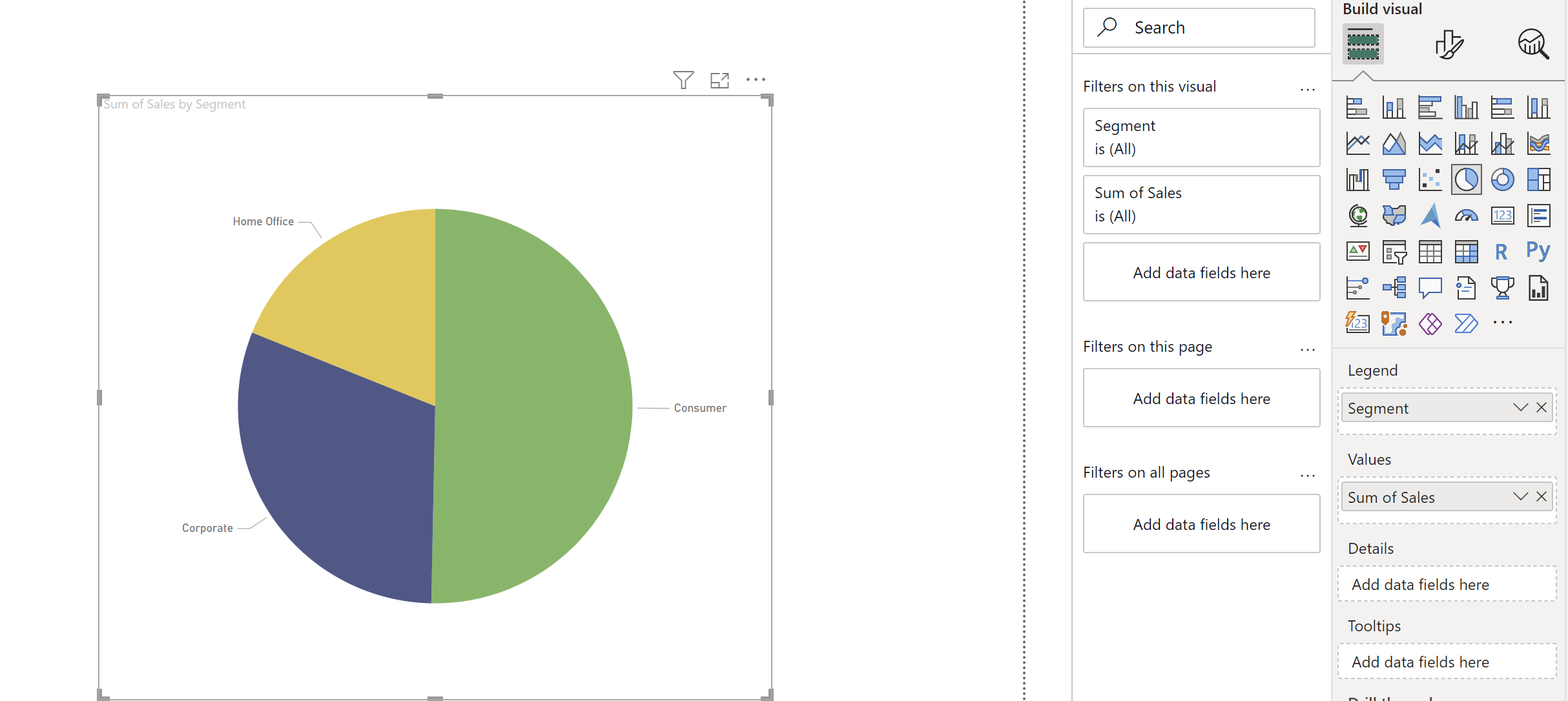
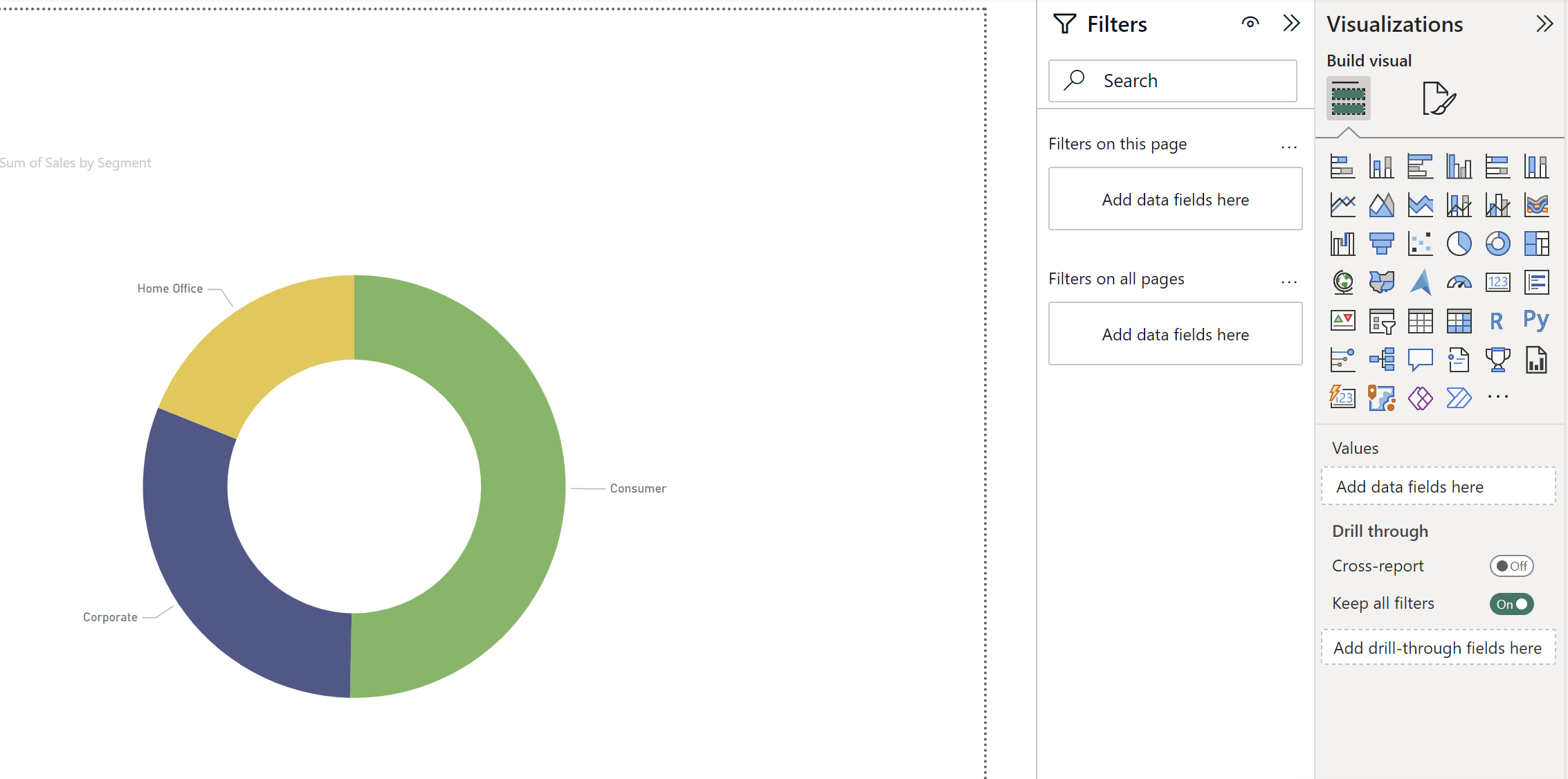
For example let's say we want to visualise some data but are not sure which chart type to use. Once you create a first visualisation, you can select the visualisation and simply select another visualisation type in the visualisation pane and it will automatically change the chart type. You can for example go from a pie chart to a doughnut chart in a single click.
We can also very easily transform those into a bar chart or a table just as easily.
One thing to be careful, sometimes it does not make sense to use certain chart types. For example here we use a categorical field (Segment), therefore, it does not make sense to use a line chart which works better with continuous fields such as dates or measures.
I'm looking forward to learning about other Power BI features and producing my first reports!