


Todays challenge involved using data from the Foodb website to build a visual aid to educate the public about food and their nutrients, taste, content, enzymes, health effects, you name it!
Data Source:https://foodb.ca/
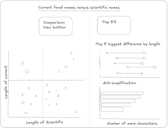
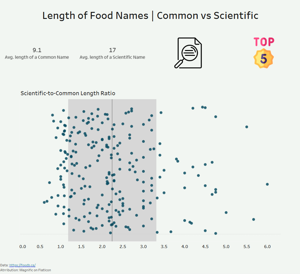
How I Approached the Dashboard: The idea for my dashboard was to compare food items' common names and scientific names. The focus was on how much they differ from one another and whether common names are always simpler than scientific names. I wanted to create two views for the user: an overall exploratory view and a more focused explanatory view that highlights interesting relationships between common and scientific names.
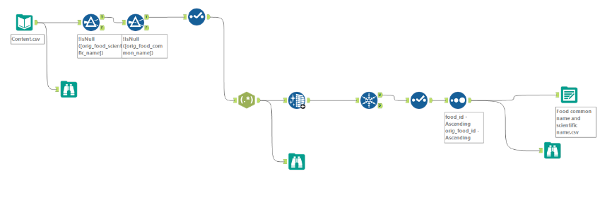
Challenges: There was a massive amount of data provided, so sifting through it to identify the required fields took time. Additionally, the scientific name was embedded in a column alongside other information like author and family. Because of this, I (with some support from Robbin) had to use Regex in Alteryx to extract the clean scientific name for each food item.
My Sketch:
Data Prep in Alteryx:
My Dashboard:
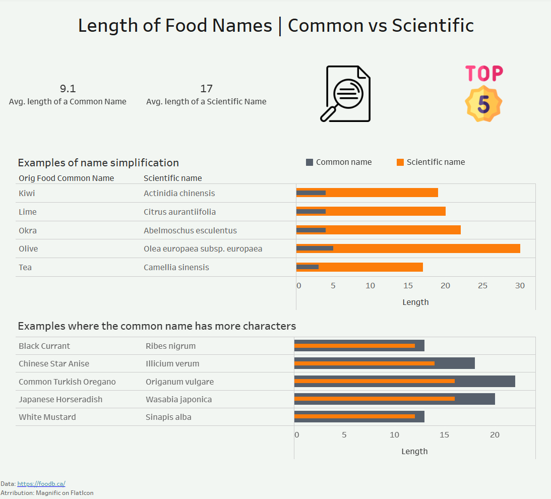
Feedback: Key feedback provided to help push this analysis further would be to incorporate a readability score for both the common name and the scientific name. That way, even if a scientific name is shorter than a common name, I can measure whether it is actually easier to read or pronounce aloud.