


Brief: Build an infographic on a series, genre, set of users, or a compelling story found within the data.
Tool: Whichever visualization tool wasn’t used yesterday (meaning Power BI was my tool today).
Data Source: MyAnimeList.net
How I Approached the Dashboard:
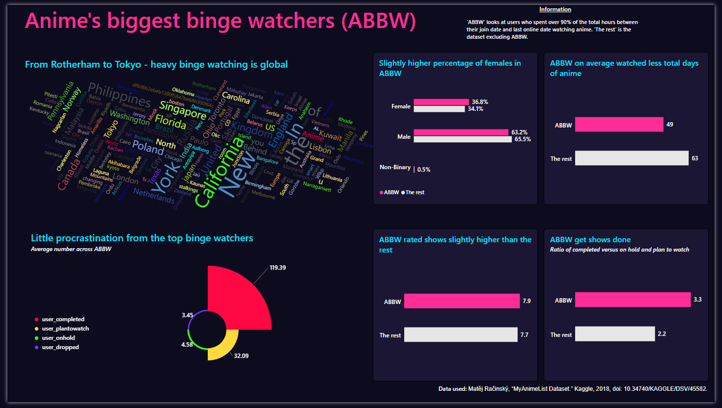
The user table contained total days spent watching anime, the join date and the date last online. Using these three fields, I focused on identifying anime’s biggest binge watchers. The aim was to compare these binge watchers with the rest of the dataset to see how they differ in demographics and user behavior.
Challenges:
Finding bold, exciting visuals required extra research time, though Power BI visual extensions helped significantly. However, since I hadn't used many of these before, it took time to understand how they worked and what data structures they required. Additionally, I spent much more time today on formatting and graph design rather than data prep.
Colour Theme and Formatting:
I found the ability to create a custom theme, using AI to generate the JSON file, which you can then import to Power BI extremely useful. This involved specifying fonts / hex codes to Gemini which then created the JSON file.
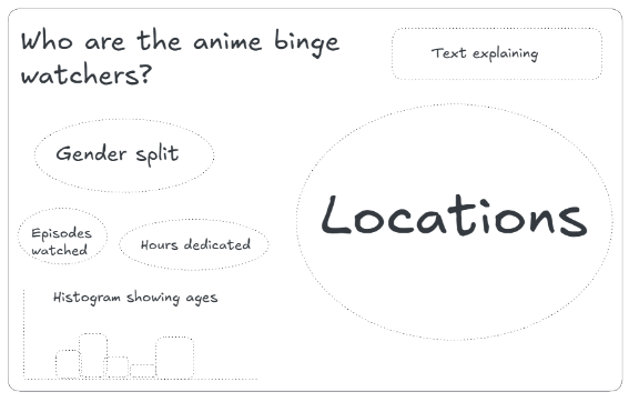
My Sketch:
My Dashboard:
Ideas to Build on the Dashboard:
Some of my cohort created cool-looking dashboards using photos or AI-generated images as backgrounds. Adopting a similar approach would definitely give my dashboard a more artistic, infographic-style feel.