


This week, I tackled a PowerBI Workout Wednesday which utilised a dumbell chart with 3 points on the line. PowerBI doesn't support dumbell charts natively, and we didn't use any custom visuals to achieve this, so how was this possible?
I started by loading in our data using the data.world connector native to PowerBI. In hindsight, this removed some special characters from the data (there are emojis in the price_index field names), which made making the legend more challenging.
First, create a clustered bar chart visual with all the price_index fields on the x-axis. Then place the country field onto the y-axis, splitting our chocolate prices.
Next, the bars need to be stacked directly on top of each other. This can be done in the "layout" dropdown underneath "bars" in format your visual.
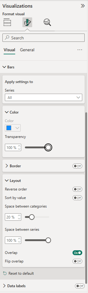
We want to set the transparency of the bars to 100%, so that they're completely invisible. We then want to tick the "overlap" switch, to allow our marks to sit on top of each other and then push the "space between series" slider to 100%.
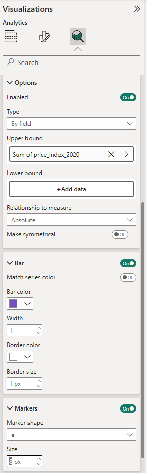
Now the trick comes in, we can create the dots of the dumbell chart by creating error bars that start and end at our different price) index fields. Starting with the price_index_2015 series, set the upper bound to "Sum of price_index_2025" by dragging in the price_index_2025 field. Then set the lower bound to "Sum of price index 2015. This creates bars spanning the difference between these fields, and will serve as the line of our dumbell chart.
Next, we need to add the "dots" that we typically see with a dumbell chart. Starting with the 2015 series, we can go to the "markers" dropdown within "Error bars" and then switch from the default to a solid circle. We are going to leave the colour of this series grey and then move onto the price_index_2020 series. Start by enabling error bars, then drag the price_index_2020 field onto upper bound. Next, change the colour in "bar" to differentiate from the 2015 series and select solid circle in "markers".
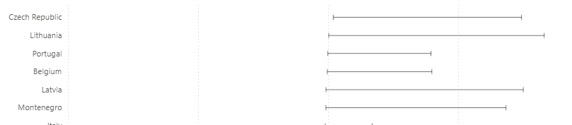
Finally, repeat this process with the 2025 series, again choosing a unique colour. Voila! The dumbell chart is complete, as you can see in the embedded PBI report below. Unfortunately, this wasn't the end of the WoW for me, as I realised that the tooltips were separate sheets! I will tackle that in a future blog, so stay tuned!