Earlier this week my fellow DS13 cohortians and I were introduced to the fact you can give different measures their own unique legends on the same chart. This can be applied whenever you have Measure Names on your row or column shelf, and means you can give each measure a different colour palette! It is also vital in order to correctly configure the tooltip in Workout Wednesday W9.2019, so this post will be incredibly valuable if you’re feeling a bit stuck on that challenge.
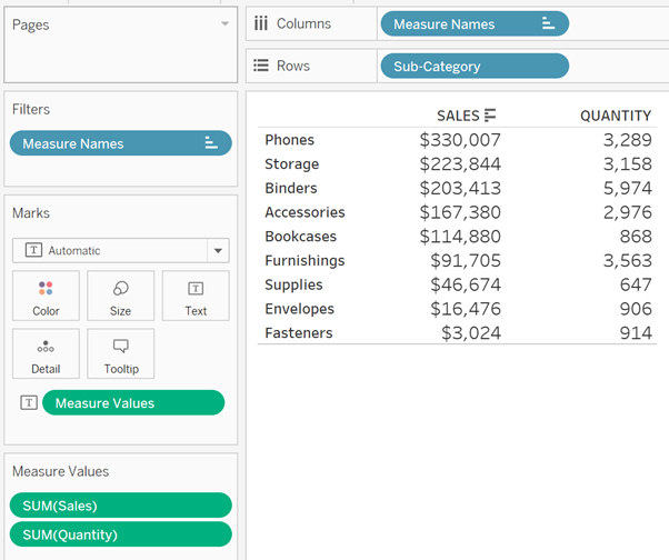
In this example I’ll be using Tableau’s “Sample – Superstore” data set and working from the below starting point.

I’ve filtered out some of the subcategories just to make it easier to view. My goal is to colour the Sales column and Quantity columns differently.
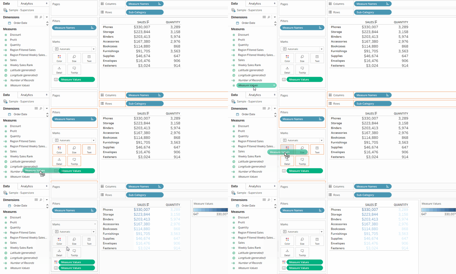
1. Drag Measure Values onto Color.

If you have a similar table as mine above you should now have a single legend that accounts for all of your measure values. Your whole table will also be colour coded based on this legend.
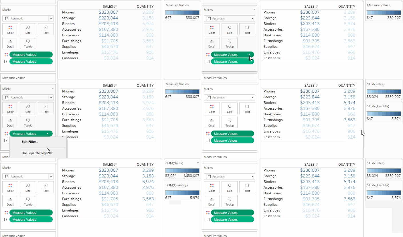
2. Right-click (or hover over and open the drop down menu for) the Measure Values color pill and select “Use Separate Legends”.

Bam! You should now have two separate colour legends for you to play with! From here you can do some pretty cool things. For example, if you:
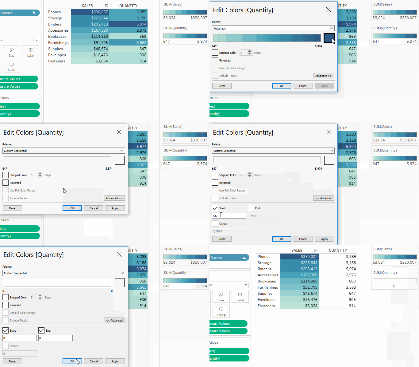
1. Swap the mark type to Square.
2. Open up the colour settings for one of your legends.
3. Set the colour to white and the start and end values both to 0.

And now you have a table where only the sales are colour coded. Neat!
