For today's task we were required to create an "exceptionally designed KPI dashboard" using a data set on San Francisco rent prices (https://www.katepennington.org/data).
The first thing I wanted to do was decide who my user would be, and how the Dashboard would help them. I settled on the idea of someone wanting to move to a San Francesco neighborhood but wanting to find out which would be best for them.
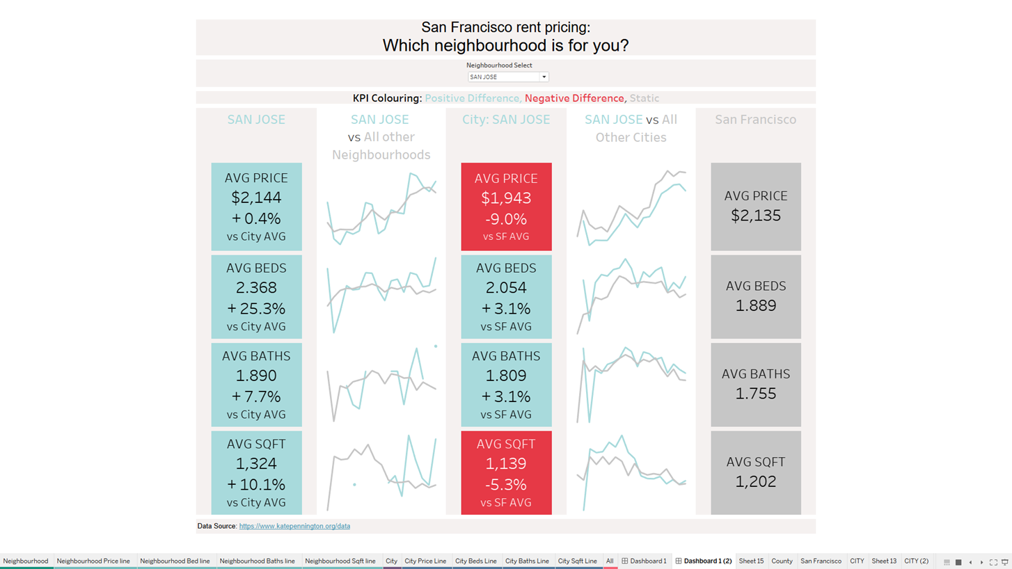
I wanted the user to be able to select a neighborhood and then see how the neighborhood compares to other neighborhoods within the same city and also how the city of that neighborhood compares to other cities within San Francisco.
The areas of comparison I used were:
- Price
- Number of Rooms
- Number of Bathrooms
- Square foot of property
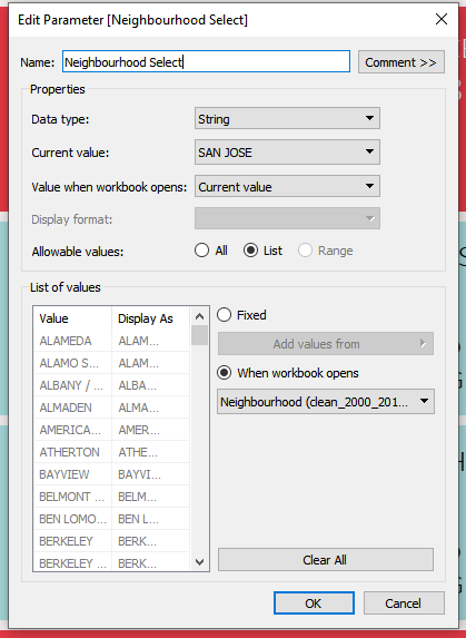
In order to hit this brief (and keep the Dashboard simple for the user) the only filter I wanted the user to have access to was a neighborhood select. I did this using a parameter:
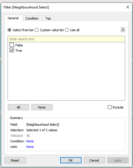
Then added this to the Filter:
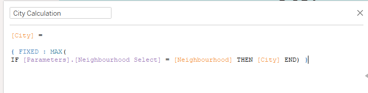
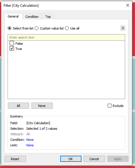
Then in order for the City part of the Dashboard to update according to the 'Neighborhood Select' parameter I created the below:
Then I added this Calculated Field to the Filter for the City page:
The final section showing the San Francisco overview just used the overall averages for my four chosen metrics of comparison.
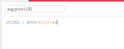
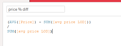
I also decided to have the KPIs change blue / red showing positive and negative comparison. Firstly for the selected neighborhood compared to other neighborhoods in that city, and secondly for the city of that neighborhood compared to other cities within San Francisco.
I did this for all for comparison metrics, by creating for each:
Then:
and dragged this onto Label.
I then created:
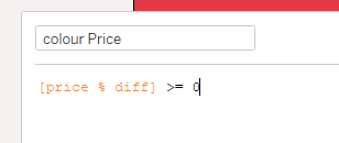
and dragged this onto color (then updated the colors).
Link for the presented Dashboard - San Fran Rent Prices | Tableau Public
Screenshot of the presented Dashboard: