At 8.59 your data school coach will publish the task to convo for you to understand, complete and present by 13:30. Remember to take your lunch! Below I will detail my approach and results.
The Brief:
You have until presentations at 1.30pm to add a complimentary data set to your original application to the Data School to improve your analysis. You can source your new data from anywhere but once you have it downloaded, please use Alteryx or Prep Builder (you choose which) to clean up your new data ready to add it to your work. You’ll present at 1.30 and will watch the other cohort present after.
My approach:
The first thing that I did was to summarise the brief and write the key points that I would then refer to, ensuring the project is completed.
- The first thing that I did was to summarise the brief and write the key points that I would then refer to, ensuring the project is completed.
- Add a complementary data set to my original dataset
- Find and download original dataset
- Source a new dataset
- Use ALTERYX or tableau prep to add this complementary data.
- Use this to embellish my original viz for new graphs and insights
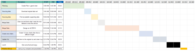
Next I created a Gannt chart to keep me on track with my timings.
Upon sourcing some new data from Kaggle, an online store of datasets, I glanced over the dataset and made a few notes on the current state of the dataset and how it would then need to be cleaned. I spent some time visualising internally what the data would have to look like in order to be added onto my original data.
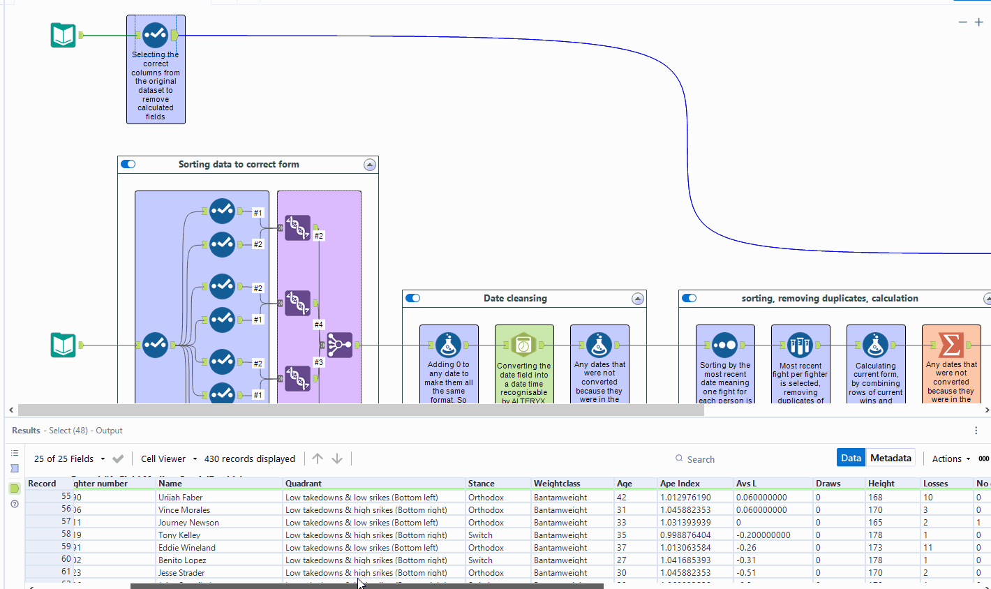
This identified areas that I would have to address in Alteryx to prepare the data to be added onto my own. The following video shows how the original and new data set were structured and the workflow necessary to merge the data.
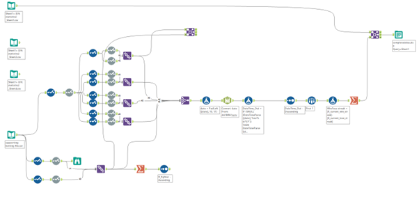
My original workflow:
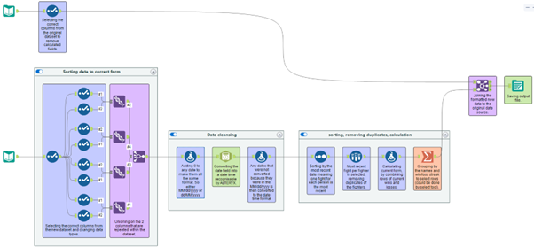
After tidying workflow results:
Reflections:
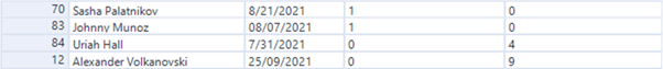
Overall the new data set tracks the fights between competitors, tracking the statistics of each fight such as the winner, strikes landed per minute, takedowns per minute and many other statistics. Due to the structure of the data sets there are 2 fighters and their following fight statistics on each row; also there are duplicates of fighters in rows as each bout a fighter has is added as a new row.
To quickly run through the workflow I isolated each column that would be necessary, separated them into the red corner and blue corner fighter, union them to create a long list with every fighter and many duplicates, join all of the column together, convert to dates, sort by most recent dates and sample for the most recent fight subsequently removing duplicated then join onto my original data set.
After streamlining my initial workflow I labelled and explained the use of every tool and the rationale behind them.
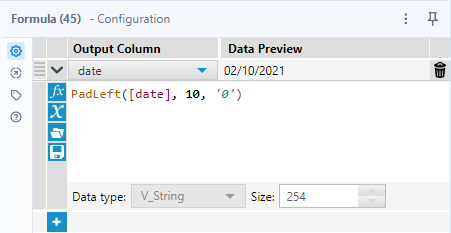
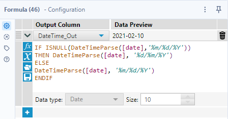
The main problem with the data set is the dates and the different manipulations that I had to use to mould it into a form readable by Alteryx. Firstly, some dates were in a d/MM/yyyy whilst others were dd/MM/yyyy format. The dates also varied from an American to an English date format.
The solution:
Final thoughts:
The scoping and blocking more time for the revision of a presentation are the most important parts of the process that I must improve upon.
https://public.tableau.com/app/profile/joel.akaje.macauley/viz/Week1addon/Dashboard2