


What is a Scatter Plot?
A Scatter Plot (also known as a Scatter Graph or Scatter Chart) is a visual representation of data points on a graph, where each data point is represented as a dot (a mark in Tableau). The placement of dots is determined by the values of two variables (two continuous measures in Tableau), one on the x-axis and the other on the y-axis.
This arrangement allows you to observe patterns, correlations, clusters, and trends that might not be immediately apparent in tabular view (a table).
The size of the dots can also be utilized to represent an additional measure, adding yet another dimension for viewing differences and relationships within the data.
Moreover, colour can be employed to categorize dots, like different product types, enriching scatter plot insights. Yet, it's recommended to avoid too many colors in one view to prevent visual confusion.
Dependent and Independent variables
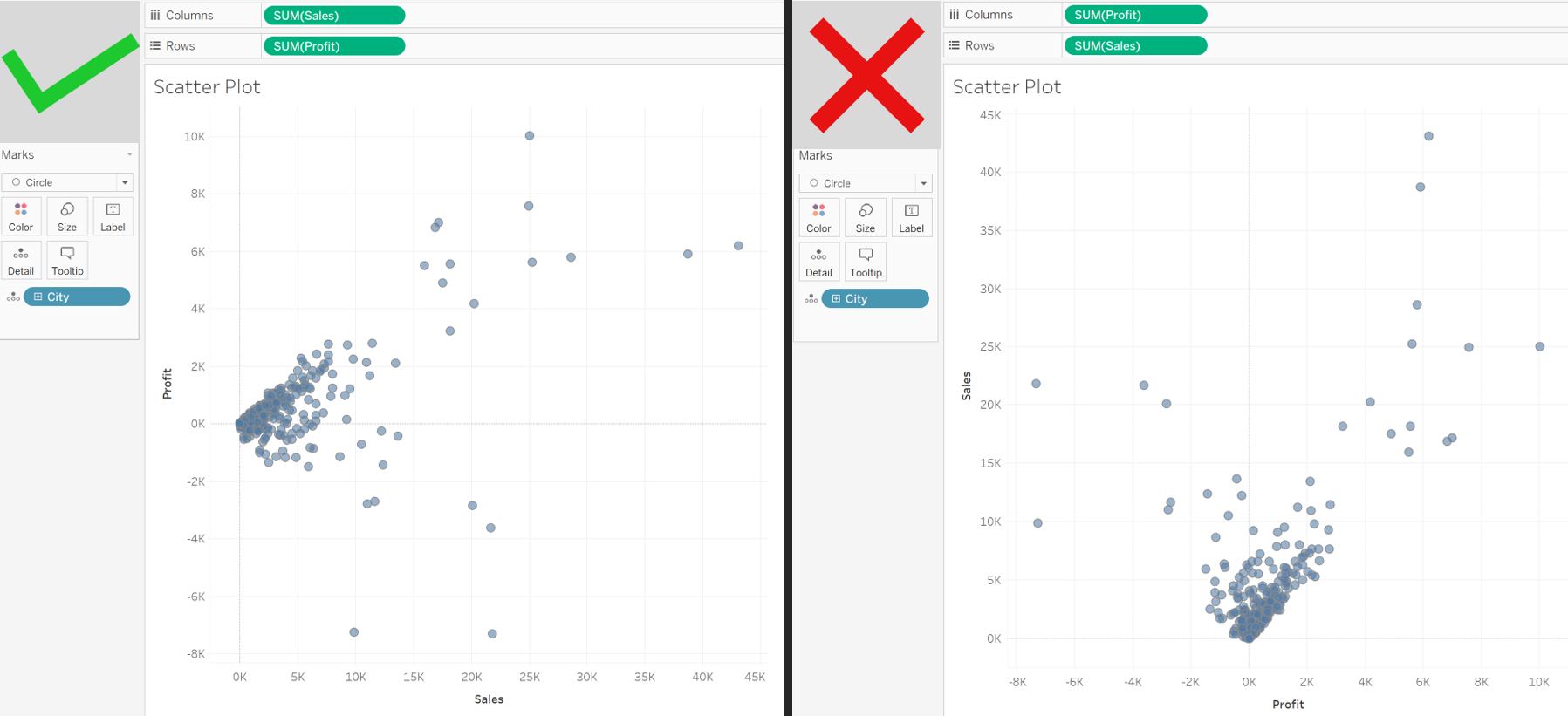
For a meaningful scatter plot, remember to place the independent variable on the x-axis and the dependent variable on the y-axis. For example, if you are exploring the relationship between sales and profit, place sales (independent variable) on the x-axis because profit (dependent variable) wouldn’t exist without sales.
Try to Create Your Scatter Plot in Tableau
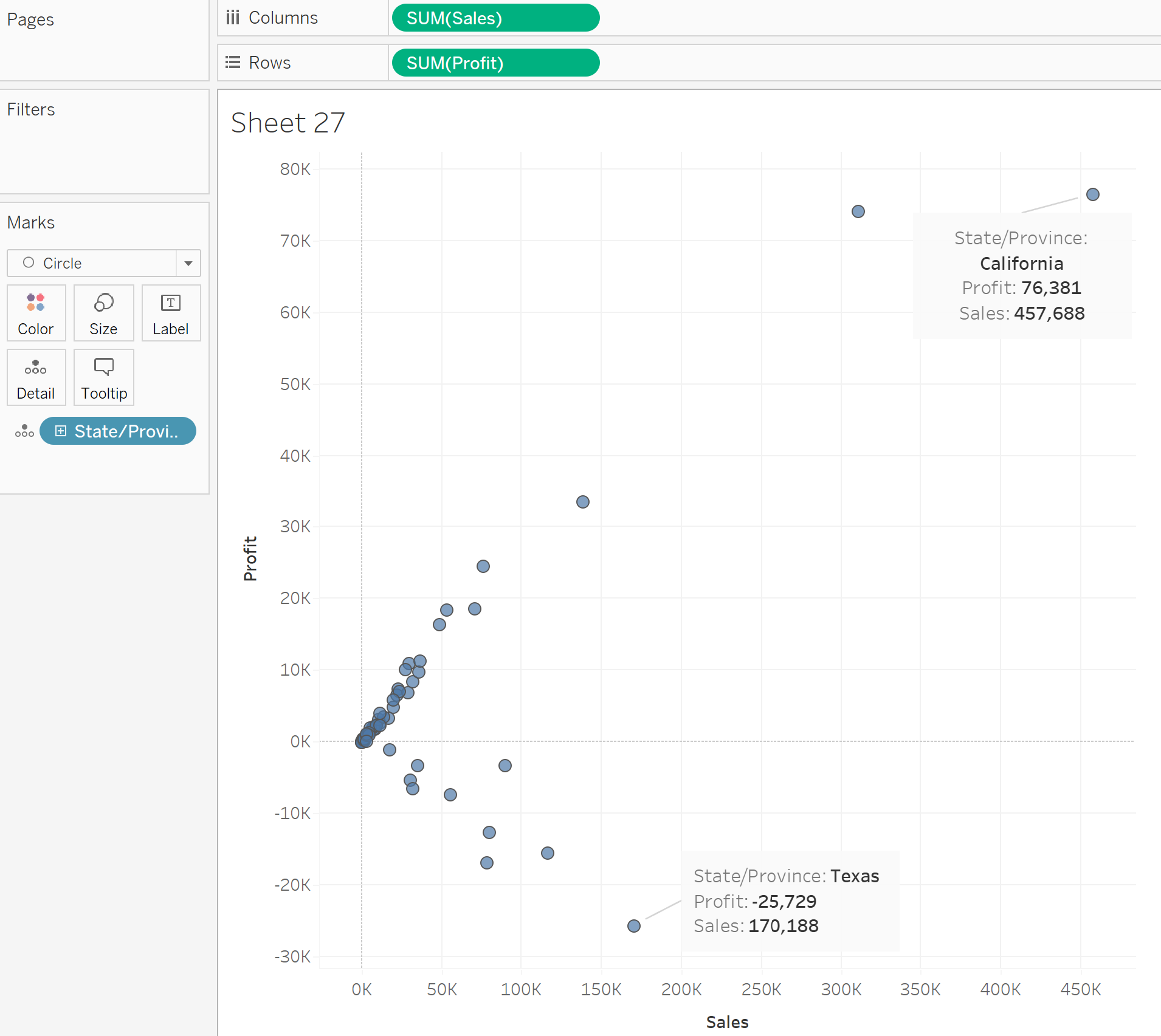
A simple scatter plot with two variables allows us to quickly identify outliers. For example, in the picture below, you can see that California has the highest sum of sales and brought us the highest profit. However, despite Texas' decent sales ranking in third place, it has the greatest loss in comparison to the rest of the US states.
Let's find out in which category of our products Texas is losing. Drag 'Category' to the 'Color' in the 'Marks' shelf. Right-click on 'State/Province' and choose 'Show Highlighter' so we can highlight only Texas.
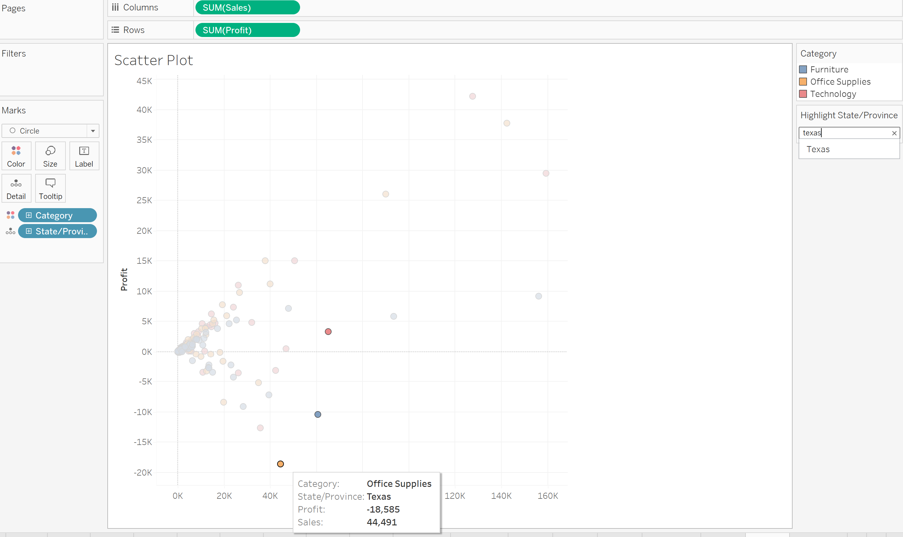
We have found that our Office Supplies in Texas have generated a loss of $18,585.
Interesting Fact
You can have an unlimited number of dots (marks) in Tableau, while Power BI is limited to only 3000 of them.