


This is by far my favorite project so far, because it sparked so many ideas and allowed me to connect data with a deeply personal story. Today, I analyzed the Apple Music history of a close friend known for her exquisite taste in music. My goal was to completely abandon traditional dashboards and build something experimental, creative, and dark—matching the exact vibe of her favorite tracks.
Inspired by her preference for electronic, ambient, metal, and punk, I went for a look that resembles an abstract, mysterious LP cover. Instead of serving a full analysis on a silver platter, I wanted users to explore and get lost in the data. Just like we feel and experience music rather than rationally understanding it, I wanted users to truly experience this data as well, letting it take them wherever it takes them.
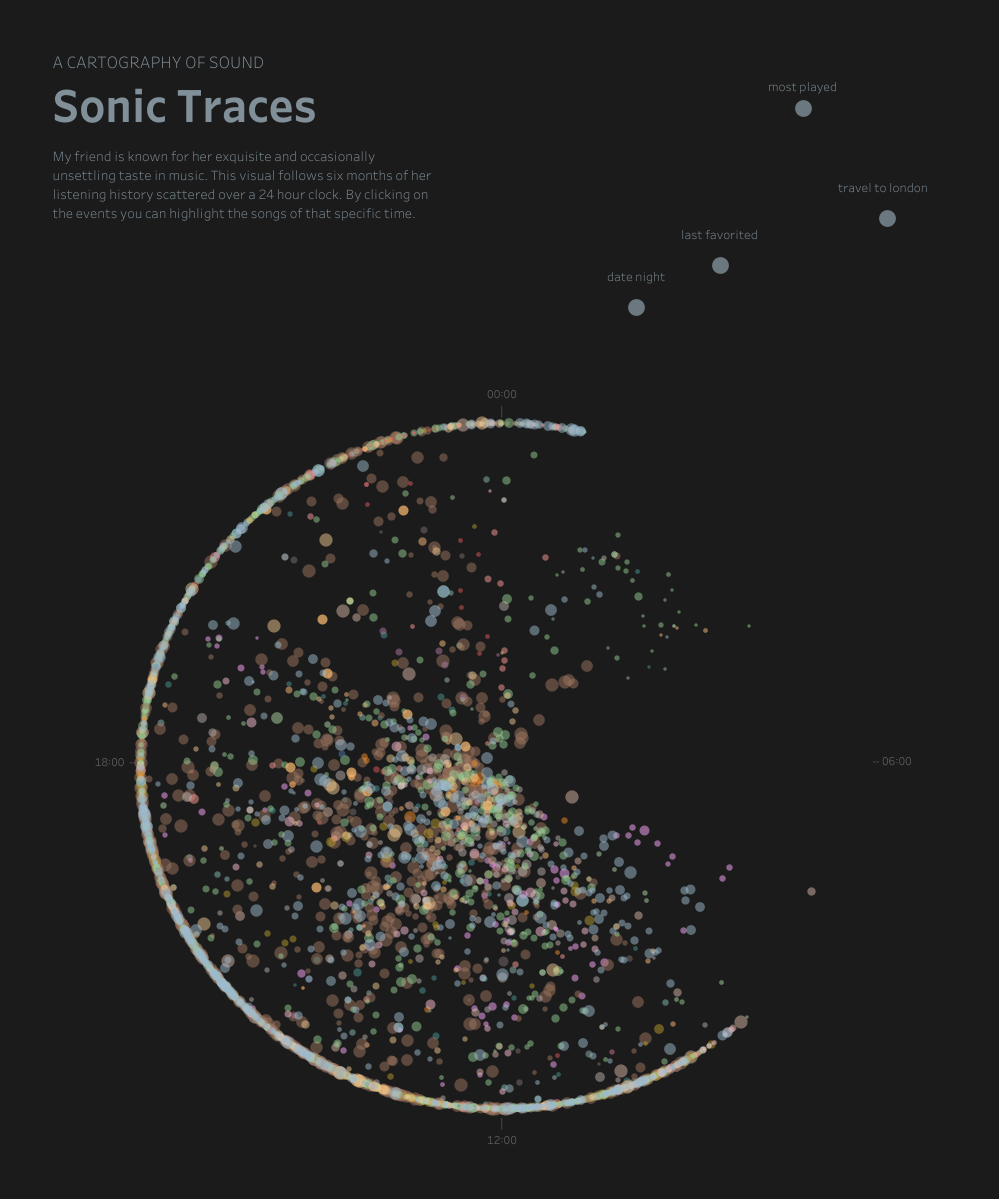
There Is Logic Behind the Chaos
Though it might seem a random scatter at first sight, there is actually some logic behind the chaos:
- The LP Aesthetic: The dark background and circular layout are a direct nod to vinyl covers.
- Structure at Second Sight: The circle functions as a 24-hour clock with 00:00 at the top and 12:00 at the bottom, making her nightly downtime instantly visible. Inside that framework, song frequency dictates size—more frequently played songs appear larger—while skipped songs are pulled deeper toward the center of the circle.
- Deliberate Mystery: I intentionally built in some slowness. For example, the colors are coded by genre, but there is no legend. This forces users to discover the patterns and decipher the code as they go.
Current Features & Happy Accidents
I originally wanted to create a second, outer circle following a 365-day calendar logic, where clicking a daily dot would highlight that day's music. Due to time constraints, I had to pivot for now. Instead, I placed four specific "events" in the top right corner representing special milestones like trips to other cities. Clicking these, will highlight the relevant data of the event.
Interestingly, a small mathematical accident in my radius logic caused a row of dots to line up perfectly along the border. While they are just songs right now and not calendar days, it created a similar visual look I was aiming for.
What’s Next
Since this project is so personal, I still have plenty of ideas. I will definitely give the full calendar circle another try. I also want to enhance the existing events by adding audio previews to a small election of songs, allowing users to hear the exact music from that specific moment in time and truly relive the mood.
You can check out the current version here, it will be updated soon.