


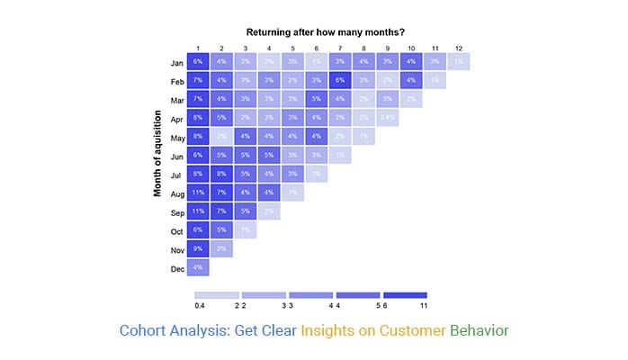
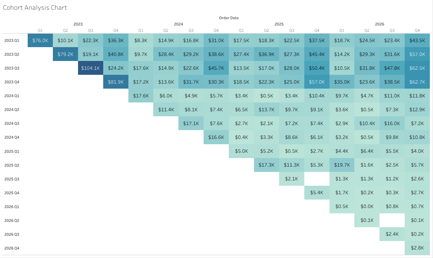
During a recent client project, I had the opportunity to build a cohort chart in Tableau for the first time. Cohort charts are a unique way to visualize data because they provide the user a specific framework in which to conduct their analysis (by a sub-set aka cohort). For example, a business could use a cohort chart to aid in the development of a segmentation strategy. If a cohort represents a sub-set of their users/consumers, they could analyze the quantity or usage of certain products amongst various cohorts. If certain cohorts seem more engaged with the product or company than others then they know exactly who to target—how to partition the market to get a competitive advantage. Below is an example of a cohort chart.
How to Build a Cohort Chart
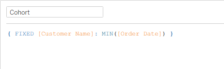
- Create your cohort. In the context of the superstore data, I’ve defined a cohort as the year and quarter in which a customer made their first purchase. So, all people that made their first purchase in the first three months of 2024 would be in a cohort; Q1 2024. We can create a cohort using a FIXED LOD calculation:
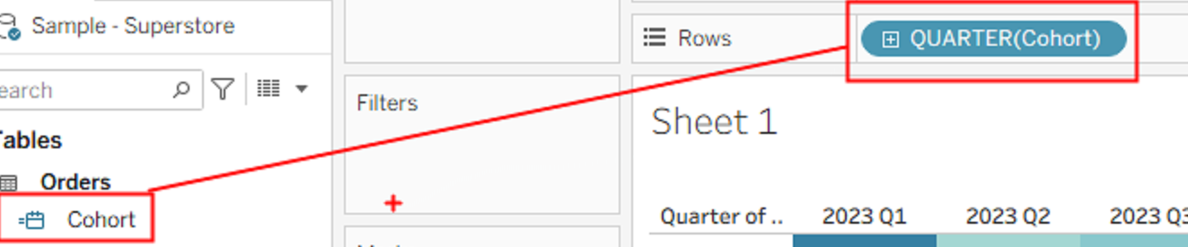
- Bring your cohort on to rows. This field should be a date based on our LOD. In this view I have truncated my order date to quarter. You can do this by right-clicking on the cohort field and selecting quarter from the drop down menu.
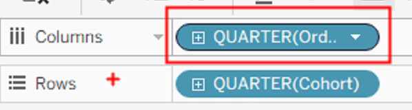
- Bring your continuous date on to columns. In the following screenshot, I’ve changed my order date to a discrete date for the sake of user clarity in the visualization but the chart will still work with a continuous date.
- Build a heat map! Don’t worry this part is only two small steps
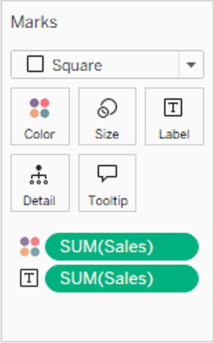
- Change your Mark Type to a square
- Drag SUM(Sales) onto Color and Label
You should end up something like this:
Optional: Make It Interactive
Adding interactivity to your visualizations is a great way to allow your user to determine the scope of their analysis. We can make the cohort chart interactive by adding a parameter that allows the user to choose the start date of the chart. You can do this in three simple steps:
- First, create and show a parameter called “Select a Start Date” with these three conditions met:
- Data type is a date.
- Allowable values are a “range” (adding the dates from the order date field).
- Step size is a quarter.
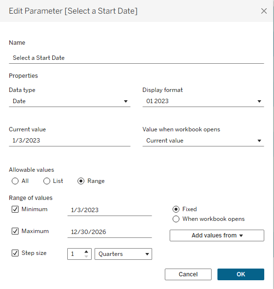
- Second, connect the parameter to the data using a calculated field. Since we’re selecting a start date, all subsequent dates will be less than or equal to it since they are later (or newer) dates.
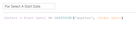
- Lastly, add your parameter calculated field to the filters shelf.
That’s it! You’ve officially created a cohort chart in Tableau!