


Most of my Tableau education happened on a need-to-know basis. If I wanted to make something happen in my dashboard, I researched it, read a few blogs, then implemented it and went on with my process. Data School training approaches Tableau development differently, with in-depth sessions exploring different sections of the software in detail.
One part of the Tableau interface where I wish I had taken the Data School approach with initially is the toolbar. It is found under the file menus and right above the canvas:

Some of the icons are pretty self-explanatory. Clicking the left arrow undoes an action, clicking the projector screen converts the display into full screen. Since many of the the less obvious ones are actually extremely useful, this blog will go through each and every icon available on the Tableau toolbar describing what they do and when they might be useful.
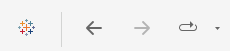
- The Tableau logo (with all of the little '+' symbols) takes you from the canvas view to the data source view, which can be useful to navigate back to that screen when working with a slow data source or before you put data in at all!
- The back and front arrows are undo and redo buttons, which are useful alternatives to the classic keyboard shortcuts.
- The next icon is for replaying animations, the movements that occur when a view changes in Tableau. If animations are on in a dashboard (they usually are) then this button gives the option to replay the most recent animation at varying speeds.
These next three have to do with data sources:
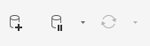
- The cylinder with a '+' lets you quickly add a new datasource to your workbook.
- The cylinder with a pause icon can be used to pause auto-updates, which can speed up workbooks using large data sources.
- The cycle icon refreshes the data source (it is greyed out because it is already refreshed in the workbook I took this screenshot in).
From here, we get into actions having to do with sheets:
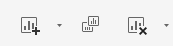
- The first icon shown lets you add a new sheet to your workbook, with the dropdown letting you choose between a worksheet, dashboard, and story.
- The second lets you quickly duplicate your current sheet. Otherwise, you would need to right click the sheet's tab on the bottom of the canvas in order to duplicate. I didn't know about this button before writing this blog!
- The third icon gives you options for clearing the worksheet. Without using the dropdown, the button empties the sheet to look like you had just opened it, but the dropdown allows for more precise clearing of formatting.
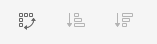
- The first icon in this group lets you quickly swap the axes, placing the Row pills onto Columns and visa versa. This is particularly convenient when you want to envision what a graph would look like 'sideways' without moving a bunch of pills.
- The other two icons are used for sorting charts, typically bar graphs. The one with the small bar at the top sorts ascending, while the one with the large bar at the top sorts descending. Sorting is also somewhat involved to do manually, so this can help to get a quick look as maximum and minimum values.
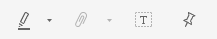
- The marker/highlighter logo controls highlighting, enabling the user to toggle highlighting on or off, or choose which fields get highlighted.
- The paperclip can be used to group selected categories quickly based on selections in the view.
- The dotted box with a 'T' in it is used to quickly add labels to a chart, which comes in handy quite a lot in practice.
- The pin restores the original version of the view, whether that is the centering of a scatterplot or the geographic location of a map. I most often use this after I have been messing with a map on a Tableau dashboard and completely lose track of where I started.
The final stretch!
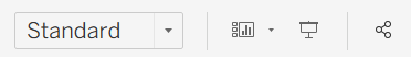
- The dropdown with Standard helps you decide how fully your charts fill out your canvas. Standard is the default, but other options such as 'fit width', 'fit height', and 'entire view' fill up different dimensions of the canvas for easier analysis.
- The next icon lets you determine which cards are shown in the view. Cards are the different components that make up the view, such as the title, caption, subtitle, and even the marks card. Once you hide a card it can seem like it is permanently gone, but here is where you can go to get it back.
- As I mentioned in the introduction, this next icon sets the dashboard view to full screen, which is great for presenting your work.
- Similarly, the classic 'share' icon enables you to publish your work via Tableau server or Tableau Cloud.

- The little alien icon (or at least it looks like that to me) allows you to interact with a Tableau agent, which is only available for particular users.
- The signpost gives you a data guide, which brings up some information to inform the user about the data behind the current view.
- Last, the 'Show Me' tab brings up a list of the possible charts that Tableau is capable of producing. If you click one, it will automatically suggest fields to populate that kind of chart type. Use this at your own risk, it rarely produces what you are imagining!
I hope this tour of the Tableau toolbar has been informative and will help you get around the interface a bit more smoothly. Have fun dashboarding!