


Data analysts build histograms to assess how data is distributed. They give you information about the center, shape, and spread of a data set. One of the most desirable data distributions is the normal curve commonly known as the bell curve. Without getting into more of the statistics content (that might be reserved for a later blog), the normal curve tends to appear in nature and is very useful to make inferences about future unknown data.
When an analyst scans a histogram to assess normality, the best the human eye can really do is assess symmetry! The normal curve describes a very specific spread centered at a specific mean and spread by a standard deviation. It would be useful if you could easily overlay a normal curve onto your histogram to see how close it fits and where your distribution is over and under the curve.
To get started, open up a new Tableau workbook and connect to the Sample - Superstore dataset that comes with every edition of Tableau. We are going to make a histogram of profit first. Tableau's default functionality to make bins for histograms makes them discrete which means they are plotted as their own categories on the x-axis. To make them continuous, we need custom bins. To do this, you can make the following calculation:
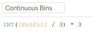
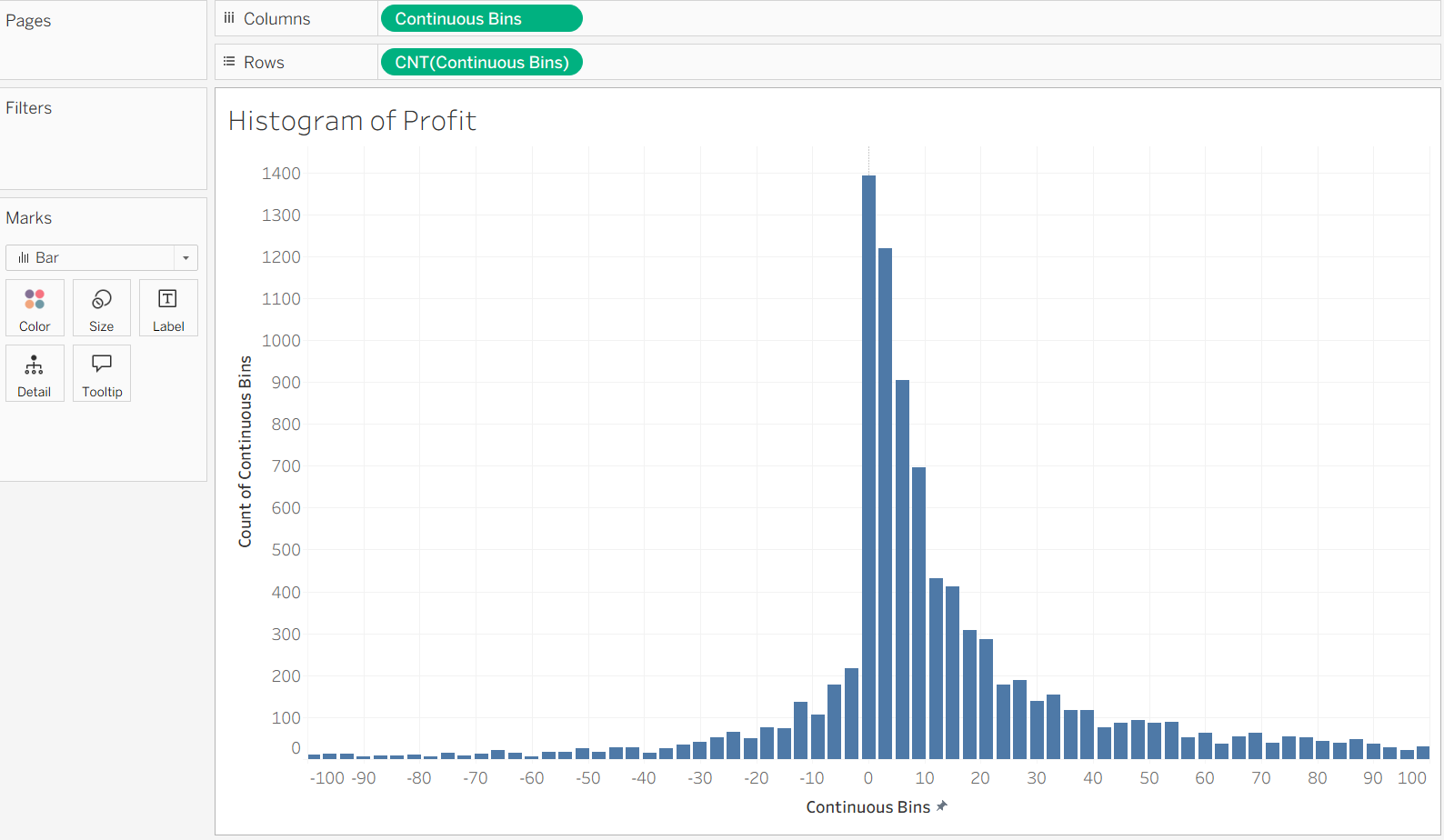
I chose 3 to be my bin size for visualization purposes, but this number can vary based on the application. Next, drag these bins to the columns as a dimension. From there, move a Count of these bins to the rows and set the marks as bars to create the histogram.
Next, we need to figure out how to make a bell curve! I will spare you most of the math and give you this calculated field:
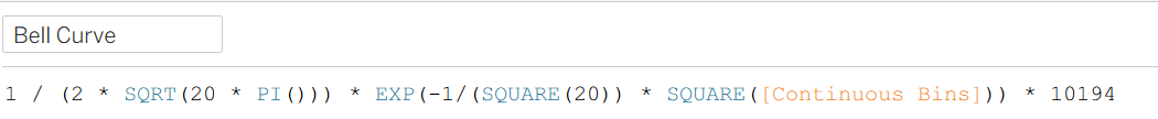
For the familiar reader, you will notice that I have chosen 20 as the standard deviation for this bell curve, and I chose 0 for the mean (so it would not have to appear in the calculation). To make the axes work together easily, I have also multiplied by the sample size of 10,194. Finally, add the bell curve calculated field as a dimension to the plot, set its mark type to be a line, then make the axes dual, and synchronize them.
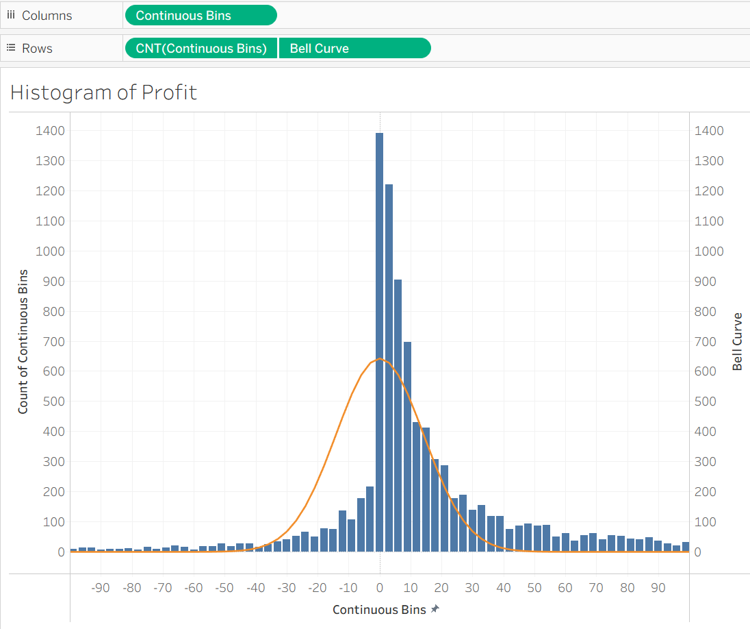
At last we have some insight! The distribution of profits in the Sample - Superstore dataset is pretty close to normal, although it is a bit heaver between 0 and 30 and much lighter between -30 and 0. The tail towards positive profit also exceeds the normal distribution. In general, the distribution has a moderately strong left skew, meaning density towards the right and a tail toward the left.