


Textual data is ubiquitous in the internet age, with social media providing a wealth of opportunities to learn about people's opinions about virtually everything. Although Tableau is more focused on quantifiable data, it is also capable of analyzing text to extract the sentiments within it.
Step 1: How can we figure out sentiment?
There is an entire field dedicated to quantifying different emotions, but for the sake of this blog post I will be delineating sentiments into three buckets: positive, negative, and neutral. To find these sentiment associations for words throughout the English language, I found a Kaggle page with two extremely long list of positively associated and negatively associated words.
Step 2: What text are we analyzing?
This step is only limited by your creativity, but for my sake I wanted to analyze some classic, well-known writing. I selected three of Aesop's Fables and loaded them into a Google Sheet such that I had a column of fable titles, each with a corresponding cell containing the entire text of that fable.

Step 3: Data Cleanup and Transformation!
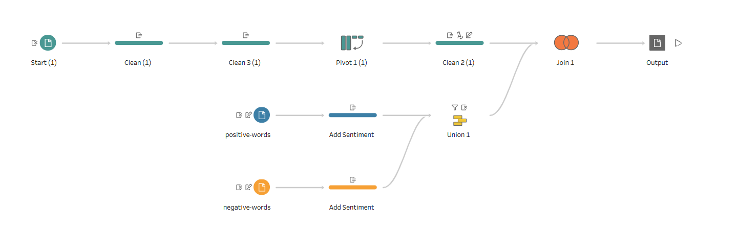
To make use of both of these sets of information, I cleaned and combined them using Tableau Prep, Tableau's data preparation software. My Tableau Prep flow started by converting the previous 3x2 dataset into a much longer format. First, I cleaned the 'Text' column by making everything lowercase and removing punctuation. This way, when I split 'Text' using the space character, it creates 150 columns for each of that index of word (or null if there were fewer words in the fable). At this point, the table was 3x151. Next, I pivoted such that each word became its own record, complete with a title, a word, and an index representing which number word that word was within its fable.
From here, the positive and negative words had to be consolidated into their own data table instead of just being two lists. T0 do this, I added a 'Sentiment' column to each of the lists, then unioned the two lists.
Finally, I did a full outer join of the two data tables. The final data format includes a row for every word that was either in the sentiment dataset or in the selected fables. This way, we get "null" sentiment values for the words in the fables that were not included in the Kaggle dataset, which will prove useful later.
Here is a glimpse at the Tableau Prep flow that did everything I just explained!
Step 4: Let's Visualize!
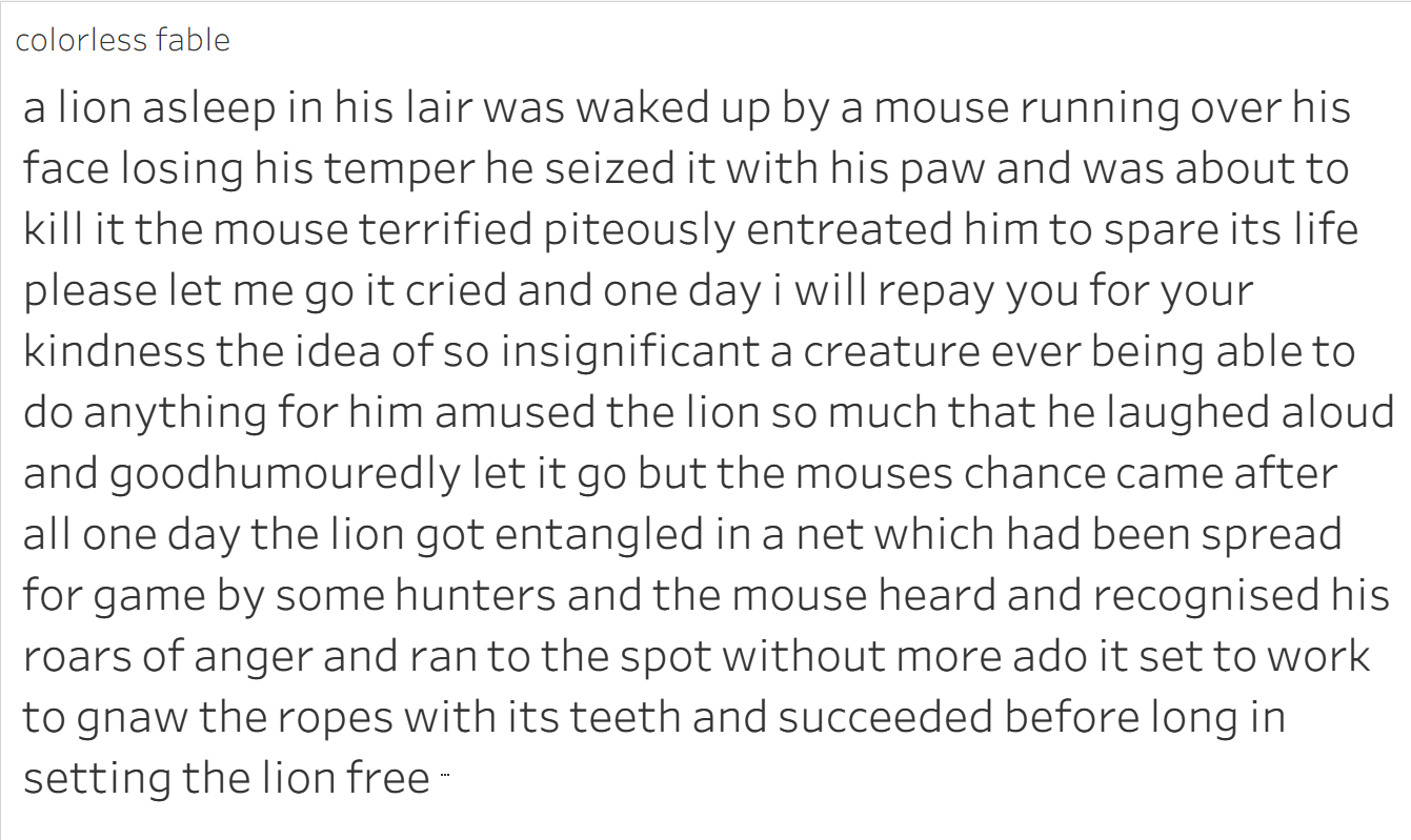
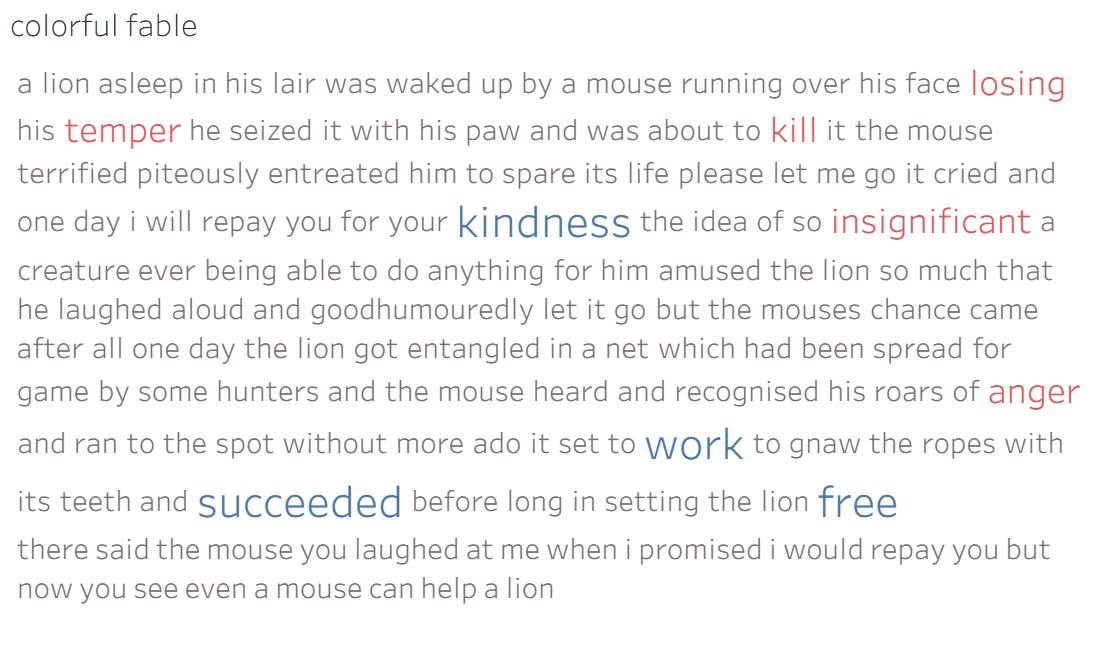
After extracting the output from Tableau Prep into Tableau, everything was ready to be plotted. To look at only one of the fables, I filtered by a single title, for this example "The Lion and the Mouse". Next, I ordered the words from this fable using their index, then plotted each word as a text mark, giving us the original text in a single color.
From here, I added the sentiment field as both a color and size mark, separating out the words where we have information about the sentiment. I set it so that all words with a known sentiment are larger, and unknown sentiments are colored grey, positive sentiments are colored blue, and negative sentiments are colored red. Here is the final product:
The cool part about this software is that it is extremely transparent and reproducible! If you replicate this procedure with your own text you will end up with a similar looking visualization at the end for your own text. In the future, I will try to do some more intricate sentiment analysis, but positive vs. negative is a great start and a cool example of what Tableau is capable of in terms of analyzing text!