


Understanding the difference between the BLUE and GREEN FIELDS is key when using Tableau.
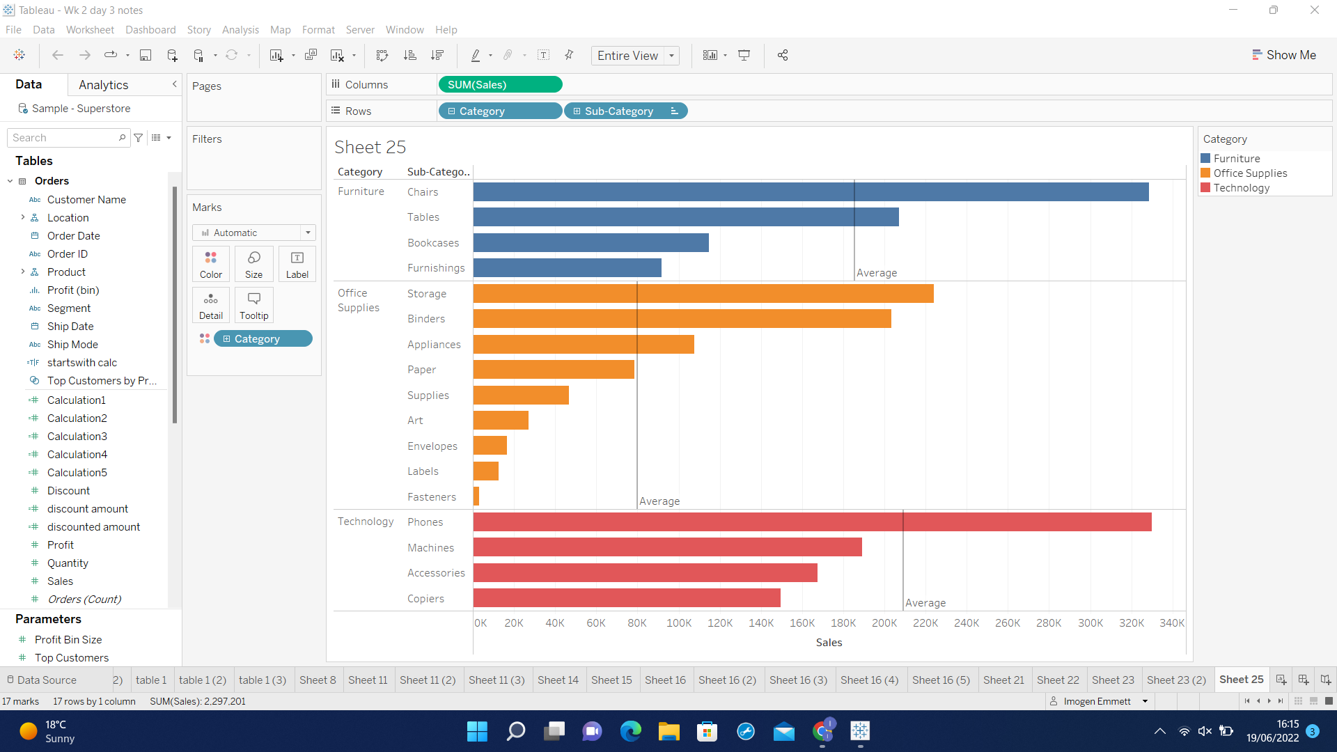
One of the first things we notice in Tableau is that the icons in the data window are either blue or green (see image below). In the graph below, we can also see that a number of blue fields appear on the row shelf and the colour shelf; and a green field appears on the column shelf.
So what does the colour BLUE and GREEN indicate?
It is a common misconception that the blue colour indicates a dimension and the green colour a measure. This conclusion is easily reached as most dimensions are blue and most measures are green, but this is not correct.
The colour is in fact used to indicate which fields are discrete and which are continuous.
BLUE FIELDS correspond to discrete data
GREEN FIELDS correspond to continuous data
So what does this mean?
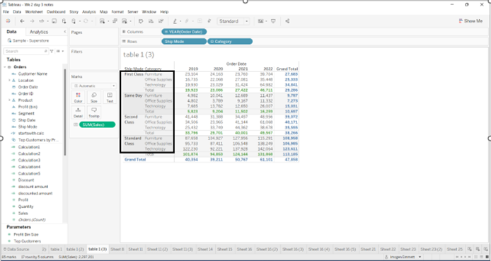
- Discrete data contains a finite number of values, for example the field 'ship mode' only contains the values First class/Same day/Second class and Standard class. When this type of data is added to the row or column shelf Tableau responds by displaying a Tableau header - as highlighted below.
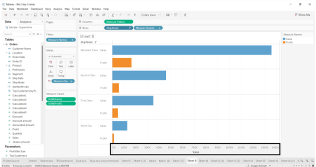
- Continuous data on the other hand can contain an infinite number of values, for example the field 'profit' could take on any value. When this type of data is added to the row or column shelf Tableau responds very differently by drawing an axis - as highlighted below.
IMPORTANT NOTE: some fields can be both discrete and continuous
Date fields are an interesting example as they can either be discrete or continuous:
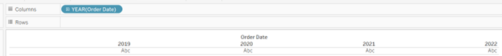
Discrete dates - the value (Abc) corresponds to that year only.
Continuous dates - the value could correspond to any date within a scale.
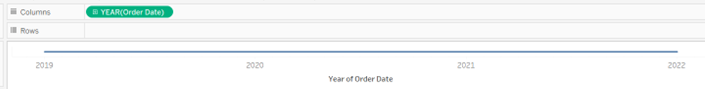
Tableau intuitively creates a table (with headers) for discrete fields and an axis for continuous fields when we double click on a field - this is a good indication of whether a field is discrete or continuous.