


Tableau’s Dashboard Item Hierarchy displays the structure of all the objects used in your dashboard. You can find it at the bottom of the Layout tab in the left-hand panel of the dashboard view.
We had our first dashboarding exercise today, and I found myself going back to this panel and scrolling through it incessantly.
The task was to recreate a sample dashboard as closely as we could in an hour.
The goal of the exercise was to practice choosing and organizing the correct containers for our dashboard objects and ultimately producing a close-enough recreation.
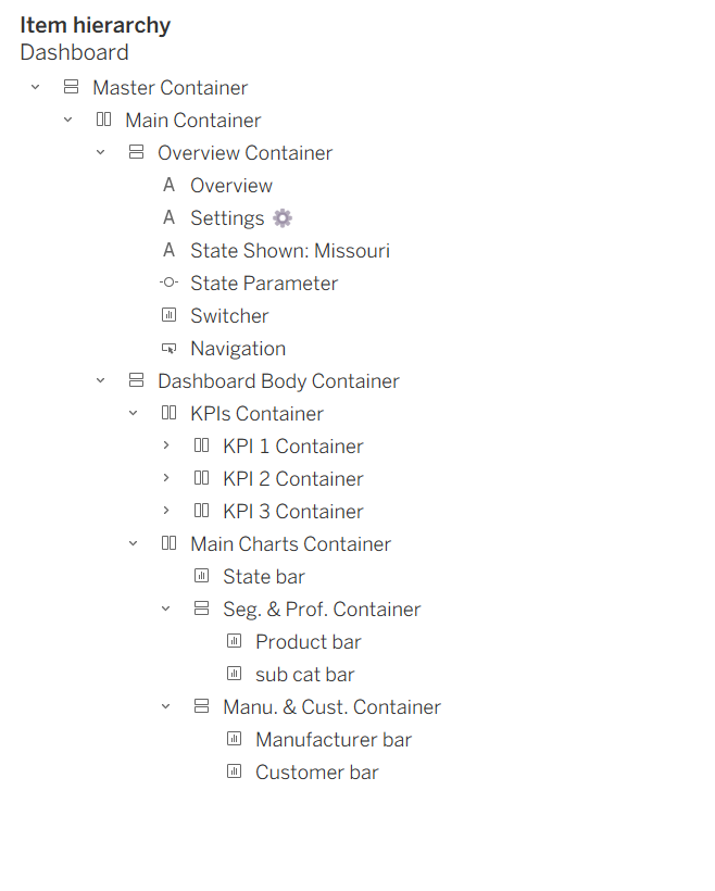
One helpful feature of the Item Hierarchy is that you can rename all the objects in it, especially containers.
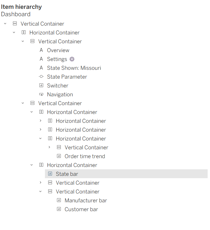
I did not do this during the exercise, and at some point, all the containers started blending together. I would click on one, thinking it was another, and end up making changes to the wrong container.
It's especially easy for me to mix these up under a time crunch.
Here's what my panel initially looked like:
And here's what it looked like after I renamed my containers:
In my next build, I'll make sure to take the time to rename my containers as I go.
I also see this as another way of documenting my work. It makes it easier for me to navigate and make changes, but also for someone else to understand the structure if I were to hand my work over.
EXTRA TIP: Resizing can get frustrating when a container is pinned. Instead of going through each one on the dashboard, I found it easier to locate and manage them through the Item Hierarchy.