


This project began with a fictional stakeholder brief for PitchSide Pro, an online sports retailer. The aim was to create an executive overview bringing together website traffic and sales performance, while allowing users to investigate patterns by season, channel, region, product and customer.
Starting with a plan
Rather than opening Tableau immediately and working things out as I went, I dedicated the first day to understanding the brief, asking follow-up questions and sketching the dashboard.
This helped me decide which questions the dashboard needed to answer, how users would move between high-level performance and supporting detail, and which charts could share a consistent structure. It also gave me time to work through the data model, which contained separate Sales and Traffic fact tables connected to shared Date, Channel and Region dimensions.
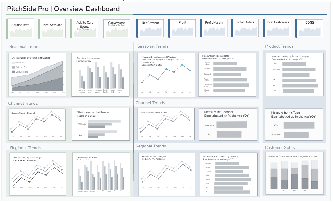
The resulting sketch separated Traffic and Sales visually while retaining common sections for seasonal, channel and regional trends. KPI cards provided the headline figures, with additional views for product performance and customer segments.
Responding to stakeholder feedback
One of the most useful pieces of stakeholder feedback was that I needed to lock down how colour and time periods would work across the dashboard.
This led to several additions to the sketch:
- Teal highlights positive performance and red highlights negative performance.
- Bar charts and KPI cards compare the selected current period with the same period last year.
- Users can switch these comparisons between MTD, QTD and YTD.
- Line charts retain the full five years of history, with reference bands showing the current and prior comparison periods in context.
This meant the different chart types could serve different purposes. The bars and KPIs provide a focused performance comparison, while the lines show whether that result forms part of a longer-term trend.
The Sales charts also include a measure selector, allowing users to move between Net Revenue, Profit, Profit Margin, Orders, Customers and COGS without requiring a separate set of charts for every metric.
The final dashboard
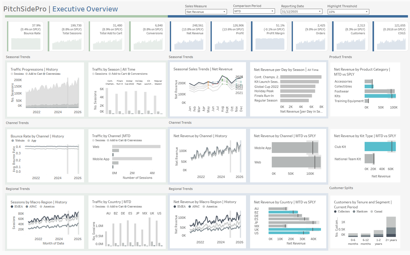
The completed dashboard combines ten KPI cards with views covering the customer journey, seasonal peaks, channels, regions, products, kit types and customer tenure.
Reflections and next steps
There are still things I would improve with more time. In particular, I would make the dashboard slightly larger, give some charts more breathing room and complete another round of formatting and tooltip polish.
The biggest lesson was that planning absolutely saved time overall. I would not have been able to build this dashboard in a day without the decisions already being made. However, the build was still tight for time because the plan itself was ambitious.
That is useful to remember going into Dashboard Week next week: planning makes an ambitious build possible, but it does not make the scope any smaller!