


The brief
For the third day of Dashboard Week, the challenge was to create an infographic using the MyAnimeList dataset and a visualisation tool I had not used the previous day. For me this meant Power BI! I explored how anime production, genre preferences and the global audience has changed over time.
The original plan
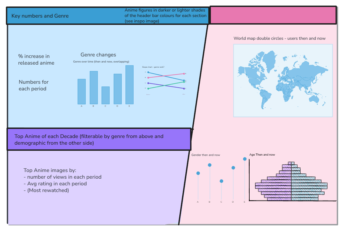
My initial idea was to compare two important periods in anime’s growth: the television boom of the late 1990s and the streaming boom of the 2010s.
I planned a single-page infographic divided into three sections:
- key numbers and changing genre rankings;
- the geographical and demographic composition of viewers;
- the anime that defined each period.
I used bold coloured panels, angled divisions and anime silhouettes to create an illustrated, manga-inspired design.
Adapting to the data
Although the anime data covered the 1990s, the user viewing data only extended back to around 2004. This meant I could not make a consistent comparison between the 1990s television audience and the later streaming audience.
Instead, I selected two equal five-year periods with stronger coverage: 2005–2009 and 2013–2017. This allowed the production, genre and audience sections to use the same time periods throughout the dashboard.
The map showed less dramatic geographical change than expected, so I used one map combining recent viewer numbers with changes in each country’s share of the audience. I also changed the original genre slope chart into a rank-based bump chart, making it much easier to see which genres rose or fell.
Initial sketch
Final dashboard
The finished dashboard brings production growth, shifting genre rankings, geographical reach, audience demographics and the defining anime of each period together in one infographic-style view.
Data source: Matěj Račinský, “MyAnimeList Dataset,” Kaggle, 2018.