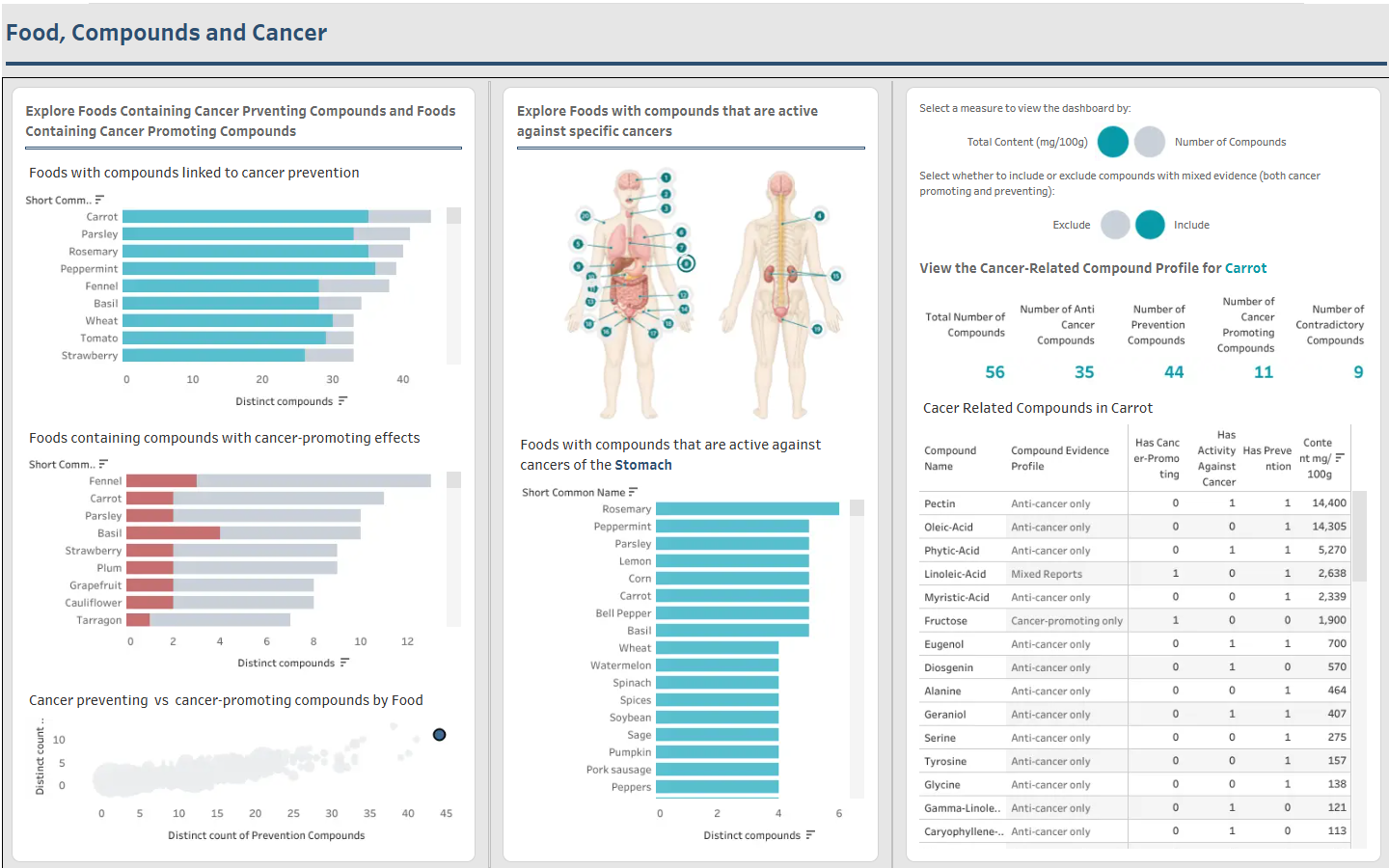
For the second day of Dashboard Week, the brief was to explore data from FooDB and create an interactive dashboard in Tableau. It had to be a single page and feature interactivity without drop down filters etc, using dashboard actions instead.
The original idea
My initial plan was to investigate fibre content across different types of food. I wanted users to compare food groups, explore the individual foods within each group and switch between values per 100g and per portion.
However, once I began profiling the data, it became clear that the data didn't have what I needed for the comparisons I had planned.
Changing direction
While exploring the wider dataset, I found links between food compounds and reported health effects. These included cancer related effects for different compounds with effects I grouped as prevention-linked, active against existing cancers or potentially cancer-promoting.
Sketching the dashboard
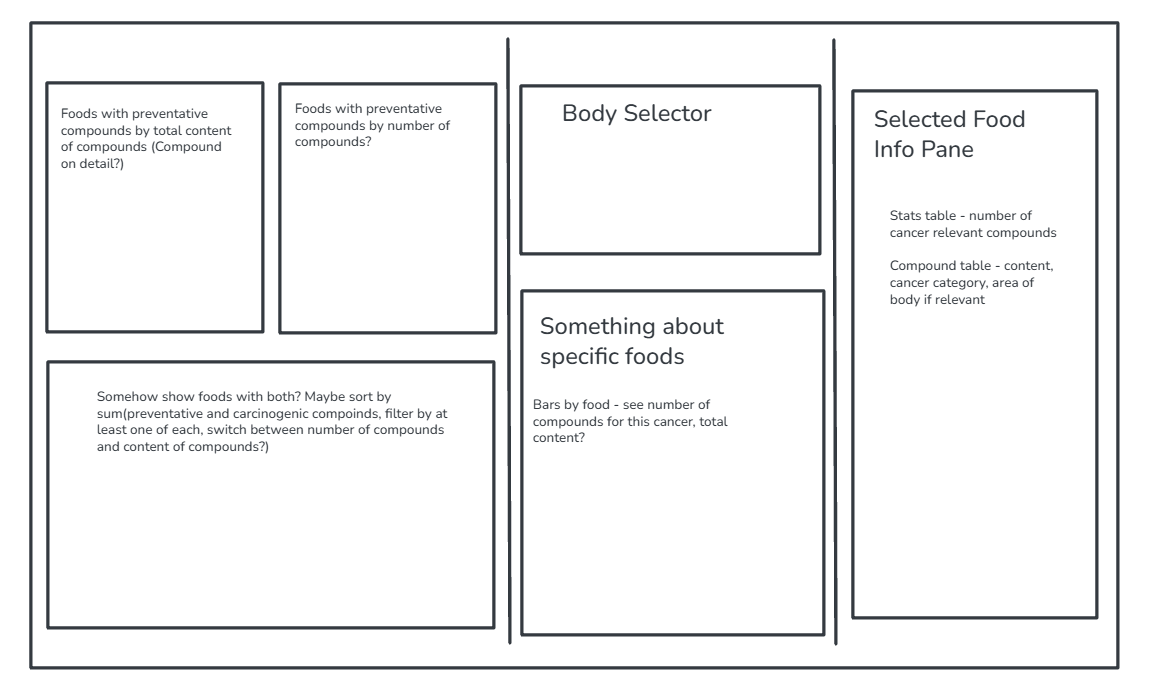
Before starting the Tableau build, I sketched a dashboard containing:
- Rankings of foods containing prevention-linked and potentially cancer-promoting compounds
- A scatter plot showing where foods contain both types
- An interactive body selector for exploring compounds studied in relation to different cancer locations
- A selected-food panel showing its compounds and their reported effects
- Buttons to switch between distinct compound counts and combined reported content, and to include or exclude compounds with mixed evidence
Final dashboard
The finished dashboard allows users to move between the overall food rankings, individual cancer locations and the detailed evidence attached to a selected food.